


Table of content ppt samples download





Try Before you Buy Download Free Sample Product
 Impress Your
 Audience
 100%
100% Editable
 Save Hours
 of Time


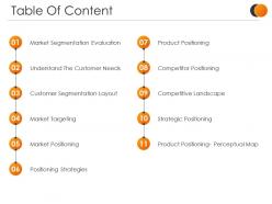
Select our Table Of Content PPT Samples Slide to give a brief account of all the important topics covered in the presentation. You can capture the attention of your audience with this vibrant and attractive PPT template that allows you to display the content of your presentation in a well-organized manner. Use this PPT layout and create a roadmap for your ideas and concepts and provide clarity to your audience. Grab the opportunity to save your time with this content-ready PPT design that lets you add or edit the text according to your requirements and needs. Use this well-formulated PPT graphic to mention all the topics and concepts covered in a list format to make it well-structured. Download this PPT theme to impress your audience with your skill and tidiness. Additionally, this PPT visual also allows you to choose from a wide range of available and customizable icons, images, tables, and charts to make your presentation eye-catching.
People who downloaded this PowerPoint presentation also viewed the following :
Table of content ppt samples download with all 5 slides:
Our Table Of Content Ppt Samples Download are an amalgamation of ease and comfort. Easy to use and good to have around.
FAQs for Table of content
Honestly, just put your main section titles and page numbers on there. Simple hierarchy so people can see how everything connects. Don't go crazy with formatting - nobody wants to squint at tiny text. I learned this the hard way lol. Stick to maybe 5-7 points max or it gets overwhelming. You can throw in some icons or brand colors if you want, but keep it scannable. Oh, and definitely update those page numbers right before you present because they shift around constantly. Super annoying but it happens every time.
Think of it like giving people a GPS for your presentation. Nobody likes being lost, right? Your audience gets way less fidgety when they know what's coming and how long you'll be up there talking. I always put mine early on - maybe slide 2 or 3. You can actually circle back to it during transitions too, which helps connect your points better. People take better notes when they understand the flow ahead of time. Oh, and it honestly makes YOU look more organized even if you're winging half of it. Just don't make it too detailed or fancy.
Honestly, white space is your best friend here - don't cram everything together. I always number my sections because jumping around during Q&A gets messy otherwise. Make your main headings bigger than subsections (obvious but people forget this somehow). Left-align everything and match your slide colors. Oh, and definitely add hyperlinks so it's actually functional, not just decorative. If you've got like 15 sections, group the related stuff together or it'll look insane. Keep the font simple - this isn't the place to get creative with typography.
Oh this is such a game changer! Select each TOC title, right-click and hit "Hyperlink," then just pick which slide it should jump to. Takes like 30 seconds per link but makes you look so professional. I always use the same color for clickable stuff so people actually know they can click it - learned that one the hard way lol. Test everything first though! Nothing worse than clicking a link that goes nowhere during your actual presentation. Seriously transforms how smooth your whole thing feels.
Honestly, skip the boring bullet points! I've been loving those chapter block layouts lately - each section gets its own colored box with a little icon. Super clean. You could also do a timeline thing if your content flows chronologically, or try the hub-and-spoke where your main idea sits in the middle with everything branching out. Numbered circles work great too. Grid layouts are solid when you've got like 4-6 sections that are equally important. Just pick whatever actually makes sense for what you're presenting and don't switch up your styling halfway through - that always looks messy.
Honestly, visuals in your TOC make such a difference - people notice right away. Instead of boring bullet points, throw in some icons or preview images. Your brain processes visuals crazy fast, like in milliseconds, so audiences instantly get your structure. They'll actually stay engaged because they know what's coming next. I mean, nobody wants their presentation to look like a grocery shopping list, right? Color-coding different sections works great too. Makes the whole thing feel way more polished and gives people a real preview of your content instead of just... words.
Don't go crazy with detail in your TOC - nobody wants to see every tiny point you'll cover. Just hit the main sections. Oh, and make the font big enough! I once had people squinting from the back row, super awkward. Hyperlinks are a lifesaver too - you can jump around during Q&A instead of frantically clicking through slides. Keep it updated if you shuffle things around. There's nothing more embarrassing than a TOC that says one thing while your presentation does something totally different. Trust me, you'll look way more polished.
Honestly, your audience will completely flip your Table of Contents upside down. When people keep asking about one topic, that's screaming "move this up front" or "split this into two sections." If you see glazed eyes during certain parts? Time to cut or combine those sections. Body language tells you everything - way more than surveys ever will. I once restructured an entire presentation because I could literally see when people checked out. The trick is ditching your original outline when it's not working. Their confused faces don't lie, and neither do their questions. Just roll with what they actually need instead of what looked good on paper.
Color psychology makes such a difference for your table of contents! It actually controls where people look first and what they expect. Blues and greens work great for data-heavy stuff since they feel trustworthy. Warmer colors? Perfect for creative sections. I used to just pick whatever looked nice - total rookie move. Here's the thing though: stay consistent. Red for urgent items in your TOC means those sections better use red in the actual slides too. Stick to maybe 2-3 colors max so your hierarchy stays super clear. Way more effective than I expected honestly.
Okay so first things first - ditch those trendy gray-on-gray color schemes. I know they look sleek, but nobody can actually read them. Go with dark text on light backgrounds instead. Bump your font size up to at least 24pt, and honestly, slide numbers are a lifesaver for navigation. Write headings that actually tell people what's coming, not vague nonsense. Don't forget alt text for any graphics you throw in there. Oh, and if you're doing this virtually, just read the TOC out loud - saves everyone the squinting. Quick reality check: if you can't read it from across the room while squinting, your audience definitely can't.
Oh dude, clickable hyperlinks are a game changer - your audience can jump straight to whatever section they want instead of sitting through everything. Way better than those boring static ones. You can throw in videos or animations too which actually keeps people awake lol. The best part? If you move slides around, most of the links update themselves so you're not stuck fixing everything manually. Obviously make sure your colors match your brand and stuff. Just don't be like me and forget to test the links beforehand... learned that one the hard way!
Okay so basically - short presentations under 15 slides? Just do a simple bullet list and call it good. But once you hit 20+ slides, trust me, you need actual structure or people get totally lost. I made this mistake with a huge client deck once (like 40 slides) and it was a disaster. Group your sections by themes, add slide numbers, maybe throw in some color coding so it's easy to scan. Visual stuff like icons helps too. The messier your presentation gets, the more your table of contents becomes your lifeline for keeping the audience with you.
Yeah, absolutely! Match it to your audience though - boardrooms need that clean, numbered hierarchy thing. Team meetings? Way more flexibility there. I've seen people get super creative with roadmaps, puzzle pieces, whatever connects to their topic. Fun fonts and icons work great for casual stuff. Clean typography for formal presentations. Oh, and colors can really help - just don't go overboard. The whole point is helping people follow along, so readability trumps everything else. But honestly, most people play it too safe when they could add some personality.
Just use hyperlinks on each section title so they jump straight to those slides. Way easier than you'd think. The Zoom feature is actually sick for this - it makes those clean thumbnail previews that link automatically. Custom animations work too if you want items highlighted as you go through the deck. Honestly though? Zoom Summary does most of the work for you and looks way more professional. I always forget about that feature but it's probably your best bet here. Sets up the whole interactive thing without much hassle on your end.
Your table of contents is basically like a movie trailer for your presentation. It shows people the story you're telling, not just random topics dumped together. Each section should connect to the next - maybe you're going from problem to solution, or current mess to future vision. Here's the thing though: don't make your section titles boring. Instead of "Market Analysis," try something like "Why Everything's Broken Right Now." You want people thinking "oh okay, I see where this is going" when they scan it. Make it feel like a journey with actual plot points.
-
Qualitative and comprehensive slides.
-
Illustrative design with editable content. Exceptional value for money. Highly pleased with the product.