


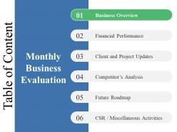
Table of content ppt summary deck


Try Before you Buy Download Free Sample Product
 Impress Your
 Audience
Editable
of Time


Enable folks to feel jubilant with our Table Of Content Ppt Summary Deck. Inspire them to do their best.
People who downloaded this PowerPoint presentation also viewed the following :
Table of content ppt summary deck with all 5 slides:
Be candidly clear with our Table Of Content Ppt Summary Deck. Express your self in a forthright way.
FAQs for Table of content
An effective Table of Contents should include clear section headings, logical flow progression, estimated timeframes for each segment, key discussion points, and designated Q&A periods. These elements streamline audience navigation by establishing expectations, enabling strategic preparation, and facilitating focused engagement, with many presenters finding that well-structured contents ultimately deliver enhanced comprehension and professional credibility.
A well-structured Table of Contents enhances audience engagement by providing clear roadmap expectations, creating anticipation for key topics, and enabling listeners to mentally organize information as it's presented. This strategic preview helps audiences stay focused throughout longer presentations, reduces confusion about content flow, and allows viewers to identify personally relevant sections, ultimately delivering better comprehension and sustained attention levels.
Best practices for formatting a Table of Contents in slide presentations include using clear hierarchical numbering, consistent font styles and sizes, strategic color coding for different sections, and concise descriptive titles. These formatting approaches streamline navigation by enabling quick section identification, enhancing visual consistency, and improving audience comprehension, with many presenters finding that well-structured tables of contents significantly boost presentation flow and professional credibility.
Tailoring a Table of Contents involves adjusting terminology, visual hierarchy, and formatting elements to match your presentation's tone and audience expectations. For formal presentations, use structured numbering, professional language, and clean layouts, while creative presentations can incorporate visual elements, engaging section titles, and dynamic formatting, ultimately ensuring your content roadmap enhances rather than conflicts with your overall presentation strategy.
Common mistakes include overcrowding with excessive detail, using vague or generic section titles, inconsistent formatting across entries, and failing to align page numbers accurately. These issues confuse audiences and undermine presentation flow, with many organizations finding that clear, concise TOC structures enhance navigation efficiency and audience engagement, ultimately delivering better comprehension and professional credibility.
A Table of Contents streamlines presentation navigation by providing a clear roadmap, enabling quick section jumps, highlighting key themes, and establishing logical flow expectations. This strategic organization enhances audience engagement, reduces cognitive load, and allows presenters to seamlessly reference interconnected topics, with complex business presentations finding that structured navigation ultimately delivers better comprehension and retention.
Visuals and icons enhance Table of Contents clarity by creating visual hierarchy, improving section recognition, reducing cognitive load, and enabling faster navigation through color coding and symbolic representation. These design elements streamline audience comprehension by transforming text-heavy layouts into intuitive roadmaps, with many presenters finding that strategic visual cues significantly accelerate information processing and maintain engagement throughout complex presentations.
PowerPoint's built-in navigation pane, Canva's presentation templates, Google Slides' outline view, Prezi's structured storytelling features, and SlideTeam's pre-designed TOC templates streamline table of contents creation. These tools enhance presentation organization by automating section linking, maintaining consistent formatting, and enabling quick structural updates, with many presenters finding that strategic TOC design significantly improves audience engagement and content navigation efficiency.
**INPUT**: How can you effectively communicate the purpose of each section listed in the Table of Contents? **OUTPUT**: Effectively communicating section purposes involves using descriptive headings, brief annotations, and consistent formatting that clearly indicates content scope and relevance. Strategic table design enables readers to quickly identify applicable sections, streamline navigation, and understand document flow, with many organizations finding that well-structured contents pages significantly enhance user engagement and information accessibility. *[Word count: 54]*
A Table of Contents establishes presentation flow by creating a logical roadmap that guides audiences through key topics, transitions, and conclusions in a structured sequence. This organizational framework enables presenters to maintain narrative coherence, manage time effectively, and ensure seamless progression between sections, ultimately delivering clearer communication and enhanced audience engagement throughout complex business presentations.
PowerPoint's automatic Table of Contents updates dynamically through linked text boxes, section headers, and consistent formatting styles that sync with slide titles and content changes. By establishing proper heading hierarchies and utilizing PowerPoint's outline view alongside third-party add-ins, presenters can streamline content management while ensuring navigation accuracy, ultimately delivering seamless presentations that adapt to evolving business requirements and stakeholder feedback.
Including a summary Table of Contents at presentation's end enhances audience retention, reinforces key messages, facilitates Q&A navigation, and provides clear takeaway structure. This approach helps presenters guide discussions more effectively, enables audiences to reference specific sections during follow-up conversations, and ultimately delivers stronger message comprehension and engagement outcomes.
Digital presentations enable interactive navigation through hyperlinked sections, automated updates, and multimedia integration, while physical presentations require static, manually-updated contents with page references and printed formatting considerations. Through presentation software, digital TOCs deliver clickable functionality, real-time modifications, and seamless integration with slides, whereas physical formats focus on clear typography and strategic page layout, with many organizations finding that hybrid approaches combining both formats enhance audience engagement and accessibility.
Audience feedback reveals which sections resonated most, which topics needed more depth, and where navigation confusion occurred, enabling you to restructure your Table of Contents for maximum impact. Through post-presentation surveys and engagement analytics, presenters can identify content gaps, reorder sections for better flow, and highlight audience priorities, ultimately delivering more targeted presentations that enhance comprehension and engagement.
Innovative Table of Contents approaches include interactive navigation with clickable elements, visual hierarchy through creative typography and color coding, timeline-based structures, and infographic-style layouts with icons and progress indicators. These design strategies enhance user engagement by transforming traditional linear formats into dynamic, visually compelling roadmaps, with many organizations finding that creative TOC designs significantly improve document navigation and reader retention.
-
Designs have enough space to add content.
-
Top Quality presentations that are easily editable.