

Company profile summary table of contents






Try Before you Buy Download Free Sample Product
 Impress Your
Audience
 100%
Editable
 Save Hours
of Time


Our Company Profile Summary Table Of Contents enable a firm control on expenditure. It helps economize on costs.
People who downloaded this PowerPoint presentation also viewed the following :
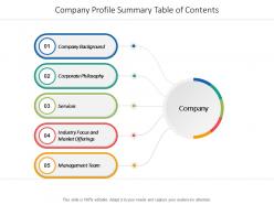
Company profile summary table of contents with all 5 slides:
Accelerate away to your goal with our Company Profile Summary Table Of Contents. It helps you change gears.


FAQs for Company profile summary
Okay so definitely include your mission and what you actually do - but in normal people words, not corporate speak. Testimonials are gold if you've got them. Show off your team's skills and any certifications or awards you've won. Contact info seems obvious but honestly, tons of companies forget it somehow? Your unique selling point needs to come through clearly. I'd say match whatever tone fits your brand - professional, casual, whatever. Oh and pro tip: make different versions for different audiences. Investors care about totally different stuff than regular customers do. Start with a basic template then tweak it.
Your template is literally the first thing people see, so it sets the whole vibe. Modern designs scream "we're innovative!" while conservative ones say "trust us, we're stable." Colors and fonts do the heavy lifting here - startup energy feels totally different from corporate authority, you know? Spacing matters too, weirdly enough. I'd say pick something that actually matches your company culture instead of just chasing trends. It's shallow but people judge fast. Oh, and don't overthink the imagery - just make sure it doesn't look like stock photo hell.
Your visual design is literally the first thing people judge you on - before they read anything. Colors, fonts, images all scream different messages. Apple's minimal vibe says "we're sleek and innovative." Ben & Jerry's crazy colorful stuff? Pure "we're fun and care about stuff." Pretty wild how a logo alone tells your whole story, honestly. The trick is keeping everything consistent - your website, business cards, whatever. Don't let your Instagram look playful if your website feels corporate, you know? Everything needs to match the same energy you're going for.
Look, you need actual numbers to back up what you're saying instead of just generic fluff. Like, don't just claim "we're industry leaders" - show them "we hold 23% market share in the Northeast." Way more convincing. Market research lets you dig into real competitor analysis and customer pain points your company actually solves. Your audience will know you get the landscape you're working in, which honestly makes all the difference for credibility. I'd start with maybe 2-3 solid market stats that connect directly to what makes your company valuable. It's basically showing vs telling.
Honestly, the worst thing you can do is be super vague about what you actually offer. Like, I see so many people trying to cram every single service they've ever done into one paragraph - total mess. Pick your main strengths and stick to those. Also? Ditch the corporate BS nobody reads. Skip all that "leading solutions provider" garbage. Talk about real results you got for clients instead. Oh, and update the damn thing regularly - nothing screams amateur like info from 2019. Keep it focused on what clients need, not stroking your own ego.
Don't just dump stats on them - nobody remembers that stuff anyway. Tell the story of why your founders started this thing in the first place. What problem pissed them off enough to actually do something about it? That's your hook. Then throw in some real customer stories that show how you actually work, not just what you claim to do. I swear, the best company presentations feel like someone's just telling you about their journey over coffee. Structure it simple: here's what sucked → here's how we're fixing it → here's the difference we're making. Way more memorable than bullet points.
Yeah, totally! Switch up your company profile depending on who's looking at it. Investors want the money stuff - growth numbers, financials, market potential. Customers need to see how you'll actually help them and maybe some success stories. Job seekers? They're checking if your culture doesn't suck and if there's room to grow. Oh, and benefits obviously. Partners care more about whether you're stable and easy to work with. Honestly, it's just about figuring out what each group actually gives a damn about and putting that front and center. Just don't lie about anything.
Here's what I'd track - engagement during presentations is huge. Are people actually paying attention or scrolling their phones? For digital stuff, check click-through rates and how long people stay on each section. Follow-ups are where the magic happens though - count how many reach out within a week or ask for more info. Download numbers tell a story too. Honestly? Sometimes you just know from the room's vibe if it's working. I'd make a simple spreadsheet (yeah I know, boring but it works) to log this stuff after each presentation. You'll start seeing patterns pretty quick.
Dude, consistency makes or breaks how legit you look. I've literally watched companies blow deals because their proposal felt like it came from a totally different business than their website. Super awkward. Your colors, logo, messaging - all that stuff needs to match across every single page. Someone should get the exact same vibe whether they're on your about page or reading team bios. Maybe I'm being picky, but it really does scream amateur when things don't align. Just make a quick brand guide with your main elements and actually use it when you update stuff.
Honestly, video testimonials from customers are way more convincing than any written review. I'd also make a timeline showing your growth - those before/after visuals really pop. Case studies work great if you write them like actual stories instead of boring reports. Oh, and don't just mention awards - show the work that got you there. Interactive stuff helps too, like progress bars or badges on your site. My personal favorite? Create a "wins wall" with photos and quick metrics. Makes everything feel real instead of just corporate BS. People connect with stories, not lists of achievements.
Honestly? Every 6 months, but I'd set quarterly reminders so you don't totally forget. Update your metrics, recent wins, any shifts in who you're targeting - that stuff moves fast. Like when remote work exploded overnight and suddenly everyone's pitches were irrelevant. Your profile can't be stuck two years ago while you're trying to land today's clients. New case studies are huge. Also refresh your value prop to match what people actually care about right now. I learned this the hard way when my messaging was completely off for like 8 months.
Honestly, colors and fonts matter way more than people think. Blue screams trustworthy, red feels energetic - that kind of stuff. I've literally seen amazing content ruined by Comic Sans (why does that font even exist?). Fonts either make you look professional or creative, so pick wisely. Keep things consistent across everything you do - it builds recognition. Also, if your text is hard to read because of bad contrast, people won't even try. Stick to 2-3 colors max and choose readable fonts that actually fit your vibe.
Dude, testimonials and case studies are total game-changers for credibility. Instead of you just saying "we're awesome," actual customers are vouching for you - which honestly hits way different. Case studies work best because they show the whole journey with real numbers and results. People read them and think "oh shit, that could be us." I'd throw in 2-3 solid ones that speak to your audience's main headaches. It's basically letting your customers do the heavy lifting for you, and prospects trust that way more than your marketing pitch. Actually just remembered - make sure they're recent too.
Honestly, graphics and infographics are total lifesavers for company profiles. Nobody wants to stare at walls of text anymore - like, who has time for that? Charts make financial stuff way easier to digest than paragraphs of numbers. Plus they're perfect for showing org charts or market position without boring people to death. Some folks just learn better visually anyway. Just don't go overboard with random decorative stuff. Use them where they actually help tell your story. A good chart beats three paragraphs of revenue explanation every time.
Honestly, videos are a game-changer for keeping people on your page longer. Throw in some client testimonials or behind-the-scenes stuff - maybe a quick office tour or your founder talking about why they started the company. Product demos work great too. Keep everything under 2 minutes though, because people's attention spans are basically nonexistent these days. I'd start with one solid video at the top of your page and see how it does before going crazy with more. Oh, and if you're doing auto-play, mute it by default - nothing's more annoying than random audio blasting when you visit a site.
No Reviews