


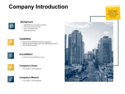
Company introduction production capacity ppt powerpoint presentation pictures




Try Before you Buy Download Free Sample Product
 Impress Your
 Audience
 100%
100% Editable
 Save Hours
 of Time


Ensure arrangements are genuinely high class with our Company Introduction Production Capacity Ppt Powerpoint Presentation Pictures. Be able to handle iconic events.
People who downloaded this PowerPoint presentation also viewed the following :
Company introduction production capacity ppt powerpoint presentation pictures with all 5 slides:
Identify iconic achievements with our Company Introduction Production Capacity Ppt Powerpoint Presentation Pictures. Explain the importance of their impact.
FAQs for Company introduction production capacity ppt
Honestly, we got fed up watching smart people waste hours making PowerPoint not look awful. You know how it is - you're an expert at your thing, but then you're stuck battling slide layouts instead of focusing on what actually matters. Most templates out there are either soul-crushingly boring or way too flashy for real work. We wanted something in the middle ground - stuff that looks professional without needing a design degree to customize. Short version: your ideas deserve better than those tragic default slides everyone's tired of seeing.
Honestly, the difference is night and day. We work with actual designers who get visual hierarchy and brand stuff - not just random people slapping shapes around. The color palettes actually make sense together, and the layouts are smart enough to adjust when you swap content. Vector graphics too, so everything stays crisp whether you're on your laptop or some massive conference screen. Other companies basically give you boring slide layouts and call it good. Download a few samples from us versus competitors - you'll spot the quality difference immediately just from the typography and spacing. Trust me on this one.
We work with a ton of tech startups and SaaS companies mostly. Digital agencies love our stuff too. Consulting firms and e-commerce businesses use the templates pretty regularly, plus creative studios. What's wild is how many healthcare and fintech companies picked them up - didn't expect that since they're usually super picky about compliance stuff. Really, any industry that moves fast and needs polished presentations without the design headache works well. Oh, and if your clients are always scrambling for pitch decks or proposals, these templates are perfect.
Look, we just make stuff that actually works when you're presenting. Clean and simple - none of that flashy garbage that looks great on Behance but totally bombs once you add real content. Three things we care about: can people read it, does it flex for different topics, and do your main points pop. That's it. Start with the basic layouts honestly - I know they seem boring at first, but you'd be surprised how much you can do with them once you mess around a bit. Way more versatile than the fancy ones.
Look, we basically build everything in layers so newbies and pros can both dive right in. Step-by-step guides, visuals, examples - the whole deal. Sometimes I think we go a bit overboard with explanations, but whatever. You'll find basic stuff AND advanced options, so you won't get bored once you level up. The real trick? We test everything with actual people first. If someone gets stuck during beta testing, that's our cue to make it even simpler. Nobody's got time to figure out confusing templates.
So the feedback's been pretty great actually - people love how much time these templates save them. Makes smaller companies look way more polished than they'd expect, which is cool to see. Main complaint? Everyone wants more industry-specific stuff, especially healthcare and tech startups. Honestly the testimonials section has some really solid examples of how people made them work for their specific situations. Oh, and apparently they help you look professional without needing to be some design wizard, which... yeah, that was kind of the whole point.
Yeah totally! The templates come with tons of cool stuff already built in. Interactive hotspots, animated transitions, polls - basically everything to keep people actually engaged instead of zoning out. Adding your own videos and images is super simple with the drag-and-drop thing (honestly way better than dealing with more generic stock photos). Discussion prompts and Q&A sections are scattered throughout too. Oh, and definitely start with the "Interactive Intro" template if you're new to this - it's got all the good engagement stuff ready to go. Just drop your content in and you're set.
Honestly, we refresh them every quarter but marketing and sales ones get updated way more often - those areas are just constantly changing. There's also this big annual review where we toss the old stuff nobody uses anymore and build new ones based on what people actually want. Oh, and if there's some major industry thing happening, we'll jump on updates right away. You can see when each template was last updated in your dashboard, plus we'll ping you when your go-to templates get big changes. If something feels outdated just let us know!
Honestly, customer feedback drives pretty much everything we build. Users will literally tell us "I wish you had X" and boom - that becomes our next template. We're always digging through support tickets and feature requests to see what's missing. Some of our most popular templates actually started as complaints about gaps in our offerings (which I love, tbh). Pain points and usage patterns show us what needs tweaking too. So definitely grab those "I wish..." moments when you're chatting with customers - they turn into real products faster than you'd think.
We follow design blogs and scroll through Dribbble/Behance constantly - honestly it's kinda addictive seeing what's hot. Client meetings give us good intel too since we notice what makes people's eyes light up. Every quarter we refresh our templates with new colors, fonts, and layouts. Nothing too crazy trendy though because who wants their deck looking stupid in six months? Focus groups help us A/B test stuff to see what actually works. Oh and definitely hit up our "Recently Updated" section first - that's where all the good new stuff lives.
Oh totally! We customize stuff all the time - honestly, that's kinda our thing. Every business is different, so we're pretty flexible about tweaking features or building something totally new if that's what you need. Some of our coolest projects actually came from clients with weird, specific requests that made us get creative. Integration with your existing systems? No problem. Want to start from scratch? We can do that too. You should just give us a call so we can figure out exactly what you're dealing with and go from there.
So we've got this whole resource library thing set up - video tutorials, customization guides, templates you can just drop in and use. Start with the "Quick Start" guide though, it'll save you time. The community forum is actually where the magic happens - people post these crazy creative workarounds that honestly put our original ideas to shame. There's also monthly live workshops if you're into that, where we demo advanced stuff and answer whatever questions come up. Just focus on the features you actually need first instead of trying to learn everything at once.
Yeah, totally! TechFlow just raised $2M with our pitch deck template - they told us the clean design let investors actually focus on their numbers instead of getting lost in fancy graphics. Then there's GreenSpace, who nailed their board presentation with our demo template and got their whole roadmap approved. The templates just give you a solid starting point, you know? Saves you from wrestling with layouts so you can focus on your actual story. Though honestly, the magic happens when you customize everything to sound like *you* while keeping things professional. Want me to shoot over those case studies?
Oh totally! We bake accessibility in from day one - high contrast colors, bigger fonts (18pt+), layouts that play nice with screen readers. One thing that catches tons of designers? Don't use color alone to show important stuff. Always add alt text to images too. Honestly, clean design usually equals accessible design anyway. We run everything through accessibility checkers before wrapping up. Just give us a heads up about any specific needs your audience has and we'll handle it!
So they're going hard on AI automation and cloud stuff for the next year and a half. Three new product lines coming that'll blend machine learning with what they already have. The market's honestly insane right now - changes every week it feels like. Mobile-first is huge for them too since that's where everyone's at. They're basically trying to become this whole digital ecosystem thing instead of just another software company. Oh and definitely watch for their Q2 announcements, that's when the good stuff hits.
No Reviews