

Company name presentation powerpoint templates





Try Before you Buy Download Free Sample Product
 Impress Your
 Audience
 100%
100% Editable
 Save Hours
 of Time


Address any bitterness with our Company Name Presentation Powerpoint Templates. Identify factors generating discord.
People who downloaded this PowerPoint presentation also viewed the following :
Company name presentation powerpoint templates with all 5 slides:
Identify factors causing inefficiency with our Company Name Presentation Powerpoint Templates. Highlight aspects generating delays.
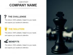
FAQs for Company name
Honestly, the biggest thing is making sure fonts and colors stay consistent throughout - nothing screams amateur like a messy mix. You'll want clean typography that's actually readable, not some fancy script that looks cool but nobody can read from the back row. White space is your friend too. I always check that there are different layout options for charts, timelines, whatever content you're throwing in there. Oh, and definitely test how it looks projected! I've made that mistake before - looks perfect on my laptop then turns into a blurry mess on the big screen. Download a few sample slides first to get a feel for it.
Honestly, good templates are a game changer. You'll look way more professional without doing any extra work - just swap in your content and you're done. No more wasting time picking fonts or whatever. Your brand stays consistent too, which makes you seem like you actually have your act together (even when you don't lol). The best part? You can focus on what you're actually saying instead of making everything look pretty. I'd start with one solid template that fits your company vibe, then tweak it for different types of presentations later.
Honestly, colors can totally save or destroy your PowerPoint. I made the mistake once of pairing neon green with bright red - looked like Christmas threw up on my slides. Your audience gets distracted by clashing colors instead of actually listening to you. Stick with maybe 2-3 colors that work well together. Professional presentations need that consistent look throughout, and smart color choices help people focus on what's important first. Oh, and definitely check how everything looks on different screens before you present - learned that one the hard way too.
Basically, these templates come pre-loaded with all the stuff your industry expects to see. Healthcare ones have medical icons and that clean blue/white look hospitals love. Education templates? They've got classroom-friendly fonts and spots for learning objectives. It's honestly a lifesaver because you're not starting from zero. Each template already "gets" your field's vibe, so you look professional without the work. My old boss used to spend hours picking colors - such a waste! Just grab one that fits your area and tweak it. Way easier than building everything yourself.
Honestly, animated templates are such a game changer - people actually pay attention instead of staring at their phones. The movement naturally guides your audience through each point, making everything flow way better. Static slides just feel so 2015 now, you know? What I love most is how you can time animations to hit right when you're making your key points. Way more impact. Oh, and they look way more professional without much extra effort. Just don't get crazy with spinning text and stuff - keep it clean so people focus on what you're saying, not some wild transition effect.
Honestly, templates are lifesavers. You skip all that tedious design stuff and just plug in your content - takes like 10 minutes instead of 45. I used to get so caught up making fonts look perfect (total time waster). Now I just focus on what I'm actually trying to say. Your slides end up looking way more professional too, which is nice when you're winging it. Oh and grab a few different styles - like one for data-heavy stuff, one that's more visual. You'll never panic about ugly presentations again.
Look, nobody wants to stare at spreadsheets all day. Infographics basically save your audience from death by data overload. You can use charts and icons to walk people through the important stuff without making their brains hurt. Plus we process images way faster than text anyway - that's just science. Build those visual elements right into your templates. Consistent chart styles, icon sets, data layouts. Makes everything look polished without extra work later. Oh and figure out what types of data you present most often, then create dedicated template sections for those. Trust me, people will actually remember your presentations instead of zoning out.
First thing - go into those master slides and swap out their colors and fonts for yours. Trust me, doing this upfront will save you hours of tedious editing later. Replace their stock photos with images that actually fit your vibe and brand style. The layout structure is probably fine (most templates nail this part), but definitely customize the graphics and icons to match your brand guidelines. Oh, and update that footer with your logo and contact details - people always forget that step. Save everything as a new template file so your whole team can use this branded version from now on.
So responsive PowerPoint templates basically adapt to whatever device you're looking at them on - phone, tablet, whatever. Your text automatically resizes so it's not tiny, images don't get chopped off at weird angles, and everything just flows better. Regular templates? They're stuck looking the same no matter what, which honestly looks terrible on mobile. I learned this the hard way after sending a deck to clients who probably couldn't read half of it on their phones. If people might view your presentation on mobile (and let's be real, they will), definitely go with responsive templates. Makes a huge difference.
Honestly, the worst thing you can do is force your content into a template that doesn't fit. I've seen people try to make square pegs work in round holes - it's painful. Skip anything with flashy animations or weird fonts (unless you want that early 2000s vibe, which... why?). Change the colors and fonts to match your brand instead of using whatever default they give you. Short sentences work. Also make sure people can actually read your stuff on phones and tablets. My take? Find something clean, then bend it to work for YOU, not the other way around.
So templates basically give you a roadmap for your story - like problem/solution layouts or before/after stuff. Pick one first, then let it shape how you tell your story. They keep everything looking consistent too, which honestly saves you from those tragic slide decks where every page looks different (ugh). Most good ones have placeholder text that guides you through what content goes where. Just match the template to your story type - are you building up to something big? Walking through steps? The structure should fit whatever you're trying to do.
Oh definitely pick something clean like Calibri or Open Sans - those fancy script fonts just make people squint and give up. Size matters more than you'd think too. Anything smaller than 24pt and half your audience will mentally check out. I learned this the hard way at my last presentation lol. Make sure there's good contrast with your background. Test it by standing across the room first - if you can't read it easily from there, nobody else will either. Simple fonts that match your brand always win over decorative ones.
Ugh, template compatibility is such a pain but you really can't ignore it. Sharing stuff with your team or clients? You'll definitely run into formatting disasters, missing fonts, animations that just break - the whole nine yards. I had this nightmare situation where a client's presentation looked totally butchered on their ancient PowerPoint version. Save everything as .potx files, that's your safest move. Test on a couple older versions too if you can. Oh and always do a quick check before sending anything major out - trust me on this one, it'll save you so much embarrassment later.
Minimalist is totally the way to go right now - clean fonts, tons of white space, simple graphics that actually pop. Dark mode everything because who wants to burn their retinas during a 2pm meeting, right? Interactive stuff is cool too if it makes sense, like smooth transitions or videos that aren't just there for show. Oh and accessibility matters way more now, so high contrast colors are pretty much expected. Those crazy busy templates from like 2019? Yeah, skip those. You'll want something clean and straightforward - less is definitely more these days.
Honestly, accessible PowerPoint templates are a game-changer for reaching more people. High contrast colors and readable fonts don't just help folks with visual issues - they make life easier for everyone trying to read slides in those awful dimly lit meeting rooms. Alt text is clutch for screen readers, plus it makes your stuff more searchable later. I always start with templates that already have decent color contrast built in because fixing it afterward is such a pain. Clear typography matters too. Your presentations will look more professional anyway, so it's basically a win-win situation.
-
Easily Editable.
-
Excellent products for quick understanding.