


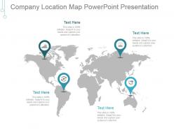
Company location map powerpoint presentation






Try Before you Buy Download Free Sample Product
 Impress Your
 Audience
 100%
100% Editable
 Save Hours
 of Time


Gauge different angles with our Company Location Map Powerpoint Presentation. Give each aspect full consideration.
People who downloaded this PowerPoint presentation also viewed the following :
Company location map powerpoint presentation with all 5 slides:
Feed fertile brains with our Company Location Map Powerpoint Presentation. They excel at handing down expertise.
FAQs for Company location
Put your main office front and center, then add all your other spots - branches, stores, whatever you've got. Don't forget the practical stuff like highways, airports, and landmarks people actually know. Otherwise they'll be driving in circles cursing your name. Make a legend so people can tell different location types apart, and zoom in on crowded areas. Oh, and if you have new locations or special services somewhere, call those out. Honestly, the best thing you can do is grab someone who's never been there and see if your map makes sense to them first.
Honestly, location maps are a game changer for presentations. Instead of boring address lists, stakeholders get instant visual context about where you operate. Geographic spread becomes super obvious, and investors eat this stuff up - they want to see your physical footprint mapped out. You can highlight key facilities, show market coverage, plus layer in extra data like employee counts per location. Interactive features are clutch if you can swing it, lets people explore on their own. I swear it's one of those things where you're like "damn, should've done this ages ago." Way more engaging than text blocks.
Honestly, just start with Google My Maps - it's free and dead simple to use. If you need fancier stuff later, Mapbox has crazy customization options but you'll need to learn some coding. Leaflet's another good one, especially if you're working with developers since it's open-source. ArcGIS Online works for big companies but costs a fortune (learned that the hard way). My advice? Test everything out with Google My Maps first. You can always upgrade once you figure out what features you actually need versus what sounds cool in theory.
For the markers, I'd stick with your company colors so everything looks cohesive. Different icons work great too - like one style for your main headquarters, another for branch offices. If you've got multiple locations crammed in the same city, definitely use those numbered cluster things or it'll look like a total mess. Each pin should show the basics when people click - address, phone number, hours if that matters. Honestly, the biggest thing is just keeping it simple enough that people don't have to zoom in and out a million times trying to find the closest location.
Different colors and shapes will save you here - blue pins for headquarters, green for manufacturing, red for retail spots. Circles, squares, diamonds all work. Size your bigger facilities larger too. Honestly, the hover labels are clutch - people love clicking around to see details. Just stay consistent with whatever system you pick or it'll look messy. Building icons are cool if your map software has them, though sometimes simple shapes work better anyway. The whole point is making it scannable so someone can glance and instantly get what they're looking at.
So basically you can throw demographic stuff, income data, competitor spots - all that onto your company map and suddenly patterns pop up everywhere. Population density is huge for this. I'd honestly start with just one extra layer though, don't go crazy right away. You'll spot weird things like why your downtown location crushes it while the suburban one doesn't, or find dead zones where you should expand. The trick is figuring out what question you're actually trying to answer first, then hunt down the geographic data that'll help. Foot traffic info is gold if you can get it.
Your map colors can totally make or break the whole thing. High contrast is key - people need to spot your locations fast, not squint at the screen. I'd stick with your brand colors for the markers but make sure they actually stand out against whatever map background you pick. Oh, and skip the red/green combo since colorblind people can't tell them apart (learned that one the hard way). Test it on your phone too because colors look way different on smaller screens. Honestly, simple beats fancy every time. Function over flashy stuff.
Honestly, just throw your store locations into Tableau or ArcGIS - even Google My Maps works if you're on a budget. Then layer census stuff on top like income and age data. Makes these crazy cool heat maps that show patterns you'd never notice otherwise. I usually start with just population density and income because it gets overwhelming fast if you add too much. You'll spot weird gaps in your coverage or realize some locations are sitting in perfect demographics but still tanking. Perfect for figuring out where to expand next too.
Definitely check the licensing stuff first - most map services have weird rules about business use. Google Maps usually wants attribution, sometimes you need a paid license. Apple's super picky about this. The tricky part is "free" maps aren't always free when you're using them for work presentations. Screenshots vs embedded maps might have different rules too (honestly the legal stuff gets confusing). OpenStreetMap's your safest bet since it's actually open source. Way better than dealing with lawyers later.
Maps are honestly a game-changer for showing expansion plans. Plot your current spots in one color, future ones in another - way better than boring bullet points. Layer in stuff like population data or where competitors are to back up your choices. I've seen people miss obvious gaps just staring at spreadsheets all day. Create a conservative timeline and an aggressive one so everyone can compare. The visual aspect makes stakeholders actually get excited about growth instead of glazing over during presentations.
Dude, you should totally try 3D maps for your company locations - they actually grab people's attention instead of boring them to death. Way better than those flat 2D things that look like they're from 2005. People can actually see how your offices relate to each other geographically, plus elevation stuff makes way more sense. Honestly, anything that keeps people awake during quarterly reviews is a win. Your supply chain visualizations will look sick too. I swear, last time I saw someone use these, half the room was leaning forward trying to get a better look at the screen.
Okay so basically you gotta think about what each group actually cares about. Investors want to see market coverage and strategic spots - they're all about growth potential and geographic spread. But employees? They need the practical stuff like addresses, parking, how to get there on the subway. Clients just want proof you're nearby and can actually help them. The design should match too - investors get the sleek professional version while employees get something more straightforward and useful. Honestly, I'd start by just writing down what each person would actually do with your map, then work backwards from there.
Revenue per location and customer foot traffic are your best starting points - they tell you everything you need to know pretty quickly. Heat maps are perfect for this stuff because the bad spots jump out immediately. Don't go crazy adding every metric though. Maybe throw in conversion rates or inventory turnover if those matter for your business. Customer satisfaction scores work too. I always think it's tempting to cram everything onto one map, but honestly? Stick to 2-3 metrics max. You'll actually be able to see patterns instead of getting overwhelmed by data soup.
Definitely start collecting feedback through surveys and customer service calls - see what's actually tripping people up on your location maps. The complaints that keep coming up? Pure gold. Like when everyone says "couldn't find the parking" or "which entrance do I use??" - that's your roadmap right there. Companies miss this obvious stuff all the time, honestly. Add more landmarks and better street names based on what customers are struggling with. Oh, and test the updated maps with a few people first before you launch them everywhere. Saves you from looking dumb later.
Airbnb's global host map is perfect for this - they use heat mapping so millions of listings don't look chaotic. Spotify's "Musical Map of the World" does something similar, layering music data by region. There's also McDonald's interactive timeline showing their expansion since 1940 (I got way too absorbed in that one). Uber visualizes real-time demand with color gradients for pricing across cities. They all nail progressive disclosure - big picture first, then you can zoom into details. For your company map, figure out what story you want the data to tell upfront, then pick visual techniques that actually support it.
-
Content of slide is easy to understand and edit.
-
Nice and innovative design.