

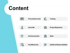
Content personal overview ppt powerpoint presentation file example





Try Before you Buy Download Free Sample Product
 Impress Your
 Audience
 100%
100% Editable
 Save Hours
 of Time


Help for all your presentations. Thousands of Content Personal Overview Ppt Powerpoint Presentation File Example are on hand for any of your business needs.
People who downloaded this PowerPoint presentation also viewed the following :
Content personal overview ppt powerpoint presentation file example with all 5 slides:
Help is on the way for boring presentations. Our Content Personal Overview Ppt Powerpoint Presentation File Example can make any project engaging!
FAQs for Content personal overview ppt powerpoint
Honestly, start with a solid title slide and section dividers - saves you so much time later. Keep your fonts and colors consistent throughout (seriously, pick like 2-3 max). White space is your friend, don't cram everything together. For the love of all that's holy, avoid Comic Sans. I don't care how "fun" your topic is. Set up bullet layouts and image placeholders so you're not rebuilding every slide. Add footers with page numbers. The flow should go intro to conclusion, obviously. Once you nail the visual consistency, you'll never want to go back to starting from scratch every time.
Honestly, templates are like having a roadmap when you're lost. They stop you from staring at blank slides going "wtf do I put here?" You get this built-in story structure - set up the problem, build some tension, then boom, here's your solution. Way better than just throwing random data at people and hoping something sticks. Pick the right template though - pitching needs different flow than reporting quarterly numbers. It's basically like choosing the right genre for your movie, if that makes sense? Short answer: they keep your audience awake and give your brain a starting point.
First thing - swap out those colors and fonts for your actual brand ones. Makes a huge difference instantly. Don't forget to replace any placeholder logos, and honestly? Update the favicon too if you're presenting online. People definitely notice that stuff. I'd keep layouts pretty clean but add your brand's vibe through spacing and icon choices. Oh, and consistent imagery obviously. Small tweaks work way better than redesigning everything from scratch - learned that the hard way. Once you nail it, save that sucker as a master template. You'll thank yourself later when you're not rebuilding presentations every single time.
Oh definitely! Colors totally mess with people's heads in presentations. Like, reds and oranges pump up energy but blues feel super trustworthy and chill. I bombed this budget presentation once using bright red everywhere - made everyone feel panicked about money lol. You want maybe 2-3 colors tops that actually match your vibe. High contrast helps people read stuff easier. But honestly? Clashing colors will just make everyone focus on how ugly your slides look instead of what you're saying. Keep it simple and don't overthink it.
Dude, typography is like your secret weapon - it guides people's eyes without them noticing. Make sure your fonts are big enough (18pt minimum for body text) so the back row can actually see. High contrast is key, and stick to sans-serif like Arial or Calibri since they're way cleaner on screens. I cannot tell you how many presentations I've watched die because someone used some ridiculous script font that looked "pretty" but was totally unreadable. Keep your font hierarchy consistent - maybe 2-3 sizes max. Test your slides from across the room first though, trust me on this one.
So here's what I've learned from way too many boring presentations - put your charts right after you mention the data, not randomly scattered around. Keep everything matching your color scheme and fonts or it'll look messy. Oh, and don't pack a million things into one visual because people's brains just shut off. One clear point per graphic works way better. I'd start by picking your 2-3 biggest points first, then find visuals that actually back them up instead of just filling space. Trust me, less cluttered = people actually pay attention.
Templates are lifesavers, honestly. You'll go from zero to polished presentation in like 10 minutes instead of spending hours tweaking fonts that don't match. They give you those professional color schemes and layouts that actually look good together - saves you from creating something that screams "I made this at 2am." Plus you get slide ideas you wouldn't think of, like timeline layouts or comparison charts. The obvious downside? Everyone might recognize the same template, but whatever. Just swap the colors and throw in your own images. Pick one that fits your topic, then customize it enough so it doesn't look totally generic.
Start with responsive layouts right from the beginning - flexible grids, fonts that scale, images that adjust to any screen size. I always test on mobile, tablet, and desktop super early because what looks amazing on my laptop can be totally unreadable on a phone (trust me on this one). Your text needs to be at least 24pt for mobile viewers. High contrast colors are your friend. Make clickable stuff big enough for thumbs - honestly, this drives me crazy when designers forget about fat fingers. Oh, and create a mobile-first version of your main slides since that's where most people end up viewing them anyway.
Yo so the big thing is mixing up your delivery constantly. Start with something that grabs them right away, then break your main stuff into chunks of three - way easier to follow. I swear, boring presentations are my worst nightmare lol. Switch up your pace throughout, throw in quick polls or "who here has ever..." moments. Stories work way better than bullet points too. Don't forget to actually move around and pause for drama. Oh and transitions are clutch - always preview what's coming next so people aren't lost.
So you can totally add clickable buttons and hover effects directly into your templates - most tools support hyperlinks that jump between slides or animated transitions when you click stuff. I'm obsessed with hover animations honestly, they just look so clean. Embedded polls work great too, like Mentimeter for live feedback. Interactive charts are cool where people click to see different data points. Oh and you can throw in form fields for real-time responses. Start with simple click-to-reveal things first, then get fancy with the complex interactions once you're comfortable.
Dude, culture totally changes how you design templates. Red screams "lucky!" in China but "danger!" everywhere else. Some places read right-to-left too, which completely flips your layout. Wild, right? You've gotta think about business formality - like, Germans love detailed info while Scandinavians prefer clean, minimal stuff. Religious symbols can be tricky territory. Honestly, I learned this the hard way once with a client in Dubai. My advice? Do your homework on the audience first, then find someone from that culture to give it a quick look before you finalize anything.
Honestly, start simple with polls and Q&A boxes - Slido's pretty solid for this stuff. Those little reaction buttons hit different though, makes people feel like they're actually part of it instead of just sitting there. I'd throw in a feedback form on your last slide too. Don't go overboard at first - pick maybe two things max or you'll overwhelm everyone (including yourself). Once you see what people actually click on, then you can add more. The whole point is keeping it smooth so nobody's fumbling around trying to figure out how to participate.
Track engagement stuff - how long people stayed tuned in, questions they asked, feedback you got afterward. I always check my timing too because honestly, rushing through slides at the end makes you look unprepared. Did you actually get what you wanted though? The decision, approvals, whatever your goal was. That's the real test. Run a few presentations with the same template and see what happens. If you keep going over time or people zone out halfway through, your template's probably too packed. Sometimes less really is more with these things.
So everyone's obsessed with minimalism right now - clean layouts, bold fonts, lots of white space. Interactive stuff is where it's at though, like clickable sections and embedded videos that actually keep people awake during presentations lol. Dark mode templates are finally everywhere (thank god). There's also this big push for accessible designs with better contrast and readable fonts, which honestly should've happened ages ago. AI-generated layouts are popping up too and they're surprisingly decent time-savers. Just make sure whatever you pick works on different screen sizes since we're all still doing hybrid meetings.
So basically you just swap out colors, images, and content to match each industry. Education needs warmer colors and student pics. Healthcare wants those trustworthy blues and greens - you know, the "we're professional" vibe. Tech is all about sleek, modern stuff with way too many gradients (seriously, why do they love those so much?). Don't forget to change your language too. Healthcare gets formal terminology, education needs accessible words, and tech... well, they eat up buzzwords. Start by figuring out what your audience actually cares about, then tweak everything to speak their language.
No Reviews