

Question ppt powerpoint presentation file pictures





Try Before you Buy Download Free Sample Product
 Impress Your
 Audience
 100%
100% Editable
 Save Hours
 of Time


Counter any critics with our Question Ppt Powerpoint Presentation File Pictures. You will come up with cogent arguments.
People who downloaded this PowerPoint presentation also viewed the following :
Content of this Powerpoint Presentation
Description:
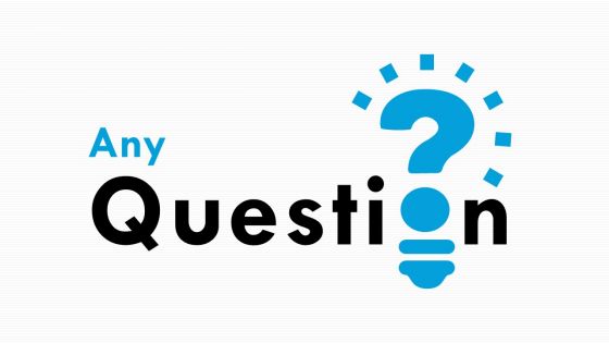
The image is a PowerPoint slide with a graphic designed to signify a question or inquiry. The word "Any" is in light blue, and "Question" is in black, with a bold and large font size, making the text highly visible. Below the word "Question," there is a stylized image of a light bulb that integrates a question mark, with the filament of the bulb forming the bottom curve of the question mark. This design cleverly combines the traditional symbol for an idea—the light bulb—with the universal symbol for inquiry—the question mark.
The slide is likely used at the end of a presentation or a meeting, inviting the audience to ask questions about the topics that have been presented. The slide also states "This slide is 100% editable. Adapt it to your needs and capture your audience's attention." This means that the presenter can customize the slide's template to match the theme or branding of their presentation.
Use Cases:
Question slides are versatile and functional, facilitating a structured Q&A session after presentations in various sectors.
1. Education:
Use: Inviting questions after lectures or educational presentations.
Presenter: Teachers, Professors.
Audience: Students, Academic Peers.
2. Corporate:
Use: Concluding business meetings or corporate presentations.
Presenter: Managers, Executives.
Audience: Employees, Stakeholders.
3. Healthcare:
Use: Wrapping up medical conferences or information sessions.
Presenter: Medical Experts, Researchers.
Audience: Healthcare Professionals, Patients.
4. Technology:
Use: Ending tech product demos or development updates.
Presenter: Product Managers, Developers.
Audience: Users, Industry Experts.
5. Finance:
Use: Closing financial reports or investment briefings.
Presenter: Financial Analysts, Advisors.
Audience: Clients, Investors.
6. Legal:
Use: Summarizing legal seminars or continuing education courses.
Presenter: Lawyers, Legal Instructors.
Audience: Law Students, Practitioners.
7. Non-Profit:
Use: Concluding volunteer training or donor presentations.
Presenter: NGO Leaders.
Audience: Volunteers, Donors, Community Members.
Question ppt powerpoint presentation file pictures with all 5 slides:
Boost the desire for higher achievements with our Question Ppt Powerpoint Presentation File Pictures. It helps increase the impetus.
FAQs for Question ppt powerpoint
Honestly, grab them right from the start with something interesting - boring openings kill presentations instantly. Stick to 2-3 main points because nobody can focus anymore. Your slides shouldn't look like novels, and definitely practice those transitions so you don't sound awkward between sections. Eye contact is huge, don't just stare at your notes the whole time. Oh, and move around a bit if you can - standing like a statue is weird. End with telling people exactly what you want them to do next. Practice out loud at least once, trust me on this one.
Okay so here's the thing - your brain is literally hardwired to remember stories way better than random facts or bullet points. When you wrap your message in a story, people connect with it emotionally and actually remember the *why* behind what you're saying. I mean, think about it - what sticks with you more, a list of features or hearing how something actually helped someone? Next time you're presenting, just start with a quick customer story or something that happened to you. Then bring it back at the end. Works every time.
Honestly, just keep it clean and readable. Pick something basic like Helvetica, stick to maybe 2-3 colors tops, and don't go crazy with fancy layouts. The worst presentations are when you can't even read the text from the back - so bump that font up to at least 24pt. High contrast colors are clutch too. Here's what I've learned: cramming a million things on one slide never works. One idea per slide, use bullet points instead of writing novels, and only add images if they actually help your point. Oh, and test it on the screen beforehand if you can - projectors can be weird. White space isn't wasted space, it makes everything look way more professional.
Think about who you're presenting to first. Executives? Go formal. Brainstorming session? Get creative. I usually decide based on whether I need more room for text or want to emphasize visuals. Clean layouts work best for data-heavy stuff - you'll want chart space. Storytelling presentations are better with image-focused templates. Oh, and if it's external, don't ignore your brand guidelines. Here's what I always do: test your actual content in 2-3 templates before picking. Templates look way different when they're empty versus filled with your messy real slides.
Think of audience analysis as your cheat sheet for not bombing. Who's actually gonna be there? That changes everything - your vocab, examples, the whole vibe. I mean, you wouldn't pitch machine learning to engineers the same way you'd explain it to marketing people. Figure out their background first, what problems they're dealing with, what they actually care about. Then ditch those boring template slides. Short version: their expertise level = your word choices. Their goals = your main points. Honestly, just ask yourself "what do these specific people need from me?" before you even open PowerPoint.
Honestly, videos and animations are game-changers for presentations. Our brains are basically hardwired to notice movement, so when you throw in a quick video or animated chart, everyone's attention snaps right back. Complex stuff becomes way clearer too - like, I'd rather watch a machine actually work than listen to someone drone on about gears and whatever. Though I learned this the hard way after using a 3-minute video once and losing half my audience to their phones. Keep them short, maybe 30-60 seconds tops, and you'll totally reset people's focus without killing your momentum.
Ugh, the worst thing people do is cram paragraphs onto slides then just read them word-for-word. Super awkward. Your audience reads way faster than you talk anyway! Also those tiny fonts kill me - like, we're not all 20 with perfect vision here. Practice your timing beforehand because going over is painful for everyone. Don't use busy backgrounds that make text impossible to read. And honestly? Have a backup plan ready because tech always fails at the worst moment. Stick to bullet points instead of full sentences. Oh, and don't present to the wall - face your audience!
Ugh, don't be that person who throws a million stats at people - their eyes will literally glaze over. Pick like 2-3 numbers that actually prove your point and make them visual. Charts are your friend here, not spreadsheet vomit. I made this mistake once and could feel the room dying lol. Tell the story behind your data instead of just rattling off figures. Round when you can - "about 75%" hits better than "74.3%." Always explain why each number should matter to them. Give them one stat they'll actually remember later.
Honestly, every 3-5 minutes you gotta switch something up or people zone out completely. Hook them first - weird stat, crazy question, whatever makes them go "huh?" Then mix it up: tell stories, ask them stuff, do polls if you can. I bombed so many early presentations watching people scroll Instagram while I droned on! Move around, change your voice, pause for effect. Oh and transitions between topics? That's where you lose half the room if you're not careful. One interactive thing per section minimum - trust me on this.
Oh dude, body language is HUGE for presentations. I bombed so many early ones because I'd just stand there like a statue avoiding eye contact - even when my slides were actually good. Your posture and gestures honestly say more than your words sometimes. Stand up straight, move your hands when you talk (but like, naturally), and look at different people around the room. Sounds basic but it works. I still record myself practicing because wow, you don't realize how awkward you look until you see it. Trust me on this one.
Honestly, practice is everything - rehearse answers to obvious questions beforehand. When someone's asking something, actually listen instead of planning your response (I'm terrible at this lol). Don't know the answer? Just say "great question, let me circle back with you on that." Way better than bullshitting your way through it. Also repeat the question so everyone can hear it. Keep responses short and focused - nobody wants a 5-minute ramble. Oh, and questions are usually good! Means people care about what you're saying, not that they're trying to destroy you.
Start with big, readable fonts and high contrast colors - trust me, squinting at tiny text kills engagement. Add captions to videos and break everything into clear headings with bullet points. Skip the jargon or at least explain technical stuff since not everyone's coming from your world. I always send materials ahead of time so people can actually prep (some folks need that processing time). Mix it up with visuals, audio, and text so you're hitting different learning styles. Oh, and test it on someone outside your team first - they'll catch the blind spots you totally missed.
Honestly? Just use PowerPoint or Google Slides - everyone knows them and they work fine. Canva's great if you want prettier designs. I'd avoid Prezi unless you really need the zooming thing, but fair warning: it makes some people motion sick lol. Charts and data stuff? PowerPoint handles that better than the others. But here's the thing - the software doesn't really matter that much. Your story and how you present it matters way more. Get comfortable with whatever tool you pick first, then worry about getting fancy later. Practice your delivery too!
Oh man, presenting across cultures is tricky! Japanese audiences want you to be way more indirect and build relationships first - hierarchy matters big time there. Germans? Complete opposite. Just hit them with data and get to the point. Some cultures expect tons of back-and-forth while others want you to be the expert who just talks. Even your gestures and eye contact have to match what they're used to. I learned this the hard way once, actually. Your slide design matters too! Definitely research their communication style beforehand or you'll be scrambling.
Dude, you gotta practice beforehand - it's seriously the difference between nailing it and bombing. When I rehearse out loud (like actually speaking, not just thinking through it), I catch all the weird transitions and figure out my timing. Used to just wing presentations and always kicked myself after. Run through it at least twice because then the content becomes automatic. You're not frantically trying to remember what slide comes next or stumbling over explanations. That muscle memory thing is real - suddenly you can actually look at people instead of just panicking internally. Trust me on this one.
No Reviews