


Results ppt powerpoint presentation file background image




Try Before you Buy Download Free Sample Product
 Impress Your
 Audience
 100%
100% Editable
 Save Hours
 of Time


Display information about the criteria with our Results Ppt Powerpoint Presentation File Background Image. It helps advertise the jobs.
People who downloaded this PowerPoint presentation also viewed the following :
Content of this Powerpoint Presentation
Description:
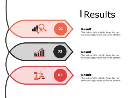
The image is of a PowerPoint slide with the title "Results" suggesting it's used to present outcomes or findings. The slide is structured into three sections, each with a distinct icon representing different types of results: analysis, growth, and discussion. Each section is numbered, indicating a possible sequence or priority. The slide's design is simple yet effective, with each result section having a large, bold number beside an icon, followed by a placeholder "Result" title and a text box stating "This slide is 100% editable. Adapt it to your needs and capture your audience's attention." This indicates that the information can be customized to fit various contexts and to engage the audience.
Use Cases:
Such a slide could be effectively used in diverse sectors for presenting results and findings:
1. Market Research:
Use: Displaying data analysis findings.
Presenter: Market Analyst
Audience: Executives, marketing team
2. Financial Services:
Use: Illustrating financial growth or trends.
Presenter: Financial Advisor
Audience: Clients, investors
3. Education:
Use: Showing research results or educational outcomes.
Presenter: Academic Researcher
Audience: Students, faculty
4. Healthcare:
Use: Presenting patient treatment results.
Presenter: Medical Researcher
Audience: Medical professionals, stakeholders
5. Technology:
Use: Reporting on software testing outcomes.
Presenter: Product Manager
Audience: Developers, technical team
6. Retail:
Use: Analyzing sales performance.
Presenter: Sales Manager
Audience: Sales staff, management
7. Manufacturing:
Use: Discussing production efficiency results.
Presenter: Operations Manager
Audience: Production team, executives
Results ppt powerpoint presentation file background image with all 5 slides:
Our Results Ppt Powerpoint Presentation File Background Image will endorse your views. They will encourage the audience also to approve.
FAQs for Results ppt powerpoint presentation
Honestly, contrast is everything - learned that when I picked this gorgeous sunset photo and literally no one could read my text lol. Pick something that won't fight your words for attention. Bright, busy backgrounds are the worst for this. Your audience matters too. Fun pics work great for team stuff, but I'd go more professional for client meetings. Test it out first! Slap some actual text on there and see if it's readable. Short sentences help. When you're unsure, boring beats unreadable every time.
Your background image should totally match the vibe you're going for. Quarterly results? Go with something clean and corporate-y like a city skyline. Product launch calls for energetic, modern vibes. I once watched a presentation completely bomb because they used this random sunset photo for budget planning – like, what were they thinking? Pick something subtle that won't fight with your text for attention. Good contrast matters too so people can actually read your stuff. Bottom line: whatever background you choose should make your audience feel the right emotions and help them remember your message. Don't overthink it though.
Oh man, don't use super busy or bright images - your text will just disappear. Low-res stuff looks terrible when projected too. I learned that one the hard way! Make sure there's good contrast so people can actually read what you wrote. Also avoid anything too eye-catching since it'll steal attention from your content. Skip personal photos or anything copyrighted obviously. Here's what I always do: test everything on a projector first because colors look completely different than on your laptop screen. Trust me on this one.
Dude, background colors totally mess with your audience's heads. Warm stuff like red gets people hyped up, but cool blues make them chill and trust you more. I once used this insane bright yellow that made everyone squint the whole time - rookie mistake! You want good contrast so people can actually read your text. Busy patterns are the worst though, they'll kill your message. Honestly? Just pick colors that vibe with what you're talking about and test if you can read it first.
So corporate presentations? Keep it super clean - light gradients, simple geometric stuff, maybe subtle textures. Your brand colors but nothing crazy. Creative presentations are totally different though - you can go wild with bold graphics, artsy photos, whatever feels right. I honestly think corporate people are just scared of anything too interesting lol. But here's the thing that actually matters: make sure people can still read your text easily. Doesn't matter how pretty your background is if nobody can see what you're saying.
Hey! So first thing - crank that background image opacity way down to like 20-30%. Trust me on this one. You want something simple too, not crazy busy patterns or detailed photos. Save the cute cat pics for Instagram lol. Pick colors that actually contrast with each other - dark text on faded light backgrounds works great, or flip it around. Here's my go-to test: step back from your screen and squint at it. Can you still read everything? Then you're good to go.
Definitely check out Unsplash and Pexels first - they're free and honestly have better stuff than some paid sites. For presentations, I'd also peek at Canva's built-in backgrounds since they're already optimized for that kind of thing. Shutterstock's pricey but worth it if you need something really specific. Oh, and this sounds obvious but test your background with actual text before you finalize everything. I learned this the hard way when my "perfect" image made my bullet points completely unreadable. Sometimes the prettiest background is just a nightmare for legibility.
Think of custom backgrounds as your brand's personality showing through the whole deck. Use company colors, sneak your logo in there, maybe add some textures that fit your vibe. I've seen people use faded product shots or even photos of their office space - pretty clever honestly. Just don't let it overpower your actual content. Keep the opacity dialed down so people can actually read your text. Oh, and definitely test it on a few slides first before you go crazy and apply it everywhere. Nothing worse than realizing halfway through that your background makes everything impossible to read.
Yeah textured backgrounds are pretty solid - they give your slides some actual depth instead of looking flat and boring. Plus they hide little design mistakes which is honestly super helpful. The trick is keeping your text readable though, so go subtle with the texture and make sure there's good contrast. I learned this the hard way but definitely test on the actual projector first since textures can look totally different than on your laptop. Solid colors are probably safer if you've got tons of text. But seriously, anything beats staring at plain white slides for half an hour.
Ugh, I made this mistake so many times! Drop your background opacity to like 10-30% - trust me on this. Dark text on light backgrounds is your friend. White text can look really clean on darker images too. Sometimes I'll throw a blur effect over the whole thing or add one of those semi-transparent overlays. The real test? Back away from your screen and squint a little. Can you still read everything without straining? Then you're good. Oh, and avoid super busy patterns - they're just distracting no matter what you do.
Yeah, this stuff gets tricky fast. Colors mean totally different things everywhere - red's lucky in China but screams danger here. Religious imagery can offend people without you even realizing it. Honestly, I learned this the hard way once. Even showing people in backgrounds is weird now because representation issues come up. My advice? Go super minimal with international audiences, or better yet, find someone local who can give you a heads up about what works. When you're unsure, boring neutral backgrounds are your friend. Way better than accidentally insulting half your audience.
Try making your text boxes semi-transparent - that's how you get those clean overlay effects. I usually do like 60-80% transparency on the background image through "Format Background." Makes everything look way more professional. For text, go with white on dark parts of your image and dark text where it's lighter. Drop shadows help too! Oh and definitely preview in presentation mode because the colors always look weird when you're editing. Trust me on that one - learned it the hard way lol.
Yeah, definitely go with higher resolution for your backgrounds - like 1920x1080 minimum. Low-res stuff looks pixelated on big screens and makes your whole presentation look cheap. Nobody wants that awkward moment where everyone's squinting at blurry images. Going higher than 1080p is fine too, just watch your file size or PowerPoint might start acting up. I learned this the hard way when my presentation crashed right before a meeting last month. Oh, and definitely run through it in presentation mode first - what looks good in editing view can be totally different when you're actually presenting.
Stick with JPEG or PNG for PowerPoint backgrounds - they're your best bet. JPEGs work great for photos, while PNG is what you want for anything with transparency or clean graphics. Honestly, I used to go crazy with super high-res images until my presentations started running like molasses! Try to keep files under 2MB and shoot for 1920x1080 resolution since that matches most screens anyway. Oh, and definitely test your background with actual text first - you don't want to find out it's too busy or dark when you're presenting.
Make your background image super light - like 20-30% transparency. Right-click the image, hit Format Picture, then mess around with that transparency slider. I learned this the hard way after making slides nobody could read lol. The contrast between your text and background is what really matters here. Short sentences work better than long ones for this stuff. If parts of your image are too busy, throw a subtle overlay on there. Trust me, your audience will thank you for not making them squint through your whole presentation!
No Reviews