


Introduction purpose scope ppt powerpoint presentation infographics show




Try Before you Buy Download Free Sample Product
 Impress Your
 Audience
 100%
100% Editable
 Save Hours
 of Time


Thousands of presentations will be ignored this year. Yours won't be forgotten thanks to engaging Introduction Purpose Scope Ppt Powerpoint Presentation Infographics Show design.
People who downloaded this PowerPoint presentation also viewed the following :
Content of this Powerpoint Presentation
Description:
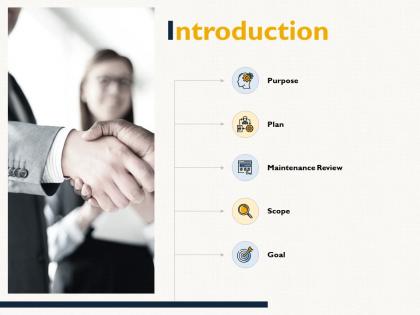
This image appears to be a screenshot of a presentation slide titled "Introduction," featuring a handshake in the background which suggests a theme of partnership or agreement. On the right side, there is a vertical flowchart with icons representing different segments: Purpose, Plan, Maintenance Review, Scope, and Goal. Each element helps outline the initial sections of a strategy or project plan.
Use Cases:
The slide can be tailored for a variety of professional industries where structured planning and clear communication are critical:
1. Corporate Finance:
Use: Outlining investment strategies
Presenter: Financial analyst
Audience: Stakeholders and investors
2. Information Technology:
Use: Presenting system upgrade plans
Presenter: IT project manager
Audience: Technical and non-technical staff
3. Healthcare Administration:
Use: Explaining new policy implementation
Presenter: Hospital administrator
Audience: Healthcare staff and management
4. Marketing and Advertising:
Use: Launching a new marketing campaign
Presenter: Marketing strategist
Audience: Marketing team and company executives
5. Construction and Engineering:
Use: Detailing the phases of a construction project
Presenter: Head engineer or project manager
Audience: Construction team and contractors
6. Educational Institutions:
Use: Planning academic or administrative initiatives
Presenter: School principal or department head
Audience: Educators and administrative personnel
7. Manufacturing:
Use: Introducing process improvement plans
Presenter: Operations manager
Audience: Production team and floor managers
Introduction purpose scope ppt powerpoint presentation infographics show with all 5 slides:
Thousands of Introduction Purpose Scope Ppt Powerpoint Presentation Infographics Show are ready to be added to your presentations. High design on demand.

FAQs for Introduction purpose scope ppt powerpoint
Keep it clean with lots of white space - that's your starting point. Stick to 2-3 colors max and one font throughout (seriously, don't go crazy with fonts). Follow the 6x6 rule: max 6 bullet points, 6 words each. High-quality images beat cheesy clipart every time. Make your text big enough for the back row to read. Oh, and make sure your main points are bigger/bolder than the smaller details. I learned this the hard way - always test your slides on the actual screen you'll use before presenting.
So you've got three main things to tweak: how complex your language is, how deep you go into details, and the visual vibe. Executives want the big picture stuff - show them business impact. Technical people? They actually want to see the data and specifics. For everyone else, ditch the jargon and explain more context. I totally used to just copy-paste the same presentation for different groups... yeah, that bombed. Switch up your examples so they'll actually relate, and honestly even your colors matter - finance teams expect everything to look super polished and corporate. Figure out what level they're at first, then what's keeping them up at night.
Here you go: Stories beat boring slides every time. Your brain actually processes narratives way better than random facts and figures - we're just built that way. Nobody wants to zone out during another PowerPoint parade, right? When you tell a story, people connect emotionally with your message instead of just nodding off. Complex stuff becomes way easier to understand too. Oh, and they'll actually remember what you said afterward. Try opening with a quick story that hits your main point, then bring it back at the end. Trust me, it works.
Honestly, colors make a huge difference in how people react to your slides. Reds and oranges get people pumped up, while blues and greens are more chill and trustworthy. I made the mistake of using bright yellow text once - total disaster, nobody could read anything! You want good contrast so people can actually see your text, but don't go crazy with too many colors or it'll look like a rainbow threw up. Depending on your audience, you'll want either professional vibes or something more creative. Keep it simple with 2-3 colors tops, and definitely test your slides beforehand.
Go for clean layouts with tons of white space - corporate people absolutely despise messy slides. Stick to max 2 fonts and pick colors that actually match your brand. Most templates are honestly way too over-the-top for business stuff. Good contrast is crucial since you'll present in different lighting. Make sure it's got the basics: agenda slides, section breaks, comparison charts. Oh and definitely test it with real content first - I learned that one the hard way! You don't want to discover formatting issues right before your big meeting.
Okay so basically, charts and graphs are lifesavers because nobody wants to sit through a bunch of random statistics. People's brains just process visual stuff way faster - like, you can spot a trend in a graph instantly vs. trying to make sense of a spreadsheet. Memory-wise, visuals are sticky. I mean, can you even remember what your coworker said in yesterday's standup? Probably not, but you'd remember a crazy spike in a chart. One thing though - don't go overboard with fancy designs. Clean and simple wins every time. Oh, and actually make sure your visual tells a story, not just... exists.
Okay so first thing - don't just slap your content into whatever template you picked without tweaking it. I cringe when I see presentations with those default fonts and colors that scream "I didn't even try." Also? Just because there's space doesn't mean you need to fill every inch with text. Nobody wants to read paragraphs on slides. Oh and this is embarrassing but check for placeholder text - I've literally seen people present with "Insert your company name here" still showing. Preview everything first. The template should work for your story, not against it.
Honestly, less is more with animations. Simple fade-ins work great, maybe some gentle slides between sections. I used to go crazy with spinning text (so embarrassing looking back lol). Pick one style and stick with it throughout your whole deck. Time everything to match how fast you talk - practice this part! The thing is, if people walk away talking about your cool animations instead of your actual points, you've totally missed the mark. Oh and avoid those bouncing graphics at all costs. They're distracting as hell. Test your timing when you rehearse so it doesn't feel awkward.
Honestly, every piece of media needs a real purpose - don't just throw in videos because they look neat. Make sure visuals are big enough for people in the back to actually see. Test your tech setup beforehand because something always goes wrong when you least expect it. Videos should be under 2 minutes or people zone out. I learned this the hard way once. Too much multimedia turns into background noise nobody pays attention to. Have backups ready. If something doesn't make your point clearer, just cut it. Oh, and rehearse with your actual files loaded - not just placeholders.
Dude, consistency is what makes presentations look legit instead of thrown together. Same fonts, colors, layouts - that's what lets people actually focus on what you're saying. I swear, nothing screams "procrastination project" like slides that all look totally different. Your brain automatically trusts consistent design more. Stick to maybe 2-3 fonts tops and use the same colors throughout. Oh, and make a template first! Sounds boring but it'll save you so much time. Trust me on this one.
Grab your brand colors and fonts first - that's like 80% of the work done. Your logo obviously goes in too. I always peek at our brand guidelines before I start because getting called out for using the wrong shade of blue is honestly embarrassing. Match the spacing and layout style from your other stuff. Oh, and don't forget about tone - write like your brand normally talks to people. The whole point is someone should recognize it's yours even if they can't see the logo. Pro tip: show a slide to whoever sits near you and ask if it "feels right" for your company. They'll know immediately.
Honestly, practicing with a timer beforehand is everything. Set specific time blocks for each section and actually stick to them - I know it sounds rigid but it works. Always add like 2-3 minutes of buffer time because something will go wrong or someone'll ask a question. Use phrases like "moving on to our next point" to keep momentum. Don't feel bad about cutting stories short if you're behind schedule. Have backup slides you can skip if needed. Oh, and set a phone timer too - sometimes you zone out and need that buzz to snap back. Trust me on this one.
Honestly, feedback is a lifesaver because you're basically blind to your own mistakes. Like when you think something's crystal clear but your friend goes "huh?" - that's the stuff you need to catch. Other people notice when your slides suck, when you're talking too fast, or doing weird hand gestures you don't realize. I always get way less nervous after practicing with someone too. Oh, and try to find people who are kinda like your actual audience if you can. Don't just ask "how was it?" - be specific like "did that second part make sense?" Way more useful that way.
Templates are seriously game-changers for presentations. All that design stuff? Already done for you. You don't have to sit there staring at a blank slide wondering what the hell to do next. The layouts, colors, fonts - it's all there and actually looks decent. Most come with built-in slide types for objectives and activities that match how teachers usually structure things anyway. I swear it's like having someone else do the hard work while you focus on your actual content. Find 2-3 good educational ones you vibe with, then tweak them with your own style and boom - you've got your go-to setup ready.
Oh man, this is so key - you've gotta mix things up constantly or people will zone out hard. Polls and breakout rooms are lifesavers. I bombed a webinar last month by just talking the whole time... never again! Switch up your content every 5-7 minutes with videos or quick activities. Look directly at your camera, not your screen (feels weird but works). Get people talking right away with an icebreaker question. Your energy has to be way higher than normal since you can't read faces. Also push for cameras on if you can - makes such a difference.
No Reviews