


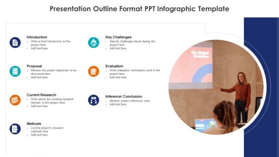
Presentation outline format ppt infographic template




Try Before you Buy Download Free Sample Product
 Impress Your
 Audience
 100%
100% Editable
 Save Hours
 of Time


Deliver amazing PPT presentations with this Presentation Outline Format PPT Infographic Template by preparing an outline of the topics to be discussed in the presentation. This outline PPT slide will help you summarize what you want to say to your consumers or investors. Using a framework for your PPT presentation will increase your audience interaction. It lays down a clear path that you will follow while delivering your presentation. It is a 7 stage outline template which includes the topics and subtopics that provide an overview of your presentation to the viewers. Translate your ideas into words by developing a logical structure of the topics to be covered. By consolidating all the important topics in just one single slide, you can make your viewers familiar with the presentation. Give a recap of the main points in the conclusion section.
People who downloaded this PowerPoint presentation also viewed the following :
Presentation outline format ppt infographic template with all 5 slides:
Our Presentation Outline Format Ppt Infographic Template ensure the audience hands it to you. Your efforts will always be acclaimed.

FAQs for Presentation outline format
So for your presentation outline, grab their attention right away with a solid hook. Keep it to 3-4 main points tops - seriously, any more and you'll lose them. Back up each point with examples or data that actually makes sense. Oh, and don't forget smooth transitions between sections (awkward pauses are the worst). End strong by hammering home your key message. Build in time estimates so you're not rushing through the end like I always do. Mark where you'll use visuals or get people involved. Also throw together some backup slides for Q&A - you'll thank me later when someone asks that one random question.
Honestly, outlines are total game-changers for presentations. They keep you from wandering off into random tangents (guilty as charged lol). Your audience can actually follow what you're saying instead of getting confused halfway through. I always start with my main point first, then figure out what I need to back it up. Makes the whole thing flow better, and you won't forget the important stuff when you're up there. Plus you'll feel way more confident knowing exactly where you're going with it. Trust me on this one - it's like having a roadmap instead of just winging it.
Ugh, the worst thing you can do is stuff way too much into your outline. You'll stress yourself out and lose your audience completely. Also, don't jump around randomly between topics - nobody can follow that mess. I learned this the hard way, but avoid super vague notes like "talk about data." That means absolutely nothing when you're up there presenting! Know your audience's background too. Short punchy sections work way better than these massive chunks. Your outline should actually help you, not make you panic when you're trying to present. Keep it detailed enough that you won't freeze up.
Yeah, your outline totally depends on what you're going for! Informative stuff is pretty straightforward - intro, main points, wrap up. But persuasive presentations? You need that problem-solution flow or you'll lose people. Training sessions are weird though - I always build in those demo-practice chunks or everyone just zones out. Used to think all presentations were the same and couldn't figure out why mine felt clunky. Then I realized - are you teaching, convincing, or just sharing info? Match your structure to that goal and everything clicks way better. Like, don't try forcing a sales pitch structure onto a training session, you know?
Honestly, tech has totally changed how I do outlines now. AI can spit out a basic structure in seconds - saves so much time upfront. Then I'll throw it into Notion or Miro where everyone can jump in and mess with it together. The templates are pretty smart too, they'll suggest how to organize stuff based on who you're presenting to. Oh, and most presentation apps just pull straight from your outline now, which is clutch. I've gotten weird about using voice-to-text while driving to dump ideas. Start simple though - grab a basic template app first, then dive into the AI stuff once you're not fumbling around.
Honestly, audience analysis is everything when you're building an outline. Like, you can't figure out what to say until you know who you're talking to, you know? Their experience level tells you whether to cover basics or dive straight into the complex stuff. Plus their pain points help you decide what deserves the most attention - which is actually harder than it sounds sometimes. Even tiny details matter. Someone in finance vs marketing? Totally different examples and language. I always start by writing down 3-4 key things about my audience first. Makes the whole process way smoother.
Just throw brackets right in your outline where you'll use each visual - something like "[SLIDE: Q3 revenue chart]" works perfectly. Saves you from that awkward fumbling around moment (we've all done it). Each visual needs to actually support whatever point you're making, not just look pretty. I always jot down the main takeaway too - like "[CHART shows 40% increase - hit the growth trend hard]." Oh, and do a quick practice run to make sure the timing doesn't feel weird or choppy. Nothing worse than killing your momentum with a visual that doesn't fit the flow.
Okay so first thing - lead with your main point right away. Then I usually group similar stuff under headings that actually make sense. There's this "rule of three" thing that works pretty well since people remember things better in threes. For processes, chronological order is your friend. Problem-solution works when you're trying to convince someone of something. You can also go broad to specific or flip it around. Just pick one approach and stick with it - don't bounce around randomly or you'll lose everyone. Honestly, I always sketch it out on paper first to see if the flow looks right visually.
Definitely research how your audience likes to communicate first. Some cultures want you to get straight to the point, others need way more context and relationship stuff upfront. High-context cultures? Add more background slides. Low-context? Just lead with your conclusions. Oh, and think about hierarchy - certain audiences expect formal credential intros. Visual preferences matter too. I totally bombed a presentation in Japan once because I didn't consider this! Buffer time for questions is huge since participation styles are all over the place. Get a local colleague to review your outline beforehand though - seriously saves you.
Honestly, I'd go digital if I were you. Way easier to move stuff around and you can add links to resources without rewriting everything. Paper's nice if you think better with a pen in your hand - I get that. But here's the thing: when you're done outlining digitally, you can just jump straight into making your actual slides. Super smooth transition. Also you won't have those messy scribbled-out sections that make you second-guess yourself later. Only downside is if your laptop dies mid-prep, but that's pretty rare. Try both though - your brain might work differently than mine.
Look, when you're staring at your own work for hours, you miss obvious stuff. Get 2-3 people to read it over. They'll catch weird transitions, boring parts that go on forever, or places where you're talking over people's heads. Also typos - I swear you become blind to your own mistakes after a while. Don't just ask "thoughts?" though, that gets you nowhere. Be specific: "Does this flow make sense?" or "Is section 2 confusing?" Way better feedback. Fresh perspective is honestly everything when you're stuck in your own head.
So basically you want: exec summary first, problem statement, your solution with data backing it up, timeline for rolling it out, budget stuff, and expected results. Oh and stakeholder analysis - executives eat that up. Throw in a risk section too. Don't forget next steps with who owns what. Budget some slides for appendices because corporate people always demand backup slides they won't look at (classic). Keep track of slide counts per section or you'll end up with some 50-slide nightmare. Been there - it's brutal watching everyone's eyes glaze over halfway through.
Honestly, just treat your outline like you're plotting a story. Hook them right away with a problem or crazy anecdote, then build up tension as you move through each point. I've been doing this lately and people actually stay awake during presentations lol. Instead of boring bullet points, drop in personal stories or case studies for each section. Write down the juicy details directly in your outline - trust me, you'll blank on them otherwise. One story per major point keeps things moving. Also sketch out where you'll pause for those dramatic moments. It sounds cheesy but audiences eat it up.
Def read your outline out loud first - you'll catch weird transitions that looked fine on paper. Cut anything that doesn't actually support your main point (yes, even that amazing stat you found). Make sure people can follow your logic without their brain hurting. I do this thing where I ask "so what?" after each section - if I can't answer it, the section probably sucks. Oh and time yourself! Nothing worse than realizing you have way too much content when you're already nervous backstage.
Definitely add time estimates to each section - like "Opening: 2 mins, Main Point 1: 8 mins." Trust me, I bombed a presentation once by going way over time. Super awkward. Build in some buffer between sections because someone always asks a random question or the tech decides to glitch. Your outline becomes this handy roadmap for content AND timing. Mark where you can speed up or slow down if you're running behind. Oh, and do a quick practice run with a timer beforehand - it'll save you from that panicky "oh crap I have 5 minutes left" moment.
-
bruh.
-
Enough space for editing and adding your own content.
-
Out of the box and creative design.