


Outline presentation images





Try Before you Buy Download Free Sample Product
 Impress Your
 Audience
 100%
100% Editable
 Save Hours
 of Time


Ease your cost burden with our Outline Presentation Images. They are cheaper than you expect.
People who downloaded this PowerPoint presentation also viewed the following :
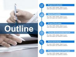
Outline presentation images with all 5 slides:
Get folks to believe they can build a better future with our Outline Presentation Images. It will inject fresh hope.
FAQs for
Honestly, it all comes down to three things: clarity, simplicity, and making sure people can actually see what matters most. Your audience shouldn't have to squint or play detective with your slides. Don't dump paragraphs on there - nobody wants to watch you read War and Peace. Stick with the same fonts and colors so everything flows nicely. Make sure there's enough contrast between your text and background (seriously, gray text on white makes me irrationally angry). Your charts should tell the story instantly, not require a PhD to decode. Quick test: if you can't get it in 5 seconds, it's too complicated.
Dude, colors totally mess with people's heads in the best way. Blue makes you look trustworthy and professional - great for boring quarterly stuff. Red gets people hyped up or creates that "act now" feeling. Green screams growth and good vibes, orange just energizes everyone. Honestly, most presentations look like they were made in 1995 with that black-on-white thing. Match your colors to what you're trying to sell them on. New product launch? Go with orange or red to get them excited. Don't be that person who uses like 7 different colors though - it's chaos. Stick to 2-3 max and you'll look way more put-together.
Dude, infographics are like the cheat code for making boring data actually interesting. Instead of drowning people in numbers and text, you're giving them a visual story they can follow. It's honestly night and day - like showing someone a map vs just reading directions out loud. I use them whenever I've got stats or complicated processes that would normally put people to sleep. The icons and bite-sized chunks make everything way less scary to look at. Oh, and pro tip - always sketch one out first before you even think about making slides or whatever. Trust me on this one.
Honestly, less is more with animations. I only use them when they actually help - like revealing bullet points to control the flow or a quick fade between sections. You wouldn't believe how many presentations I've sat through that look like a disco exploded. Keep effects subtle and fast (like 0.3 seconds tops). Here's my test: if people remember your spinning text more than what you actually said, you've screwed up. Just run through it once and cut anything that feels like visual clutter rather than helping your story.
Dude, go with sans-serif fonts like Arial or Calibri - way cleaner for presentations. Serif fonts look nice on paper but they're terrible from across a room. Body text needs to be 24pt minimum, headings should be 36pt or bigger. Trust me on this one - I bombed a presentation once because people in back couldn't read anything. Oh, and don't go crazy with fonts. Two max or it looks messy. Make sure your text pops against the background too. Before you present, literally walk to the back of the room and check if you can actually read your slides.
Ok so the trick is making your eyes naturally follow what matters most. Size is huge - blow up your main points and shrink the less important stuff. Bold colors work great for anything you really want people to notice. Put your biggest ideas in the upper-left corner since that's where we look first (weird but true). Don't pack everything together - white space actually makes things look way cleaner. Oh, and try this: squint at your slide and see what pops out first. If it's not your main point, you've got some tweaking to do!
Dude, ditch the stock photos - they're so obvious and cringey. You know those weird business people grinning at computers? Everyone's seen them a thousand times. Good images actually connect with your audience and tell YOUR story, not some generic nonsense. They make you look professional instead of like you threw slides together last minute. People remember visual stuff way better too. Oh and if money's tight, Unsplash has tons of free options that don't suck, or honestly just use your phone camera.
Honestly, matching your fonts and colors throughout just makes you look like you didn't slap everything together an hour before. Your audience won't get distracted by random design chaos - they'll actually focus on what you're saying. I've sat through so many presentations where every slide looked like it came from a different planet. Super awkward. When your visuals are consistent, people trust that you put thought into the content too. Stick with 2-3 colors max, same font family, and don't go crazy with spacing. Makes a huge difference.
Honestly, mix up your formats - throw in some charts, videos, maybe an infographic or two. Different people learn differently, you know? Some need visuals, others want to hear stuff out loud (try recording audio notes), and the hands-on learners love polls and interactive bits. Oh, and don't forget accessibility stuff - high contrast colors, decent fonts (but seriously, never Comic Sans lol). Alt text for images is clutch. I'd definitely run a few slides by someone first though. They'll catch the weird stuff you missed.
Okay so white space is literally a game changer for slides. I learned this the hard way after cramming text everywhere like an idiot. Don't do that! Leave big margins around everything. Your audience's eyes need somewhere to rest, you know? Empty space actually makes people focus on what's important instead of getting overwhelmed. There's this 6x6 thing - max 6 bullet points, 6 words each. Sounds restrictive but it works. Just resist the urge to fill every corner with something. Less really is more here.
Honestly, I'd start small - just drop in a short video clip to show a process or maybe add some testimonials. Audio works well too, like background music during transitions. QR codes linking to extra content are actually pretty smart (saw someone crush it with those last week). Try interactive stuff like clickable hotspots that play videos when you hover. Picture-in-picture is cool where a small video runs while you're talking over your main content. Audio cues can signal slide changes too. But seriously, test everything first because tech will 100% fail you at the worst possible moment. Don't go overboard - one multimedia element until you're comfortable with it.
Honestly, visuals are a game-changer for presentations. Your brain processes images way faster than text - we're literally built that way. Instead of throwing numbers at people, show them a simple bar chart and they'll get it immediately. Plus they'll actually remember what you said later. Keep it super clean though - one main point per chart. I learned this the hard way after making some overly complicated graphs that confused everyone. Skip those weird 3D effects that look like they're from 2003. Just focus on telling a clear story with your data and you'll be golden.
Dude, less text = better slides. People zone out when there's paragraphs everywhere. Also, skip the tiny fonts and crazy busy backgrounds - honestly, I've sat through too many presentations where I'm squinting like I need glasses. Don't even get me started on those random stock photos of people shaking hands that have zero connection to the topic. Keep animations super basic too. That spinning text? More annoying than cool. Oh, and if you can't read your own slide from the back of the room, it's probably too cluttered.
Think of your slides like you're telling a story, not just throwing facts at people. Set up the problem, show the struggle, then reveal how it gets solved. Each slide should move that story forward. Honestly, timelines work really well for this kind of thing. Instead of boring bullet points, try before/after shots or show someone's actual journey. Photos of real people help too - makes it less abstract. You want your audience thinking "oh, I wonder what happens next" rather than zoning out. Progressive reveals keep them hooked as you unfold each part of the story.
Honestly, just go with Canva if you're not super into design stuff - it's ridiculously easy and has great templates. Adobe Creative Suite is obviously amazing but feels like overkill unless you're already comfortable with that kind of thing. PowerPoint's actually gotten pretty decent lately (I know, weird right?). Figma works well if other people need to jump in and help. But seriously, Canva's your best bet. You'll get professional-looking slides without wanting to throw your laptop out the window, and people will think you actually know what you're doing.
-
Editable templates with innovative design and color combination.
-
Much better than the original! Thanks for the quick turnaround.