


Outline presentation ideas





Try Before you Buy Download Free Sample Product
 Impress Your
 Audience
 100%
100% Editable
 Save Hours
 of Time


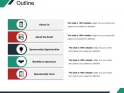
Present the outline of the events to the sponsors by downloading this Outline Presentation Ideas PPT template. Provide a roadmap to a successful business pitch using this outline PPT slide. Present the slide in front of your sponsors and offer various sponsorship benefits. Showcase how you organize and manage successful events. Introduce your company and the events organized so far with the assistance of this amazing presentation outline PowerPoint slide design. Also, by downloading this event outline template, you can get ahead of the entire event with your planning. Use it as an introductory slide at the beginning of your proposal to introduce the event. The event structure PPT layout assists you in giving an overview of the topics covered in the PPT presentation. Download this outline presentation diagram with high grade icons and save a lot of your time by creating quality rich presentations.
People who downloaded this PowerPoint presentation also viewed the following :
Outline presentation ideas with all 5 slides:
Have a go with our Outline Presentation Ideas. You are certain to accomplish.



FAQs for
So presentation outlines really come down to three things: clear structure, knowing your audience, and making sure everything flows logically. Start with your main message right up front. Then pick 3-5 key points that back it up. I totally used to overthink this part! Each section needs a purpose, plus smooth transitions between ideas. Oh, and don't forget your opening hook and closing call-to-action - those actually matter more than people think. The biggest thing? Cut anything that doesn't directly support your main goal. Simple but effective.
First thing - figure out who you're actually talking to and what they care about. Executives? Hit them with results and ROI right off the bat. They don't want to hear every tiny detail. Tech people are the opposite - they want all the specifics and proof. Mixed crowds are honestly the worst because you have to layer everything. Give the big picture first, then get into the weeds for whoever needs it. Oh, and ditch the jargon unless you're talking to specialists. I always ask myself "what's in it for them?" and just build everything around that.
Okay so basically, think of your presentation like telling a story instead of just dumping info on people. You hook them with the problem first, right? Then walk through why it sucks and what happens if nothing changes. Your solution becomes the big reveal moment - way better than those awful bullet point slides everyone hates. People remember stories, not boring stats. I learned this the hard way after watching too many eyes glaze over during presentations lol. Structure it like: problem → tension/consequences → your solution saves the day. Next time you're outlining, just ask yourself "what's the actual story here?" Makes everything flow naturally instead of feeling like a grocery list of random points.
Honestly, visuals are a game-changer for keeping people awake during presentations. Nobody wants to read walls of text - I've been there and it's painful. Charts work great for data stuff, icons break things up nicely, and relevant photos actually help your points stick. The trick is making sure they support what you're saying instead of just looking pretty. My old boss used to throw random stock photos everywhere and it was so distracting. Start with your main ideas, then figure out what visual would make each one click better. Flow charts for processes are clutch. People follow along way easier when there's something to look at.
Ugh, the worst thing you can do is cram way too much stuff in there. Like, I've sat through presentations that jumped around so much I got dizzy. Start with your audience - what do they actually care about? Don't just list random facts. Each part needs to connect back to your main point somehow. Oh, and time yourself! Can't tell you how many people I've watched panic because they planned 30 minutes of content for a 15-minute slot. Keep it simple and focused. Ask yourself: what's the ONE thing I want them to remember when they leave?
Okay so you've gotta bake the variety right into your outline from the start. Every 3-4 minutes, plan something different - questions, polls, little activities, even just a good pause. Trust me, I bombed a presentation once doing a 20-minute info dump while everyone scrolled their phones. Mix high-energy stuff with quieter moments so people don't zone out. Your transitions should feel like natural conversations, not just "moving on to the next topic" vibes. Oh and sketch out where you'll walk around or change your voice - those physical shifts actually keep people way more tuned in than you'd think.
Okay so I always start with the big picture stuff first, then break it down into smaller chunks underneath. Three main points work best - our brains just handle that better somehow. When I'm really stuck, I use problem-solution-benefit because it forces you to think logically. Mind maps are honestly a game changer too. Just sketch it out and you'll see connections you missed before. Oh, and color-coding different types of info helps tons. For step-by-step things, chronological makes sense obviously. There's also this pyramid thing where you put your conclusion first, then all the supporting details after. Works great for presentations.
Put your main CTA right after you wrap up, before Q&A starts. That's when people are actually paying attention and ready to do something. You can sprinkle smaller ones throughout too - stuff like "think about this over coffee" or "write down what clicks for you." Honestly, I'm obsessed with those little reflection moments mid-presentation! Just don't make them compete with your big finish. Oh, and make your final ask super specific with a deadline. Skip the vague "consider our proposal" garbage. Try "let's get a follow-up on the calendar by Friday" instead.
Honestly, just use whatever feels right to you first. PowerPoint and Google Slides have outline modes that are pretty decent for getting your ideas down. I'm obsessed with Notion lately - you can make these collapsible outlines that are super clean. Mind mapping more your thing? Try MindMeister or XMind. Workflowy's really simple but gets the job done if you want something basic. Oh, and don't stress about making slides look perfect right away. Get your main points and details sorted first, then worry about the pretty stuff later.
Start with something that grabs them - a crazy statistic, a question that makes them think, or a quick story. Please don't do the whole "thank you for having me" thing, it's so boring. When you wrap up, bring it back to however you started if you can. Hit your main points again, then tell them exactly what to do next. Like, be specific about the action you want. Don't just go "so... any questions?" Practice saying your opening and closing out loud until they don't sound rehearsed. Those first and last 30 seconds are everything.
Honestly, just pick your 3-5 most important points first. Everything else? Cut it. I used to way over-prep too - drives you crazy, right? Bullet points work way better than writing full sentences in your outline. Keep it simple because people actually remember basic stuff more than fancy complex arguments. Try doing three main sections with like three points under each. Oh, and set a timer when you're working on each part so you don't go down some weird rabbit hole for an hour. Your whole outline should fit on one page. That's it. The "rule of three" thing sounds cheesy but it actually works.
Honestly, the biggest difference is timing. Virtual audiences check out after like 5-7 minutes tops, so you've gotta break things up way more. I throw in polls or quick breakouts every few slides just to keep people awake. In-person is so much easier—you can actually see if someone's confused and go deeper on stuff. Your content doesn't change much, but online I'd simplify those slides big time. Bigger fonts, less fancy transitions (they always glitch anyway). Just look at your current outline and mark where you could naturally pause for interaction. Works every time.
Go heavy on visuals - like 70% pictures/charts, 30% text. Nobody wants to read a novel on your slides while you're talking. I learned this the hard way after boring people to death with text-heavy presentations. Your slides should back up what you're saying, not replace it. Sketch out your main points first, then think about what images or charts will actually help people remember stuff. Each slide is more like a street sign than a textbook page. Trust me, less text = more engagement. Just don't go overboard with flashy animations or you'll look like it's 2003.
Get a couple people you trust to look it over, but ask them real questions - like "does this make sense?" or "am I missing anything obvious?" Way better than just "thoughts?" Their feedback is gold because they'll spot stuff you can't see anymore. I swear, someone always catches the most basic thing I completely missed. Jot down what they say, then focus on fixing whatever multiple people mention. If two people say your intro is weird, it probably is. You don't have to use every suggestion though - just the ones that keep coming up.
Okay so flow is honestly everything - it's what makes people actually pay attention instead of scrolling Instagram under the table. You need each point connecting to the next like dominoes falling. I start with my best hook, then build everything step by step. Those little transition phrases help a ton - "this brings us to" or whatever feels natural. It's basically leaving breadcrumbs so people can follow your logic. Oh and definitely read your outline out loud first! If you get confused reading your own stuff, imagine how lost everyone else will be.
-
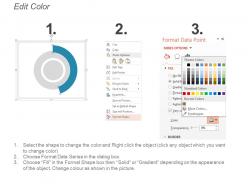
Easy to edit slides with easy to understand instructions.
-
The Designed Graphic are very professional and classic.