

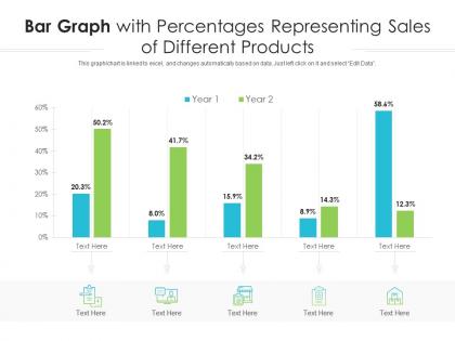
Bar graph with percentages representing sales of different products infographic template




Try Before you Buy Download Free Sample Product
 Impress Your
 Audience
 100%
100% Editable
 Save Hours
 of Time


Professionals belonging to any sector can use this set titled Bar Graph With Percentages Representing Sales Of Different Products Infographic Template. From managers, executives to lower level employees, every individual can use this tool to present insightful details and implications in a well structured format. Various charts and graphs are added to this infographic design that makes it a resourceful set. Not only will this add to the informative qualities of this template, but it also makes it an instant attention grabber. Apart from this, it offers at a glance view of the topics, thus simplifying complex concepts. This helps in retaining the information presented for a long time. The biggest quality of this template is its visual elements, all added to elevate the aesthetic appeal of the presentation. Therefore download this template and present a customized version of it without any trouble.
People who downloaded this PowerPoint presentation also viewed the following :
Bar graph with percentages representing sales of different products infographic template with all 2 slides:
Use our Bar Graph With Percentages Representing Sales Of Different Products Infographic Template to effectively help you save your valuable time. They are readymade to fit into any presentation structure.


FAQs for Bar graph with percentages representing sales of different
Key elements include clear titles, labeled axes, consistent color schemes, data source citations, and descriptive legends. These components work together by enhancing readability, ensuring accurate interpretation, and maintaining professional credibility, with many organizations finding that well-structured templates streamline report creation while delivering compelling visual narratives for stakeholder presentations.
Color schemes enhance bar graph infographic effectiveness by improving visual hierarchy, enabling quick data categorization, and increasing audience engagement through strategic contrast and emphasis. Through consistent color coding, businesses can streamline complex data interpretation, highlight key performance metrics, and create memorable presentations that facilitate faster decision-making, ultimately delivering clearer insights and more compelling storytelling.
Common mistakes include using inconsistent scales, overcrowding with excessive data points, choosing poor color contrasts, omitting clear labels, and starting axes at non-zero values that distort comparisons. These design flaws confuse audiences and undermine credibility, with many organizations finding that clean layouts, consistent formatting, and strategic color choices ultimately deliver clearer insights and stronger stakeholder engagement.
Different bar graph styles significantly impact data interpretation by influencing visual emphasis, comparative clarity, and audience comprehension through elements like color coding, spacing, orientation, and scale selection. Horizontal bars enhance readability for lengthy category names, while clustered bars enable multi-variable comparisons, and stacked variations show part-to-whole relationships, ultimately delivering more intuitive insights and faster decision-making across presentations.
Best practices for labeling axes and data points include using clear, descriptive titles, consistent font sizes, strategic color coding, precise numerical values, and logical category ordering. These elements enhance readability by eliminating ambiguity, reducing cognitive load, and enabling quick data interpretation, with many organizations finding that well-labeled infographics significantly improve audience engagement and decision-making speed.
Bar graph infographics excel at presenting comparative data, survey results, sales figures, demographic breakdowns, and performance metrics across categories or time periods. These visualizations enable businesses to showcase market research findings, revenue comparisons, and operational benchmarks clearly, with many organizations finding that bar graphs effectively communicate complex numerical data to stakeholders, ultimately enhancing decision-making processes.
Animations in bar graph infographics enhance engagement by drawing attention to key data points, creating visual storytelling through progressive reveals, and maintaining viewer focus longer than static charts. These dynamic elements help organizations streamline complex information presentation, with marketing teams and financial institutions finding that animated transitions ultimately deliver higher retention rates and improved audience comprehension.
**INPUT**: What software or tools are recommended for creating bar graph infographic templates? **OUTPUT**: Recommended tools include Canva, Adobe Illustrator, PowerPoint, Google Slides, Venngage, and specialized platforms like Tableau and Infogram. These platforms streamline template creation by offering pre-built layouts, customizable elements, and drag-and-drop functionality, with many organizations finding that PowerPoint and Canva deliver professional results while minimizing design complexity. [Word count: 54 words]
Creating accessible bar graph infographics involves using high contrast colors, alternative text descriptions, tactile elements like raised textures, and supplementary data tables with clear headings. Many organizations enhance accessibility by incorporating screen reader compatibility, keyboard navigation options, and audio descriptions of key data trends, ultimately ensuring broader audience engagement while maintaining visual appeal and professional standards across diverse communication channels.
Typography significantly influences bar graph infographic clarity through font selection, size hierarchy, contrast, and spacing, ensuring data labels, titles, and axis information remain easily readable and professionally presented. Strategic typography choices enhance comprehension by guiding viewer attention, establishing visual hierarchy, and maintaining consistency across data elements, ultimately delivering clearer communication and more impactful presentations for business audiences.
Effective bar graph design balances aesthetics and accuracy by maintaining proportional scaling, using consistent color schemes, and ensuring clear labeling while incorporating visually appealing elements. Through strategic use of white space, professional typography, and intuitive data hierarchies, organizations create compelling visualizations that enhance comprehension without compromising statistical integrity, ultimately delivering both visual impact and analytical credibility.
Healthcare, finance, retail, manufacturing, and technology industries most frequently utilize bar graph infographics for reporting purposes, particularly for performance metrics, budget analysis, and operational data visualization. These sectors leverage bar graphs to streamline complex data presentation, enhance stakeholder communication, and deliver clearer insights for strategic decision-making across organizational levels.
**INPUT**: How do you ensure that your bar graph infographic aligns with your brand's visual identity? **OUTPUT**: Ensuring brand alignment involves incorporating your brand's color palette, typography, logo placement, and visual style consistently throughout the infographic design. Strategic use of brand colors for data bars, consistent font choices that match brand guidelines, and maintaining visual hierarchy through spacing and design elements creates cohesive branded content, with many organizations finding that template-based approaches streamline this process while delivering professional, recognizable visual communications. **Word count**: 60 words
Innovative bar graph infographic templates include interactive 3D bars with hover effects, animated progress bars, comparison templates with split-screen layouts, timeline-integrated bar charts, and industry-specific themed designs. These templates enhance data storytelling by combining visual appeal with functional clarity, enabling organizations across sectors like healthcare, finance, and marketing to present complex information more engagingly, ultimately delivering improved audience comprehension and stronger presentation impact.
Peer feedback enhances bar graph infographic design by identifying clarity issues, suggesting visual improvements, and validating data interpretation accuracy. Colleagues from marketing, sales, and operations can spot confusing elements, recommend color adjustments, and confirm messaging resonates with target audiences, ultimately delivering more impactful presentations that communicate insights effectively across diverse stakeholders.
-
Perfect template with attractive color combination.
-
Great designs, really helpful.
-
Commendable slides with attractive designs. Extremely pleased with the fact that they are easy to modify. Great work!
-
Unique and attractive product design.