


Progress bar graph powerpoint ideas





Try Before you Buy Download Free Sample Product
 Impress Your
 Audience
 100%
100% Editable
 Save Hours
 of Time


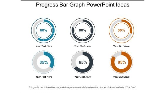
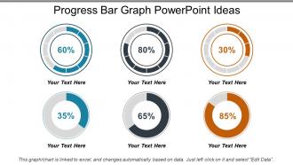
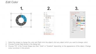
Evaluate and improve the performance of your company with this Progress Bar Graph PowerPoint Ideas. You can use key performance indicators to enable rich data-driven performance and better decision-making. Bring together performance information in a concise display. Depict an easy to understand version of complex data with this progress doughnut chart PPT slide. Easily measure, report and manage progress to improve performance, both at an individual level and a corporate level. Make the process of performance measurement effective with this readily available KPI measurement tool PPT template. Make use of doughnut charts to make the analysis easy. Doughnut charts express a part-to-whole relationship, where all pieces together represent 100%. This type of circular graph makes complex data more accessible and understandable as well as visually appealing. Make a hassle-free presentation with this readily available professional PowerPoint template. Get this PPT to impress your audience with your comprehensive PowerPoint presentation.
People who downloaded this PowerPoint presentation also viewed the following :
Progress bar graph powerpoint ideas with all 5 slides:
Our Progress Bar Graph Powerpoint Ideas are geared to come to your aid. Be certain to get the help you desire.
FAQs for Progress bar
Honestly, progress bars are way better than just throwing percentages at people in bullet points. They instantly show your audience where you're at with projects or how close you are to hitting goals. Way more visual and engaging. You can customize the colors to match your brand - or go with the classic red/yellow/green thing for status updates. They're perfect for comparing multiple projects side by side too. I always use them for quarterly reviews now instead of those mind-numbing tables. Your stakeholders will actually pay attention for once. Quick tip though - don't go overboard with too many on one slide.
Dude, progress bars are a game changer for presentations. People can instantly see what's done vs what's not - so much better than cramming numbers into tables. I'm obsessed with using different colors for stuff that needs attention. Make them thick with percentage labels and they actually look professional. Great for quarterly goals, project updates, budget stuff, whatever. Your audience won't fall asleep staring at text blocks. Honestly, anything that breaks up slide monotony is worth it. Quick tip though - don't go crazy with too many colors or it gets messy.
Honestly, high contrast is your best friend here. Green-to-red works really well for showing incomplete to complete progress - though it's kinda obvious, right? Blue and orange give you that nice pop without looking like a traffic light. You could also go monochromatic with different shades of the same color, like light to dark blue. Looks pretty clean. Just don't pick colors that are too close in brightness or people will squint at your screen. Oh, and definitely test it on whatever display you're actually using - colors look different everywhere.
Progress bars work way better when they actually tell a story instead of just sitting there looking pretty. Give people context first - what you're tracking and why they should care. Then reveal each bar as you talk through different phases or comparisons. I'm obsessed with using them for before/after stuff or showing multiple projects at once. Time your reveals with what you're saying so everything clicks together. Don't dump everything on screen immediately - that's just overwhelming. Build it piece by piece, then wrap up by explaining what it all means going forward.
Oh man, the worst thing is when people make those progress bars super skinny - nobody can see them! And please don't use neon colors that blind everyone. I hate when there's text everywhere around it too, makes everything look messy. Keep your increments simple so people actually get what they're looking at. Blues and greens work great for showing completion, nothing fancy needed. Clean labels are key. Honestly? Just show it to someone else first - they'll catch stuff you missed. My friend made one last week with the most confusing scale ever.
Honestly, progress bars are perfect for this. Break your project into chunks - one segment per major milestone or phase. Use different colors for completed stuff, current work, and future tasks. Way cleaner than those messy Gantt charts nobody wants to look at (seriously, who has time for that?). Throw some percentage labels or dates on top of each section so the timeline's obvious. Your stakeholders can instantly see if you're crushing it, falling behind, or somehow ahead of schedule. Oh, and update them live during meetings - people actually pay attention when they see things moving in real-time.
Honestly, just use PowerPoint's Insert tab - the chart tools there are pretty solid for turning regular bar charts into progress bars. SmartArt has some decent options too. But real talk? I'd just grab a template from SlideModel or PresentationGo first - way easier than starting from nothing. Rectangle shapes with gradient fills look clean if you want something custom. Oh, and double-check your percentages actually add up... made that mistake once and felt like an idiot during the presentation. Keep your colors consistent with whatever theme you're using and you'll be fine.
Horizontal bars just make more sense to most people - we read left to right anyway, so progress feels natural. But vertical ones? They pack way more punch. There's something about that upward climb that screams "you're getting closer to your goal!" Plus I swear people stare at them longer, probably because you don't see them as much. When you're comparing multiple things though, horizontal wins hands down - way cleaner to stack. Oh and honestly, if your presentation needs some extra motivation vibes, go vertical. Otherwise stick with horizontal for easy reading.
So for progress bar labels, go with whatever makes sense - percentages, actual numbers, or just describe the milestones. Put them in the same spot on each bar (above or below, pick one). Make the font big enough that people in back can actually read it - nothing worse than squinting at tiny text during a presentation. Use different colors for different categories but throw in a legend so nobody's confused. Oh, and definitely call out the important stuff like major milestones or where things got stuck. That's what really tells the story. Quick tip: check how it looks in presenter mode first!
Totally depends on your audience. Executives want clean, simple stuff - just hit the big milestones they actually care about. Don't overwhelm them with details. Tech teams are the opposite though. They want all the granular metrics and specifics - honestly, they get annoyed if you dumb it down too much. With clients or outside people, definitely use your brand colors and show progress based on what matters to *them*. Oh, and always say "60% complete" instead of "40% left." Sounds way more positive and people eat that up. It's weird but it works every time.
Definitely go for templates with editable vector shapes first - you'll want to tweak colors and percentages without hassle. Smart animations are super helpful too, especially the ones where bars fill up gradually during your presentation. Way more interesting than just static bars sitting there. Multiple layout options are nice to have - horizontal, vertical, different styles, whatever. Oh and make sure there are text placeholders for your labels and percentages already built in. Honestly, I'd grab a few free samples first to see how easy they are to work with. No point paying for something that's gonna be a pain to customize.
Oh this is easy! Just use the "Wipe" animation and set it to "From Left" - makes it look like the bars are actually filling up. Go to your Animations tab, pick your bar, then choose wipe. Way better than fly in honestly, looks way more realistic. Set up the timing so they don't all go off at once though - super awkward when that happens. I usually add a tiny delay between each bar too. Oh and definitely test it while you're actually talking through your slides! Nothing worse than standing there waiting for some slow animation to catch up with you.
Progress bars are perfect when you want to show completion percentages - like how much of your quarterly sales target you've hit or where projects stand. Way better than dumping a bunch of numbers in a table, honestly. People can instantly see what's on track vs. what's falling behind. I use them all the time in dashboards because executives love seeing progress at a glance. They're great for any "how far along are we?" situation rather than just showing raw data. Makes performance reviews so much cleaner too.
Icons next to progress bars work really well - just use small ones that actually relate to each category. Your brand colors are perfect for the bar fills too. Honestly, I'm obsessed with pairing them with timelines for project updates. Numbers or percentages in contrasting colors nearby make everything clearer. Before/after photos alongside the bars? *Chef's kiss* - same with customer testimonials. Oh, and don't let everything fight for attention. Each piece should back up your main point, not distract from it.
Interactive progress bars are everywhere right now - the kind that actually animate during your presentation instead of just sitting there. Honestly, they're so much better than the boring static ones we used to see. People are ditching basic horizontal bars for circular designs and semi-circles, which look way cooler. Clean lines with bold colors are big too. Oh, and everyone's using them for storytelling now - like showing project milestones or survey data as you go. I'd definitely try adding some gradient fills or subtle movement. Just don't go overboard with the animations or you'll distract from your actual content.
-
Informative design.
-
Unique and attractive product design.