


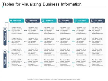
Tables for visualizing business information infographic template




Try Before you Buy Download Free Sample Product
 Impress Your
 Audience
 100%
100% Editable
 Save Hours
 of Time


Our Tables For Visualizing Business Information Infographic Template are topically designed to provide an attractive backdrop to any subject. Use them to look like a presentation pro.
People who downloaded this PowerPoint presentation also viewed the following :
Tables for visualizing business information infographic template with all 2 slides:
Use our Tables For Visualizing Business Information Infographic Template to effectively help you save your valuable time. They are readymade to fit into any presentation structure.
FAQs for Tables for visualizing business
So for your infographic, start with the biggest data point at the top - that's what grabs attention first. Make sure your fonts are big enough to actually read (I've seen way too many where you need a magnifying glass). Use lots of white space and keep your colors consistent with your brand. Charts and graphs should be super clean and easy to scan. Honestly, if someone can't get the main idea in 30 seconds, you've lost them. Don't forget your logo and contact info - otherwise what's the point? The whole thing should flow logically from top to bottom.
Honestly, infographics are game-changers for making boring data actually memorable. You know how people's eyes glaze over when you show them spreadsheets? Visuals fix that - our brains process them way faster than text. The trick is telling a story with your data, like showing how customer satisfaction jumped from 60% to 85% through specific steps you took. Each visual should flow into the next one naturally. I always sketch out the story first (learned this after way too many confusing presentations), then hunt for templates that match that flow. Makes such a difference.
Honestly, just pick 2-3 colors and call it a day. I'd start with your brand colors if you've got them, then maybe throw in one accent color for highlights or whatever. Bright neons are the worst - nobody wants to stare at hot pink charts all day. Blues and greens are pretty safe bets for work stuff since they don't scream "amateur hour." Oh, and make sure your text actually shows up against the background. Here's what I always do: convert everything to grayscale first. If you can still tell things apart, you're good to go.
Honestly, customized infographic templates are a game-changer for different industries. Healthcare needs totally different visuals than tech startups, obviously. Real estate ones focus on market trends and property comparisons, while restaurants might show menu stats or customer satisfaction data. The cool thing is you can stay on-brand while actually speaking to what your industry cares about. I'd start by figuring out what data your audience genuinely wants to see - like, what keeps them up at night? Then hunt for templates that make those numbers pop. It's way more effective than generic stuff.
Honestly, stick with the basics - bar charts, line graphs, and pie charts will cover like 90% of what you need. Bar charts are perfect for comparing stuff. Line graphs show how things change over time. Pie charts work for showing percentages, but don't go crazy with them (I see way too many terrible pie charts out there). You can also throw in some icons with big numbers for your key stats - those always look clean. Simple flowcharts work well if you're explaining a process. Sometimes a basic table is actually your best bet for detailed data. Just match whatever viz makes your point clearest. If people can't instantly get it, you've overcomplicated things.
Infographic templates are honestly a game changer for social media. Pick like 2-3 good ones and just customize the colors/fonts to match your brand. Perfect for breaking down survey data or whatever complex stuff you're trying to explain - people actually engage with visuals way more than walls of text. I started using them for everything now... product features, industry trends, you name it. They save so much design time it's ridiculous. You can totally repurpose the same template across different campaigns too. Just stay consistent with them and you'll start building that visual recognition thing.
Dude, typography can totally make or break your infographics. Poor font choices will kill even the prettiest designs - I've watched it happen so many times. You want different weights and sizes to create hierarchy so people know where to look first. Headers grab attention, body text should be super scannable. Pick 2-3 fonts tops (seriously, don't go crazy here) and make sure everything feels cohesive with your brand. Oh, and test readability at different sizes before you commit to anything. Nothing worse than text that looks great big but turns into mush when it's smaller.
Start with platform dimensions - Instagram squares, LinkedIn rectangles, Twitter's wide format. Social media compression is absolutely ruthless, so make your main message and branding bold enough to survive it. Text needs to be huge since everyone's scrolling on their phones anyway. Here's what I learned the hard way: always check how your template looks as a tiny thumbnail in feeds before calling it done. Build a few size variations of each design so you can quickly tweak one concept across platforms. Oh, and leave room for captions if you need them.
Oh man, the worst thing you can do is cram everything onto one graphic - like, nobody wants to decode a novel in picture form. Also those color combos that make text unreadable? Total nightmare. Keep your images crisp and fonts big enough that people aren't breaking out magnifying glasses. I'm guilty of this too, but resist going crazy with different fonts - two or three tops before it gets chaotic. Make sure your data actually tells a story instead of random numbers thrown together. Quick test: can someone get it in 10 seconds? If they're confused, strip it down more.
Honestly, templates are a lifesaver when you're swamped. They've already figured out the hard stuff - layouts, colors, where everything should go. You just drop your content in and maybe tweak a few things. Way better than staring at a blank screen wondering where to even start, you know? All that spacing and font nonsense is already handled. I swear I cut my design time in half using them. Maybe more. Just pick one that fits your topic and you're golden. Perfect for when your boss needs something "by EOD" and it's already 3pm.
Canva's honestly your best bet if you're just starting out - super easy to use and you'll have something decent in like 30 minutes. Adobe Express works great too. I'd skip Illustrator unless you really know what you're doing because that learning curve is brutal. Oh, and if your team needs to work on stuff together, Figma lets everyone jump in and edit at once which is pretty cool. PowerPoint actually isn't terrible for quick stuff either (weird, I know). I always get way too picky about fonts but whatever. Just start with Canva and see how it goes!
So accessibility boils down to three main things: color contrast, readable text, and having backup formats. Your colors need to follow WCAG guidelines - basically so people with vision issues can actually see what's what. Font size should be 12pt minimum, and skip the fancy fonts that look cool but are impossible to read. Alt text for images is critical too, though I swear everyone forgets this one. Also think about offering a plain text version or even audio. Oh, and there are free accessibility checkers online that'll catch stuff you missed - definitely worth running your design through one first. Way easier than fixing it later.
So right now everyone's obsessed with minimalist stuff - tons of white space, maybe 2-3 colors tops. Interactive elements are basically mandatory now, like animated charts or clickable sections. Static infographics feel kinda dead honestly. Dark mode's everywhere too. Custom illustrations are replacing those generic stock icons (thank god). Mobile-first is non-negotiable since people scroll through these on their phones mostly. Oh, and make sure your main point hits fast - you've got maybe 3 seconds before someone swipes away. Bold data viz helps grab attention too.
Basically, infographics turn boring data dumps into something people actually want to look at. Your brain processes visuals way faster than text - like 60,000 times faster, which honestly blows my mind every time I think about it. Instead of making people wade through paragraphs or spreadsheets, you're using icons and charts to walk them through your main points. It's like telling a story with your data. Pick your 3-5 most important points first, then grab a template that makes sense for how they connect. Way better than those awful bullet-point lists everyone hates reading.
Dude, animated infographics are total game-changers for presentations. Your audience actually pays attention instead of scrolling their phones. The movement naturally guides people's eyes to the important stuff, which is clutch when you're dealing with boring data. They look so much more professional than basic slides too - like you actually put effort in, you know? The animations help connect your ideas smoothly instead of just jumping around. Oh, but don't go crazy with flashy effects or you'll end up looking like a PowerPoint amateur from 2005. Keep it clean so people focus on your content, not the spinning text.
-
The Designed Graphic are very professional and classic.
-
Easy to edit slides with easy to understand instructions.
-
Out of the box and creative design.
-
Commendable slides with attractive designs. Extremely pleased with the fact that they are easy to modify. Great work!
-
Unique design & color.