


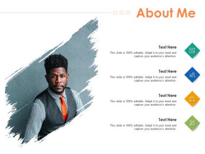
About me infographic template
You must be logged in to download this presentation.




Try Before you Buy Download Free Sample Product
 Impress Your
 Audience
 100%
100% Editable
 Save Hours
 of Time


Our About Me Infographic Template are topically designed to provide an attractive backdrop to any subject. Use them to look like a presentation pro.
People who downloaded this PowerPoint presentation also viewed the following :
About me infographic template with all 2 slides:
Use our About Me Infographic Template to effectively help you save your valuable time. They are readymade to fit into any presentation structure.
FAQs for About
Start with a wireframe first - trust me on this one. Get your hierarchy down: catchy headline, clear subheadings, logical flow. Keep charts simple but meaningful (nobody needs fancy graphics that confuse people). White space is your friend here. Pick a color palette and stick with it for good contrast. Text should be minimal - people want visuals, not essays. Throw in your branding elements somewhere. Oh, and don't forget source citations at the bottom or you'll look unprofessional. The whole thing falls apart if it's cluttered, so less is definitely more with infographics.
Okay so color theory is basically magic for infographics. Pick complementary colors to make your important data jump out, or go with analogous ones if you want everything to flow nicely together. Warm colors are perfect for grabbing attention on key stats. Cool colors work better for background info. Here's the thing though - the 60-30-10 rule actually works. Use your main color for 60% of the design, secondary for 30%, accent for just 10%. I always start with whatever matches the brand, then build from there. Honestly makes such a huge difference between looking amateur vs professional.
Put your main point right at the top - people decide in like 2 seconds if they're gonna keep reading. Then figure out how to organize everything else. Chronological works, or go by importance, whatever makes sense for your content. Group similar stuff together and don't be afraid of white space (cramped layouts are the worst). Pick consistent colors and fonts to create clear sections. Oh, and make sure your charts actually back up what you're saying instead of just looking fancy. Have someone else look at it first - if they're lost, everyone else will be too.
Vector-based software like Illustrator is your best bet here. Build flexible grid systems instead of rigid layouts - everything should be vectors, not rasterized images. Nobody wants to present blurry charts to executives, trust me on that one. Create multiple artboards right from the start: 16:9 for presentations, square for social media, vertical for reports. Here's what I learned the hard way - test your smallest size first to check readability, then work your way up. Use spacing ratios rather than fixed pixels. Oh, and consistent proportions will save you so much headache later when you're scrambling to resize everything.
Honestly, typography can make or break your whole infographic. Bad font choices? Total disaster - I've watched amazing content become completely unreadable because someone thought that swirly decorative font was "aesthetic." You want people scanning through your info easily, not struggling to decode what you're saying. Big, bold fonts work great for headlines. Clean, simple ones for the details. Here's the thing though - don't go crazy with variety. Stick to maybe 2-3 font families tops, otherwise it'll look like a ransom note. Your fonts should basically create a path that guides people through the content naturally.
Honestly, icons and illustrations are game-changers for infographics. They grab attention way better than boring text blocks. People's brains process visuals faster, so a lightbulb icon instantly screams "innovation" without explanation. Plus they guide your reader's eye exactly where you want it to go - super handy for data flow. I've noticed infographics with good visuals get shared more on social too. Just don't go crazy with random clipart that doesn't match your vibe. Oh, and make sure they actually relate to your content or you'll just confuse people.
So for infographic templates right now, minimalist stuff with tons of white space is everywhere. Bold typography hierarchies too. Mobile-first is basically required since everyone's scrolling on their phones anyway. Data storytelling is massive - like, people actually want a narrative instead of random charts thrown together. Gradients and duotones look pretty sick right now, plus accessible color palettes are becoming the norm. Interactive elements help when you can swing it. Oh, and modular designs are clutch because your team can swap out icons and layouts without rebuilding everything. Honestly saves so much time.
First figure out who's actually gonna read this stuff and what they need from it. Industry, job level, how tech-savvy they are - all that matters. LinkedIn people are way different than Instagram users, obviously. I always sketch out a quick persona (sounds nerdy but it works) to nail down their main problems and goals. Time is huge too - nobody's got patience anymore. Then match your template's complexity and tone to what makes sense for them. Honestly, the visual style can make or break it. Don't skip testing with real people from your target group before you launch anything though.
Canva's probably your best bet to start - super easy and has a million templates you can just tweak. Adobe Express is similar if you want to try something different. PowerPoint actually works too (I know, sounds random but I've seen it done well). Once you get the hang of things, Illustrator is where it's at for full control, though fair warning - it'll take some time to learn. Oh, and if you're working with other people, Figma's clutch since everyone can jump in and edit together. I'd mess around with Canva first, then see if you need the fancy stuff later.
Build accessibility into your template right from day one - trust me, it's way easier than trying to fix it later. High contrast colors are a must, and keep text at 12pt minimum. Don't forget alt-text spots for images and icons. Here's the thing though - never use just color to show important info. Add shapes or text labels too. Screen readers need clear headings and logical flow to work properly. Make interactive stuff keyboard-friendly. Oh, and definitely test with actual accessibility tools before you're done. That's where you'll spot the weird issues you totally missed.
Start by sketching out your story first - like problem to solution or a before/after thing. Then layer your data around that backbone. I'm obsessed with the journey approach where you walk people through each step. Real people or personas work amazing because your audience actually connects with them. Short punchy headlines help too. Oh, and visual metaphors are clutch - they tie everything to your main message without being boring. Honestly, just think of it like chapters in a book. Each section should flow naturally to the next so readers don't get lost in all the data.
Honestly, picking the right charts and graphs is everything for infographics. You want bar charts for comparing stuff, line graphs when you're showing trends over time, that kind of thing. I swear, nothing kills credibility faster than one of those insane pie charts with like 12 tiny slices - nobody can read that mess. The whole point is making your data tell a clear story. Good visuals guide people through your content naturally instead of confusing them. Oh, and icons work great for simple stats too. Just think about what story you're trying to tell first, then choose visuals that actually support it.
Don't cram everything onto one slide - that's the worst thing you can do. Fonts need to be readable too, not some microscopic size that makes people squint. Color combos can be brutal if you're not careful (seriously, I've seen some that made my eyes water). Your data should have a clear flow so people know what to look at first. Skip the flashy graphics that just get in the way of your actual point. Oh, and test it with different datasets, not just what you're working on now. Have someone else look at it and see if they get the main idea quickly.
Make your design work for the data, not against it. Figure out what's most important and make it bigger, brighter, or put it where people look first. Clean layouts are your friend - guide people's eyes smoothly from one thing to the next. Here's my weird trick: squint at your design. If you can still get the main point when everything's blurry, you're golden. Don't add decorative stuff just because you can. Every choice should have a reason. Oh, and test it! Show someone for 10 seconds, then ask what they remember. You'll be surprised what actually sticks.
Honestly, timeline layouts are clutch for processes or historical stuff. Comparison charts work great when you're putting two things head-to-head. Step-by-step flowcharts are pretty solid too - people love those. Statistical dashboards hit different though, everyone's a sucker for good data breakdowns. Oh, and pyramid templates are perfect for rankings or showing hierarchy. Here's the thing - don't just pick whatever looks nice. Match your template to what you're actually trying to show. Are you comparing things? Explaining steps? Just throwing stats at people? Figure that out first, then grab your template. Makes way more sense that way.
-
The Designed Graphic are very professional and classic.
-
Awesome presentation, really professional and easy to edit.
-
Amazing product with appealing content and design.
-
Commendable slides with attractive designs. Extremely pleased with the fact that they are easy to modify. Great work!
-
Very unique, user-friendly presentation interface.
-
Innovative and attractive designs.
-
Really like the color and design of the presentation.