


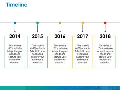
Timeline ppt icon layout





Try Before you Buy Download Free Sample Product
 Impress Your
 Audience
 100%
100% Editable
 Save Hours
 of Time


Herald your achievements with our Timeline Ppt Icon Layout. Announce them in a grand fashion.
People who downloaded this PowerPoint presentation also viewed the following :
Timeline ppt icon layout with all 5 slides:
Discern the course of action to follow with our Timeline Ppt Icon Layout. They help analyze the chain of events.
FAQs for Timeline
So you'll want start and end dates obviously, plus who's doing what by when. Dependencies are huge - like mark what can't happen until other stuff wraps up. I'm obsessed with color-coding by team because honestly it just makes scanning so much faster. Don't forget buffer time for when things inevitably go sideways. Mark those hard external deadlines you absolutely cannot move. Keep it visual but not crazy cluttered - nobody wants to stare at a wall of text. Oh and actually update the thing regularly or everyone stops looking at it!
Honestly, visuals are a game-changer for timelines. Nobody wants to stare at boring bullet points with just dates and text. Add some icons, colors, maybe actual images - suddenly people can follow along without zoning out. Like instead of "Q3 2023: Product Launch," throw in your product photo with a little rocket icon. Way more engaging, right? The visual stuff also helps emphasize your biggest milestones and keeps people curious about what's next. I always tell people to add at least one visual element per major point. Makes such a difference in how people connect with your story.
Hey! So for colors, don't go crazy - maybe 2-3 max. You want good contrast so people can actually read it. I usually do a neutral base (white or gray works) then throw in one accent color for the important stuff. Font choice matters too. Sans serif is your friend - Arial, Calibri, whatever. Just nothing fancy because timelines need to be super clear. And honestly? Make it at least 11pt or people will be squinting. Oh, here's a trick my design teacher taught me - step back a few feet from your timeline. If you can still read the key points, you're good to go.
So it really depends on what people need from the info. Project managers love their Gantt charts - all those dependencies and milestones help track who's doing what. Doctors create patient timelines to map symptoms and treatments, which honestly makes total sense for diagnosing stuff. Marketing folks focus on campaign launches and customer touchpoints. Legal teams? They build case timelines to nail down the sequence of events, and those get wild. The trick is figuring out what decisions your audience needs to make, then format everything around that.
Oh man, there are tons of good options! Canva's probably your best bet if you want something that looks professional without much effort. Adobe Express works similarly. Timeline JS is actually free and lets people click around, which is pretty cool for presentations. I've used Tiki-Toki before too - same interactive vibe. Lucidchart's decent if you're already paying for it anyway. Honestly? Don't sleep on PowerPoint. Sounds basic but you can make some really slick stuff with animations. Just think about who's gonna see it first - boring static timeline for reports, fancy interactive one for presentations where you want people engaged.
So for digital stuff, do those progressive reveals where events pop up as you click - way more engaging than dumping everything at once. Clickable dates that expand are pretty slick too. Print is totally different though. You gotta front-load all the important info since people can't click anything, obviously. Use different font sizes and colors to create visual hierarchy. I swear, half the printed timelines I see look like someone just crammed tiny text everywhere - total nightmare to read! Oh and definitely test both versions with real people first. They'll catch things you missed.
Look, timelines are basically what save your butt in project presentations. They show everyone when stuff's happening and keep people on the same page about deadlines. Super helpful for breaking down project phases and milestones so stakeholders can actually understand the scope. Plus they're perfect for shutting down clients who think you can build Rome in a day - I swear some people have zero concept of how long things take! You can track progress during meetings and honestly, they make chaotic projects feel way more manageable. Just remember to pad your estimates because everything always takes longer than you think.
Ditch those boring bullet-point timelines - they're total eye-glazers! Color-code different themes and throw in some images or icons. Makes everything way more memorable. I bombed hard with my first timeline attempt, honestly. Now I use interactive stuff like TimelineJS or simple drag-and-drop activities. Works so much better. Short, punchy descriptions for each event. Focus on how things connect - cause and effect is huge. Also, try having them build their own timelines. They'll actually retain the info when they're doing the work themselves. Oh, and always add discussion questions!
Honestly, the worst thing you can do is cram everything onto one timeline - it becomes impossible to read. Pick your 5-7 biggest milestones and stick to those. Skip the tiny details, trust me on this. Buffer time is huge too because stuff always takes longer than you think it will. Make your dates realistic, not wishful thinking. Dependencies need to be super clear - what has to happen before what else can start? And don't forget to assign owners for each piece. Someone's gotta be accountable when things go sideways, which they will.
Honestly, timelines are a game-changer for breaking down complicated stuff. They make you figure out the key moments and put everything in order. You'll start noticing cause-and-effect relationships way easier. Plus you can spot patterns and see how events actually connect - which is super helpful for processes with multiple stages or messy historical situations. I literally use them for everything now, from project planning to figuring out why our last product launch went sideways (still bitter about that one lol). The visual aspect just clicks better than reading through paragraphs of text. Seriously, try making one next time you need to explain something complex.
Your timeline's layout makes or breaks whether people actually get it. I always go chronological with consistent spacing - sounds obvious but you'd be surprised how many people mess this up. Random date jumping confuses everyone. Clean design with logical flow is key. Maybe add color coding for important events? White space helps too so it doesn't look cramped. Oh and test it on someone first - I learned that the hard way after creating what I thought was brilliant but totally confused my coworker.
There's actually way more you can do than just the basic left-to-right thing! Circular ones are cool for stuff that repeats - like seasons or business cycles. Spiral designs show progression but with themes that keep coming back. For mobile or when hierarchy matters, vertical works really well. Branching timelines are my favorite though - perfect for showing different paths or things happening at the same time. Like family trees but for project phases or whatever. Interactive ones let people click through different periods too. Honestly just pick whatever tells your story best and fits your audience.
Entrance animations are perfect for this - they'll keep people from reading ahead while you're still talking about earlier stuff. I'd stick with subtle ones though, like "fly in from left" so it stays consistent. Slide transitions between different time periods work really well too. Honestly, "wipe" or "push" transitions feel way more natural than random fades for chronological stuff. You can also use emphasis animations to highlight the big moments. Just don't get carried away with it. People should remember what you said, not how many cool effects you used. Start basic and only add animations where they actually help your story.
Yeah, timelines are actually super effective for persuasive stuff! They naturally create this story arc that people just follow along with. You can show how a problem got worse over time, or walk through successful examples, or even map out what'll happen if they take your advice. I honestly love using them - way better than just throwing random facts around. The trick is making sure each point actually connects to your argument though. Don't just list dates and call it a day. Each milestone should build your case and push toward whatever outcome you want. People are wired to follow chronological stories, so it works.
Honestly, just watch for three things: can people actually follow what happened when? Are they engaged or squinting at your messy timeline? And here's the big one - will they remember the main points later? I always test this by asking someone to summarize the key events afterward. If they can retell your story in order without staring back at the slide constantly, you nailed it. The worst timelines are those cramped ones where dates are basically unreadable - nobody has time for that. Your audience should walk away knowing the sequence, not feeling confused about what led to what.
-
Enough space for editing and adding your own content.
-
Easily Understandable slides.