

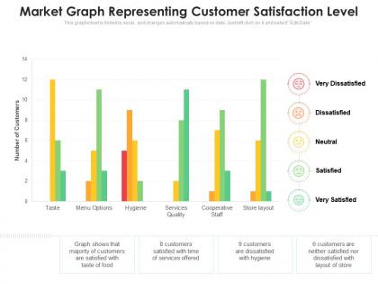
Market graph representing customer satisfaction level




Try Before you Buy Download Free Sample Product
 Impress Your
 Audience
 100%
100% Editable
 Save Hours
 of Time


Our Market Graph Representing Customer Satisfaction Level are topically designed to provide an attractive backdrop to any subject. Use them to look like a presentation pro.
People who downloaded this PowerPoint presentation also viewed the following :
Market graph representing customer satisfaction level with all 2 slides:
Use our Market Graph Representing Customer Satisfaction Level to effectively help you save your valuable time. They are readymade to fit into any presentation structure.
FAQs for Market graph representing
So there's a few key ones you'll usually see. CSAT scores are the basic "how satisfied were you" ratings - typically 1-5 or 1-10 scale. Then there's NPS, which asks how likely they'd be to recommend you to others. Customer Effort Score is another big one that tracks how easy it was to solve their problem. That one's really gaining traction these days, probably because nobody wants to deal with complicated processes anymore. Some graphs also show retention rates, churn data, or response times depending on what matters most to your business. Honestly though? Pick maybe 2-3 metrics that actually align with your goals instead of drowning in data.
Hey! So line graphs are perfect for this - just put time on the bottom and satisfaction scores going up. Monthly works well, or quarterly if you don't survey that often. Bar charts are solid too when you're comparing different customer groups. Honestly, the biggest mistake I see is people changing their measurement scale and making tiny dips look like disasters. Keep everything consistent. And seriously, set up some kind of automated report because otherwise you'll just make these nice charts once and forget about them. Trust me on that one - happens all the time.
Dude, bar charts are your best friend here. They're perfect when you're comparing satisfaction between different products or departments - super clean to read. For tracking changes over time? Go with line graphs, especially if you need to spot when things went south after a launch or whatever. Heat maps work great too if you're looking at satisfaction by like region AND age group at once. Oh, and seriously avoid pie charts - they just make everything harder to compare than it needs to be. Trust me on that one.
Honestly, looking at just overall averages will totally mislead you. Age, income, location - they all create completely different satisfaction patterns. Your younger customers probably love the app features while older ones want actual human help (which makes total sense). Higher income usually means higher expectations too. Instead of one trend line, break your data into demographic segments. That's how you'll actually see what's driving changes. Like maybe your satisfaction dip is just one age group being cranky about something specific. Then you can fix the right stuff instead of guessing.
Surveys are basically where all your satisfaction graph data comes from. You send out those rating questions and NPS stuff, then all those responses get turned into the charts you're looking at. Pretty straightforward really - no surveys means empty graphs. The trick is making sure what you're asking matches what you want to see visualized later. I'd honestly start backwards though - figure out exactly what metrics you want on your dashboard first, then design your survey questions around those. Makes the whole process way smoother and you won't end up with random data you can't actually use.
Check your satisfaction data for any dips or flat spots - those are your red flags. Break it down by department or time period and you'll start seeing the real story. Like maybe your support team had a rough quarter or your mobile app is secretly driving people crazy. I always cross-check this stuff with actual customer comments because numbers only tell you what happened, not why. Oh, and look for patterns around major business changes too. Focus on the biggest problems hitting the most customers first - that's where you'll get the most bang for your buck.
Honestly, just keep it simple and show trends over time instead of cramming everything in. Bar charts and line graphs are your best friends - way better than pie charts (I swear people are obsessed with those things for no reason). Stay consistent with your scale, and always throw in sample sizes so people know if you're working with 10 people or 1,000. Color-coding helps a ton for different segments. Oh, and highlight the main insights directly on the chart. You don't want people squinting around trying to figure out what the data's actually saying.
Those spikes and dips? They're basically your canary in the coal mine. Something always triggers them - could be a new feature launch, pricing change, or maybe your support team switched processes. Sharp drops usually mean you broke something in the customer journey (ouch). The highs are nice, but honestly, I'd focus more on what caused them so you can do it again. Don't just stare at the pretty graphs though. Match up those changes with your timeline - product releases, campaigns, that server outage last month. Figure out what actually moved the needle.
So for customer satisfaction graphs, I'd probably start with Excel or Google Sheets since you likely already have them. They're pretty solid for basic stuff. Tableau and Power BI are amazing if you want fancy interactive dashboards, but there's definitely a learning curve there. Oh, and don't sleep on Canva - I've actually seen some really clean charts made there and it's super easy to use. SurveyMonkey and Qualtrics have their own built-in chart tools too if you're already using them for surveys. Just start with whatever you've got access to and see how it goes.
Okay so customer satisfaction graphs are pretty much your best friend for making sense of all that feedback data. You'll see patterns jump out - like satisfaction tanking right after launches or improving when you fix something. Honestly, beats guessing what's actually working. I use them to figure out where to throw money and resources instead of just winging it. You can also compare yourself to competitors which is always fun (or depressing lol). The trick is being consistent with tracking and showing these to your boss - they eat up visual data they don't have to think too hard about.
Dude, turn those boring satisfaction spreadsheets into actual stories people can follow. Charts and colors make patterns way more obvious than endless rows of numbers - like you'll instantly see satisfaction tanking after launches or jumping when support gets better. Most people just zone out looking at raw data anyway, which is totally fair. Pick your biggest insight first, then build a simple visual around it. You can easily compare different time periods or highlight specific customer groups. Way better than making everyone squint at tables trying to find what matters. Start small with one key finding and go from there.
Yeah, there's definitely a connection between those two metrics. Higher satisfaction almost always means better retention - like customers scoring 8+ usually stick around at 80-90% rates. But anything under 6? Retention just tanks. The real magic happens around 7-8 on satisfaction scores - that's where retention really jumps up. Honestly, I've seen this pattern so many times it's kind of boring at this point lol. If you're analyzing your own stuff, focus on bumping people from that 6-7 range up to 8+. That's where you'll see the biggest difference in keeping customers around.
Don't mess with your y-axis scale to make tiny changes look dramatic - I learned this the hard way once. Cherry-picking timeframes is another trap. Like starting your chart right after a terrible month to make everything seem rosier. Keep your survey methods consistent too, otherwise you're comparing totally different things. Oh, and always show sample sizes and confidence intervals. Your boss will ask anyway, so save yourself the follow-up questions. People need context to actually understand what they're looking at, not just pretty graphs that tell half the story.
So basically match the detail to your audience. Executives want the big picture - overall trends and key numbers, nothing granular. Customer service teams need the breakdown though: touchpoints, complaint types, maybe individual agent stuff. Marketing probably wants demographics or product comparisons. Oh and seriously, don't overlook your axis labels and timeframes - that stuff trips people up constantly. Always throw in some context like industry benchmarks or past performance so people can actually make sense of what they're looking at instead of just staring at pretty lines.
Honestly, social media feedback can totally mess with your customer satisfaction data if you don't handle it right. People are way more emotional online - you get tons of 1-star rants and 5-star gushing, but barely any middle ground. The volume's insane compared to regular surveys too. I'd track it separately at first, maybe weight it differently than survey responses. Though I gotta say, the speed is pretty amazing - you'll catch satisfaction trends weeks before your quarterly surveys would even pick them up. Just don't let it completely skew your overall picture.
-
Excellent design and quick turnaround.