Customer complaint and satisfaction analysis dashboard

Rating:
96%
Customer complaint and satisfaction analysis dashboard
Slide 1 of 2
Favourites Favourites

Try Before you Buy Download Free Sample Product

Audience Impress Your
Audience
Editable 100%
Editable
Time Save Hours
of Time
The Biggest Sale is ending soon in
0
0
:
0
0
:
0
0
Rating:
96%
Presenting this set of slides with name Customer Complaint And Satisfaction Analysis Dashboard. The topics discussed in these slides are Customer Complaint And Satisfaction Analysis Dashboard. This is a completely editable PowerPoint presentation and is available for immediate download. Download now and impress your audience.

People who downloaded this PowerPoint presentation also viewed the following :

Content of this Powerpoint Presentation

Description:

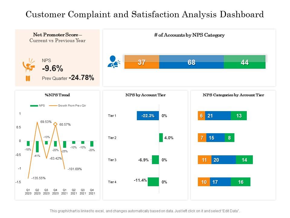
The image displays a Customer Complaint and Satisfaction Analysis Dashboard with a focus on the Net Promoter Score (NPS) which is a metric that gauges customer loyalty and satisfaction based on their likelihood to recommend a company's products or services.

1. At the top left, there's a section titled "Net Promoter Score“ Current vs Previous Year" showing a decrease in NPS by 9.6% currently, with the previous quarter experiencing a significantly larger drop of 24.78%. This suggests recent improvements in customer satisfaction despite the negative trend.

2. Below this, the "NPS Trend" graph compares the NPS versus the growth from the previous quarter. The line graph reveals considerable fluctuations in NPS with a sharp decline in Q2 2020 and a peak in Q4 2020, indicating significant shifts in customer sentiment over time.

3. In the top right section, "# of Accounts by NPS Category" is a horizontal bar graph dividing accounts into detractors (37), passives (68), and promoters (44). This offers a visual breakdown of customer attitudes toward the company.

4. The middle right section, "NPS by Account Tier," uses bar charts to show the NPS for different tiers of accounts. Tier 1 has a significant negative NPS, while the other tiers show no change, which translates to stable satisfaction levels within those tiers.

5. Lastly, "NPS Categories by Account Tier" presents a numerical distribution of account tiers categorized as detractors, passives, and promoters, providing a more detailed view of each tier's customer sentiment.

Use Cases:

This type of dashboard can be utilized across various industries to monitor and improve customer satisfaction and loyalty.

1. Banking:

Use: Assessing client satisfaction and identifying areas for service improvement.

Presenter: Customer Relations Manager

Audience: Stakeholders and Management Team

2. Telecommunications:

Use: Tracking customer feedback to optimize the user experience across services.

Presenter: Head of Customer Experience

Audience: Operations and Marketing Teams

3. Retail:

Use: Evaluating customer brand perception and developing strategies to increase brand advocates.

Presenter: Brand Manager

Audience: Sales and Customer Service Representatives

4. Healthcare:

Use: Monitoring patient experiences to enhance care quality.

Presenter: Patient Experience Officer

Audience: Healthcare Providers and Administrative Staff

5. Hospitality:

Use: Gauging guest satisfaction to refine hospitality services and offerings.

Presenter: General Manager

Audience: Hotel/Resort Staff and Management

6. Software and Technology:

Use: Measuring customer loyalty to inform product development and technical support.

Presenter: Product Manager

Audience: Development and Support Teams

7. Transportation:

Use: Analyzing traveler feedback to improve service reliability and satisfaction.

Presenter: Customer Service Director

Audience: Operations Management and Frontline Employees

FAQs for Customer complaint and

Start with CSAT, NPS, and churn rate - those are your bread and butter metrics. Customer Effort Score is solid too. First contact resolution matters a ton because nobody wants to explain their problem twice, you know? Response times are obvious but still worth tracking. Honestly, I'd maybe add support ticket volume and review sentiment analysis for context. Don't go crazy though - pick like 5 or 6 to start or you'll drown in data. The trick is making sure you can dig into specific teams when something's off.

Dude, charts and graphs are where it's at for satisfaction data. You'll catch trends way faster than staring at spreadsheets - like if one region's ratings are tanking or whatever. Heat maps are clutch for spotting problem areas across different customer touchpoints. Honestly, stakeholders actually pay attention to visuals instead of their eyes glazing over at number tables (been there lol). Patterns that'd take you hours to find just jump right out. Start simple though - bar charts for your scores, line graphs for tracking changes over time. Way more engaging than raw data dumps.

Dude, real-time data is like having a crystal ball for customer problems. You catch issues right when they happen instead of finding out weeks later through some survey. Response times going crazy? Support tickets piling up? People getting salty on social media? You'll see it instantly. Honestly, I got way too into watching those live metrics update - it's weirdly satisfying. But the real win is stopping small problems before they turn into customers jumping ship. Just set up some alerts for your key satisfaction stuff so you're not glued to dashboards 24/7.

So most survey tools like SurveyMonkey have APIs that'll feed data straight into your dashboard - that part's actually not too bad. Focus on the basics first: NPS scores, satisfaction ratings, maybe response volume trends. Open-text feedback is where it gets messy, but sentiment analysis can sort those into positive/negative buckets. Honestly though? Sometimes a simple satisfaction trend line beats all the fancy widgets. Oh, and update weekly minimum - nobody wants to make decisions off month-old data. Start simple and build from there.

Put your most important stuff at the top with charts that make sense to everyone - color coding helps a lot. Honestly, the biggest mistake I see is cramming way too much data onto one screen. Nobody wants to scroll through 15 different widgets. Make sure it loads fast because people have zero patience for slow dashboards. Add filters so marketing can see their view while sales sees theirs. Oh, and always include context like "compared to last month" or whatever - raw numbers don't tell you much. Test it with real users first. They'll catch issues you totally missed.

Honestly, start with your CSAT scores - they'll tell you the most right off the bat. The dashboard breaks down response times and resolution rates by channel (email, chat, phone), which is super helpful for spotting problem areas. I really like the trend analysis feature since you can see if you're actually getting better or just stuck in the same spot. Real-time customer satisfaction data means you won't be guessing anymore. Once you see where ratings are tanking, you can dig into what's causing those specific issues.

So for customer satisfaction dashboards, I'd probably start with Tableau or Power BI if you don't mind the learning curve - they're honestly the best once you get the hang of them. Zendesk Explore is pretty sweet if you're already using their stuff, saves you from wrestling with integrations. Google Data Studio works too and it's free, though I feel like people sleep on it. Oh, and Salesforce Analytics Cloud if you're in that ecosystem. Real talk though - figure out your actual metrics first. What are you trying to track? Then pick whatever connects to your survey tools without making you want to pull your hair out.

Try trend lines and moving averages on your dashboard - look back 6-12 months then extend them forward. Plot your NPS scores or satisfaction ratings but add seasonal overlays since people get weird around holidays and busy periods. Regression analysis will show if you're going up, down, or flat. Oh and definitely include confidence intervals so everyone knows these are predictions, not guarantees. Pull your historical data into whatever viz tool you use and mess around with different time periods. Some will give you better patterns than others - it's kind of trial and error honestly.

Honestly, feedback loops are what separate dashboards that actually work from ones that just look nice. You close the loop by acting on customer complaints, then checking if your fixes worked. Without this? You're basically staring at pretty graphs that don't change anything. I've seen too many teams build these elaborate dashboards that nobody trusts because they can't see real results. The trick is tracking everything from initial complaint to action to final outcome in one place. That way stakeholders can actually see their work paying off instead of wondering if anyone's listening.

Honestly, just ask each department what their top 3 KPIs are first - that'll save you so much headache later. Then set up different views for each team. Sales probably wants customer acquisition and renewal rates, support cares about resolution times and ticket ratings, etc. The permissions thing is clutch too - you can make it so each team only sees their stuff by default instead of scrolling through random charts. Oh and don't forget you can switch up the actual visuals. Some teams love graphs, others prefer tables or heat maps. It's way more flexible than most people realize.

Honestly, the worst thing you can do is cram like 15 different metrics on one dashboard - nobody knows where to look. Focus on maybe 3-5 things your team will actually use to make decisions, not just vanity stuff like "we got 500 responses!" Also timing matters - don't just blast surveys randomly, hit people at the right moments in their journey. Keep the colors simple too... I've seen dashboards that look like a unicorn threw up everywhere and it's just distracting. Start small with metrics that drive real changes, then add more later if you need them.

So break down your customer data by age, location, income - stuff like that. Look for patterns you'd miss otherwise. Like maybe your 25-35 crowd is obsessed with the mobile app while older folks just want to call someone (honestly, makes total sense). Different regions probably care about completely different things too. Set up your dashboard so you can filter these groups and compare them side by side. You'll see satisfaction scores and what bugs each segment. Oh, and don't try to tackle everything at once - pick your top 2-3 demographics first. Way less overwhelming that way.

Honestly, your dashboard numbers can tell you way more than just metrics if you dig into them right. When satisfaction scores tank in one region or during specific weeks, that's screaming "something's broken here" - worth investigating for sure. I always look for correlations too, like which features make customers happiest. That usually shows what's actually valuable to them. The key is asking "why" every time you spot weird trends instead of just shrugging at the data. Oh, and set up alerts for unusual patterns so you don't miss when things go sideways. Makes digging into the real story behind those shifts way easier.

Honestly, I'd go with weekly updates as your baseline. Daily is even better if you've got enough data flowing in - customer sentiment usually doesn't flip overnight unless something major happens (like a product disaster, lol). Monthly? Way too slow. You'll miss all the good stuff and can't fix problems fast enough. The trick is hitting that balance where you get fresh insights but don't drive your team crazy with endless refreshes. Definitely set up automation if you can swing it. Oh, and timestamp everything so people know they're not looking at last month's data.

So for leadership dashboards, stick to the big picture stuff - overall satisfaction scores, monthly trends, department comparisons. Executives honestly just get buried if you throw too much detail at them. Your operational teams though? They need the actual actionable stuff like individual ticket feedback and real-time alerts they can jump on. I'd probably set up completely different views, maybe even separate dashboards entirely. The whole thing comes down to matching what data people can actually use in their specific role to make decisions. Oh and trust me, granularity matters way more than you'd think.

Ratings and Reviews

96% of 100
Review Form
Write a review
Most Relevant Reviews
  1. 100%

    by Demarcus Robertson

    Understandable and informative presentation.
  2. 100%

    by Duane Ray

    Understandable and informative presentation.
  3. 80%

    by Chung Bennett

    Unique research projects to present in meeting.

  4. 100%

    by Robert Young

    Easily Editable.
  5. 100%

    by Damian Martin

    Unique research projects to present in meeting.

5 Item(s)

per page: