


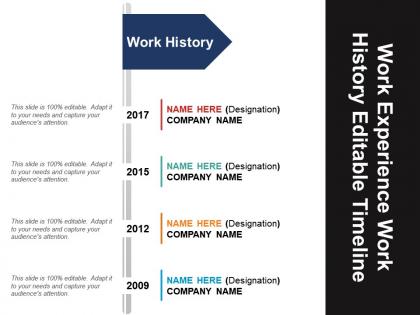
Work experience work history editable timeline powerpoint layout




Try Before you Buy Download Free Sample Product
 Impress Your
 Audience
 100%
100% Editable
 Save Hours
 of Time


The work experience timeline PowerPoint slide is suitable for a presenter to describe his mission & vision, key skills, education, work experience, workplace, career objectives, career path, his strengths & weaknesses and many more to his viewers effectively. The professional self introduction resume PPT slide is an effective presentation tool where the user can add his organization name where he had worked along with his designation in the slide. The work history presentation template acts as a visual profile for a user to highlight his background and professional skills. The professional resume slide for PowerPoint is an effective approach for you to showcase relevant job experience along with your achievements. A user can demonstrate the projects handled by him at his previous workplace by using the professional work history PPT template. The work history timeline slide is suitable for presentation related to business or project proposal because the slide can assist the stakeholders of an organization to analyze the ability of an individual to deliver the proposed idea of product or service. The recruiting agent can use creative resume template to represent experiences of capable candidates. Advocate an eco friendly approach with our Work Experience Work History Editable Timeline Powerpoint Layout. Future generations will benefit.
People who downloaded this PowerPoint presentation also viewed the following :
Work experience work history editable timeline powerpoint layout with all 5 slides:
Handle adverse influences with our Work Experience Work History Editable Timeline Powerpoint Layout. Ensure they don't cause any ill effects.
FAQs for Work experience work history editable
For each job, throw in company names, titles, dates, and what you actually did there. Skills you picked up are good too. If it's some random company nobody's heard of, definitely explain what they do - trust me, you'll forget later. Format everything the same way so it looks clean, maybe bullet points between jobs? Work backwards from your most recent gig. Oh and numbers are your friend - like "boosted sales 30%" sounds way better than just "helped with sales." Leave room to tweak it for different types of jobs since you never know where you'll end up applying.
You should definitely try color coding - it makes scanning your timeline so much faster. I usually go with blue for full-time jobs, green for freelance stuff, red for gaps. Honestly works better than I expected! Just don't go crazy with too many colors or it'll look like a rainbow threw up on your resume lol. Stick to maybe 3-4 max and keep them consistent throughout. Your brain picks up on the patterns way quicker than reading through everything line by line.
Make it super scannable first - dates, job titles, companies should jump out immediately. Drag-and-drop for reordering is clutch, plus inline editing so people aren't bouncing between a million screens. Honestly, I've used so many resume builders where you can't tell what's even clickable - terrible UX. Give it breathing room too, especially when someone's listing like 6+ jobs. Oh, and definitely show when stuff saves. Nothing worse than spending 20 minutes updating everything just to wonder if it actually went through. Keep visual cues obvious so users know exactly what they can edit without playing guessing games.
Honestly, font choice can make or break your timeline's look. Go with something clean - Arial or Calibri work great for the main text. And please, whatever you do, avoid Comic Sans lol. For headers, try a bolder version of the same font or something slightly different to break things up. I learned this the hard way after making a timeline that looked like a ransom note. Keep it to two font families max, and use different weights to separate job titles from company names and descriptions. Makes everything way more scannable without looking messy.
Honestly, drag-and-drop is a game changer - you don't want to be manually rebuilding timelines every time you tweak something. Multiple date formats are key since everyone writes dates differently. Oh, and make sure it handles employment gaps without looking weird. Templates will save your sanity when you're trying different layouts. Export options matter too (PDF, PNG, whatever you need). I'm obsessed with being able to customize fonts and colors - makes it feel more "you" instead of generic. Some let you add job descriptions which is nice. Definitely try the free version first though. If the interface feels clunky, you'll hate using it.
You can totally customize timelines based on your field! Tech people should focus on projects and programming languages. Healthcare folks highlight certifications and research stuff. Creative fields are honestly way more fun - they get to show off portfolio pieces and collaborations (those timelines look amazing btw). Different industries care about different timeframes too. Some want decades of experience, others just want to see you can learn fast. I'd start by checking job descriptions in your area - they'll show you what experiences keep coming up. Once you see the patterns, just adjust your timeline to match what they're actually looking for.
Honestly, numbers are your best friend here - they tell the real story way better than fluffy descriptions. Start your bullet points with strong verbs like "increased," "launched," or "streamlined." Think about what actually made a difference at your job, not just your daily routine stuff. Did you get promoted or win any awards? Definitely include that. Cross-functional projects are gold too since they show you can work with different teams. Keep everything to one line per achievement. Here's the thing - hiring managers literally spend like 6 seconds skimming resumes initially, so your biggest wins need to practically scream at them from the page.
Dude, visuals are a game-changer for timelines. Screenshots of your projects, team photos, maybe a quick demo video - that stuff makes your work feel real instead of just bullet points on a page. It's honestly night and day compared to walls of text. People get bored reading, but they'll actually look at images. Videos work great for showing off presentations you gave or products you built. I'd throw in at least one visual per job - makes everything way more memorable. Plus it breaks things up nicely so it's not just... you know, boring text blocks everywhere.
Honestly, timeline formats are so much better than regular resumes. Recruiters can actually see your career growth at a glance instead of digging through bullet points. You can show overlapping jobs or career changes without it looking weird too. Way more visually interesting - I mean, who wants to stare at another boring list? The best part is you can easily tweak which experiences to highlight for different jobs without rebuilding the whole thing. Definitely try it for your next application. It'll probably tell your story way better than whatever format you're using now.
So if you're just starting out, put your education and internships first since you probably don't have much work experience yet. Projects work too - anything that shows you actually DO stuff. Senior positions? Totally different game. Your work history is what matters now. Lead with big wins and times you managed people or projects. I'd honestly just drop education unless it's somehow super relevant to the specific job. The whole point is playing up whatever makes you look strongest. New grads can't compete on experience, so don't try. Experienced people shouldn't waste space on their college GPA from 15 years ago.
Look, interactivity is what stops people from just scrolling past your timeline. When they can actually click around, filter stuff, or expand sections, they're engaged instead of bored. It's like walking through a museum vs. just reading about it online, you know? People want to control what they're seeing - maybe they'll dig into certain roles or scan for specific skills. Just don't go overboard with fancy effects that take forever to load (learned that one the hard way). The interactive bits should actually help people, not just look cool.
Think of your timeline like telling a story, not just rattling off job descriptions. Connect each role to the next - like "I picked up X skill here, then used it to tackle this bigger challenge there." Honestly, the best resumes read like chapters that actually build on each other. Try phrases like "this led me to..." or "building on that..." between roles. Each position should feel like it was the logical next step, you know? It's basically leaving breadcrumbs that show you didn't just randomly job-hop but were actually going somewhere with purpose.
Don't overwhelm people with a million fields right off the bat - cluttered interfaces are the worst. Start basic: job title, company, dates. You can always add fancy stuff later. Validate those dates properly because trust me, someone will definitely put their graduation in 2030 lol. Auto-save is non-negotiable - people rage when they lose work from accidentally refreshing. Mobile's huge too since everyone edits on their phone now. Test your timeline scaling or you'll get angry support emails. Build the core first, then let actual user feedback guide what features to add next.
Honestly, just pick your 4-6 best positions and call it a day. Nobody's reading every single job anyway. Focus on showing how you moved up rather than listing every tiny responsibility. Bold the company names, use bullet points for your wins, and don't cram everything together - white space is your friend here. If you worked multiple roles at the same company, group them so it looks cleaner. Start with your most recent stuff and work backwards. I learned this the hard way, but cramming 10 years into tiny font just makes recruiters' eyes glaze over. Show progression, not your entire life story.
Oh man, so many ways to do this! Canva's probably your best bet if you're just starting out - super easy drag and drop stuff. Adobe Express is similar too. PowerPoint actually isn't terrible for timelines either (yeah I said it lol). Figma's more advanced but looks really clean if you want something polished. For interactive ones, Tiki-Toki is pretty cool, or TimelineJS if you're feeling fancy. Honestly though? Google Slides works totally fine in a pinch. I'd just grab a template from whatever platform feels right and tweak it from there.
-
Visually stunning presentation, love the content.
-
It saves your time and decrease your efforts in half.