


0314 innovative thank you graphics





Try Before you Buy Download Free Sample Product
 Impress Your
 Audience
 100%
100% Editable
 Save Hours
 of Time


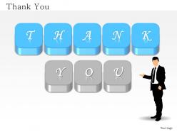
Step up your game several notches with the stylish keys in our innovative Thank you Graphics presentation slide. Your prospective clients will not remember what you said, but how you made them feel- make them feel important to your business with this presentation design, subtle gesture of gratitude. At the completion of a technology transformation roadmap, this information technology inspired Thank you PPT slide will be the perfect cherry on the cake for your team. Let not the long term growth targets intimidate you, plan ahead, deploy your analytics team and chalk out the perfect business strategy and impress your shareholders for their patience with our PowerPoint template and see the approvals shower your way to success. This PPT design is also perfect for HR executives looking for a snazzy and unique way to thank the employees of the organization for putting in their hard work during the yearend review meetings.Hard work has never scared you off. Our 0314 Innovative Thank You Graphics aren't afraid of pitching in to help with the heavy lifting on your next big presentation.
People who downloaded this PowerPoint presentation also viewed the following :
0314 innovative thank you graphics with all 5 slides:
Come out a winner with our 0314 Innovative Thank You Graphics. Your ideas will top the leaderboard.
FAQs for 0314 innovative
Honestly, less is more with thank you graphics. Make your text big enough to actually read - I can't tell you how many tiny, unreadable ones I've seen. Stick with warm colors like soft blues or greens, maybe classic black and white. Skip the neon stuff, it's just harsh. Don't go crazy with fancy fonts either. Simple works better. Keep your message short and personal, throw in some basic icons or clean borders if you want. Leave plenty of white space so it doesn't look cluttered. Oh, and definitely check how it looks at whatever size people will see it at.
Oh totally, color makes a huge difference! I always go with warm tones first - soft oranges and yellows just feel more genuine and happy. Blues work great too since they come across as sincere and trustworthy. Green's solid for customer stuff because it feels positive and relationship-y. Honestly, I'd avoid red unless you soften it to coral or something - it's just too aggressive for thank you vibes. Purple can be nice if you're dealing with higher-end clients though. Really depends on what kind of gratitude you're going for and who you're talking to. Start warm and see how it feels!
Stick with simple fonts like Helvetica, Arial, or Montserrat - they look way more professional. Sans-serif is your friend here since it stays crisp on screens. Don't go crazy with decorative or script fonts (honestly, those belong on wedding stuff anyway). Bold weight can add personality without looking messy. You want people reading "Thank You" instantly, not squinting from the back row. Oh, and definitely test your font at actual presentation size first - I've seen too many slides where the text looked fine on a laptop but tiny on the big screen.
Honestly, pictures just hit different when you're trying to show gratitude. Your brain processes visuals way faster than text, so warm colors or simple imagery like hands/hearts create that emotional connection before people even start reading. I always think of it like this - blooming flowers or sunrise shots automatically make people think "growth" and "new beginnings" without being too obvious about it. You'll want to match the vibe though. Personal thank yous? Go with heartfelt photos. Business stuff works better with clean, simple icons. One strong image plus minimal text usually does the trick.
Honestly, the worst thing you can do is cram too much stuff into one graphic - nobody wants to squint at tiny text. Skip those cheesy stock photos too (seriously, that handshake one needs to die). Your text has gotta be big enough for mobile since that's where everyone's scrolling anyway. Oh, and actually use your own brand colors and fonts! Sounds obvious but you'd be surprised how many people forget. I always check how it looks at different sizes first - saves you from that "oh crap" moment when you realize nobody can read it.
Honestly, simple animations work way better than static stuff these days. Try gentle fades or sliding text - nothing crazy overwhelming. Animated icons are perfect for this, like pulsing hearts or falling confetti that screams celebration. For text, having "Thank You" appear letter by letter looks pretty slick. I'd stick to 2-3 seconds max so it doesn't get annoying on repeat. PowerPoint can actually handle basic effects if you don't have fancy software, though Canva's probably easier. Oh, and definitely start with just one animated element - you can always add more later once you see how it looks.
Okay so brand consistency on thank you graphics is actually super important! Your customers are feeling good about buying from you, so you want those graphics to clearly look like they came from YOUR brand. Use the same colors, fonts, and logo placement you always do - basically treat it like any other marketing stuff. Honestly, I see so many companies just grab random templates and it's such a missed opportunity. You've already done the work to build brand recognition, right? Don't throw that away with some generic thank you page that could be from anyone.
Yeah, cultural stuff is huge for thank you graphics! Colors are tricky - red screams good luck in China but danger here. Hand gestures can backfire too since what looks friendly to us might be super offensive elsewhere. Don't just translate directly either, it sounds so awkward. Like "thank you very much" when everyone just says "thanks." Some cultures want fancy, elaborate gratitude while others think that's way too much. Honestly, I'd run designs by native speakers first - saves you from looking like an idiot later.
Canva's your best bet honestly - tons of templates and you'll have something done in like 5 minutes. If your team's already on Figma, that works too but fair warning, I always get sucked into font rabbit holes there. Adobe's way overkill unless this is your actual job. GIMP's decent if you're broke but it's kind of a pain to learn. Just grab a Canva template, switch up the colors to match whatever you're doing, and call it a day. Way easier than overthinking it.
Dude, thank you graphics are actually genius for keeping people engaged. Drop one in after someone asks a question or participates - makes them feel appreciated, you know? It's like holding a door open but for presentations lol. What I love about them is they give you these natural pause moments. Perfect time to look up from your slides and actually connect with people. Try throwing them in after Q&As or when you're switching topics. People definitely lean in more when they feel acknowledged. Short gesture, but it totally changes how the whole room feels about your talk.
Honestly, just think about what would make them specifically smile. Match their colors and vibe - like playful fonts for creative types, cleaner stuff for corporate folks. I've seen people throw in inside jokes or community references that totally work. Oh, and definitely use their names or company logos when you can! Different audience segments? Make different versions. The whole point is showing you actually know who you're thanking instead of sending some generic thing. What imagery fits their world? Start there and you'll nail it.
So I'd put the customer quote right in the main part of your thank you graphic, or just add a little snippet next to your thanks message. Match it to what they actually did though - like if they bought something, use a testimonial about product quality. Don't go overboard with quotes everywhere (I've seen brands do this and it feels super pushy honestly). One good testimonial per graphic is plenty. Just make sure people can actually read it and it doesn't clash with your main message. Oh, and definitely test different spots to see what works best for your people.
So first figure out where you're posting these! Social media? Go 1080x1080 square. Email stuff needs wider - like 600x200px works. PNG keeps text super crisp and gives you transparency, but honestly JPEG's fine if you need smaller files. Most people stress about this way more than necessary lol. Just make sure text reads well on phones since that's how everyone views things now. Don't put important stuff right at the edges - different platforms crop weird sometimes. I'd start with whatever you'll use most, then make other versions after.
Okay so negative space is basically giving your text room to breathe - makes it way more readable. I learned this the hard way when I crammed everything together and it looked awful! White space around your "Thank You" creates focal points that naturally draw the eye. Plus the contrast makes your text pop against the background. Honestly, most people underestimate how much empty space they need. Try leaving like 20-30% of your canvas blank and you'll see what I mean - it'll look so much cleaner than cramming decorative stuff everywhere.
Definitely keep those thank you slides clean and give them room to breathe. White space is your friend here - don't squeeze them between crazy busy slides. I learned this the hard way lol. Match your fonts to whatever style you've been using throughout. Short sentences work better than cramming everything together. Place them after major sections or save for the very end. If you're adding contact info, make it super scannable because people zone out during wrap-ups. Actually, run through the timing when you practice - that part's crucial but everyone skips it.
-
Great experience, I would definitely use your services further.
-
Commendable slides with attractive designs. Extremely pleased with the fact that they are easy to modify. Great work!