

0414 harvey balls powerpoint presentation





Try Before you Buy Download Free Sample Product
 Impress Your
 Audience
 100%
100% Editable
 Save Hours
 of Time


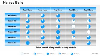
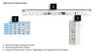
May it be product development cycle or sales management issue all need due attention and representation so that the activities can be tracked and performance can be measured – all this can be done with the help of PPT design? Each product has its own factors of development associated with it and so a sectional bifurcated and a columnar PowerPoint presentation with Harvey balls help to cover all the aspects of business development and logical arrangement of information. A well weaved though process in presentation slide show leaves the room free for other related activities and helps to capture all the necessary details. Relationship can be development in the visually impressive PPT slide show that factors in the past, present and future performance. To bring in the related base of people or clients from offline and online platforms, the colorful and the smart art graphic shapes supporting presentation slide show works wonders as it puts the proposal in a visually impressive manner. Put your ideas up on the mast. Raise the ensign with our 0414 Harvey Balls Powerpoint Presentation.
People who downloaded this PowerPoint presentation also viewed the following :
0414 harvey balls powerpoint presentation with all 5 slides:
Our 0414 Harvey Balls Powerpoint Presentation believe in asset creation. They consistently add capital.
FAQs for 0414 harvey
Harvey Balls are circular symbols that visually represent qualitative data, performance levels, or progress through filled portions ranging from empty to completely full circles. In presentations, they streamline complex comparisons by enabling audiences to quickly assess relative strengths, project statuses, or competitive advantages across multiple criteria, ultimately delivering clearer communication and faster decision-making than traditional text-heavy formats.
Harvey Balls enhance visual communication by transforming complex quantitative data into instantly recognizable visual indicators, enabling rapid assessment of performance levels, progress status, and comparative metrics across multiple categories. These simple circular symbols streamline decision-making processes in executive dashboards and project reports, with many organizations finding that stakeholders can quickly identify trends, prioritize actions, and focus discussions on critical areas without extensive data analysis.
Harvey Balls offer superior visual clarity, instant comprehension, space efficiency, and cross-cultural understanding compared to traditional numerical or text-based rating systems. These simple circle symbols streamline executive dashboards, project scorecards, and performance reviews by eliminating language barriers and reducing cognitive load, with many organizations finding that stakeholders process comparative data significantly faster during presentations and strategic meetings.
Harvey Balls are most effective when presenting comparative data across multiple categories, performance dashboards, project status updates, and strategic planning matrices where audiences need quick visual comprehension. They excel in board presentations, team meetings, and client reports where stakeholders must rapidly assess relative performance levels, resource allocation effectiveness, or progress indicators, ultimately delivering clearer communication and faster decision-making than complex charts or lengthy explanations.
Harvey Balls typically use a standardized color coding system where green represents positive or satisfactory performance, red indicates negative or poor performance, and yellow signifies neutral or moderate status. This intuitive color scheme enhances visual communication by enabling teams across industries like project management, performance reviews, and strategic planning to instantly assess progress, identify areas needing attention, and make data-driven decisions more efficiently.
Harvey Balls can be seamlessly integrated into status reports, project dashboards, performance scorecards, strategic planning templates, and executive summaries through customizable visual indicators. These versatile symbols enhance presentation clarity by providing instant visual assessment across multiple metrics simultaneously, with many organizations finding that Harvey Balls streamline stakeholder communication and accelerate decision-making processes.
Harvey Balls are commonly used across consulting, project management, healthcare, financial services, and technology sectors for comparative analysis. These visual indicators streamline decision-making processes by enabling quick assessment of vendor capabilities, product features, and performance metrics, with many organizations finding that Harvey Balls enhance stakeholder communication and accelerate strategic evaluations.
Determining Harvey Ball scale involves assessing your data range, audience familiarity, and presentation complexity, with most professionals using 3-5 levels for clarity. Financial services firms often use 4-point scales for risk assessments while manufacturing companies prefer 5-point scales for quality metrics, ultimately delivering intuitive visual communication that enhances decision-making speed and stakeholder comprehension.
Common mistakes when using Harvey Balls include using too many rating levels, inconsistent scoring criteria across categories, and overcrowding charts with excessive data points. Organizations often struggle with subjective interpretations and unclear legends, while failing to regularly update assessments, ultimately reducing their effectiveness for strategic decision-making and stakeholder communication.
Harvey Balls improve stakeholder engagement by providing instant visual clarity on project status, performance metrics, and strategic priorities, eliminating confusion from lengthy text reports. This visual approach enables faster decision-making, encourages active participation through simplified data interpretation, and maintains focus on critical issues, with many executives finding that meetings become more productive and action-oriented.
Harvey Balls require consistent sizing, clear contrast between filled and empty portions, and logical progression from empty to full across rating scales. Strategic color choices enhance readability, while maintaining uniform spacing and alignment ensures professional presentation, with many organizations finding that standardized templates streamline creation and improve audience comprehension across reports and dashboards.
Harvey Balls simplify complex data in executive summaries by providing instant visual status indicators, comparative rankings across multiple metrics, and quick progress assessments without overwhelming numerical detail. Financial services firms and consulting companies frequently use them to show portfolio performance, project milestones, and competitive positioning, enabling executives to grasp key insights rapidly and make strategic decisions efficiently.
PowerPoint, Excel, Google Slides, and Canva offer built-in Harvey Ball symbols, while specialized tools like Lucidchart and Visio provide enhanced customization options. These platforms streamline dashboard creation by enabling consistent visual communication, automated data integration, and professional formatting, with many organizations finding that standardized Harvey Ball templates ultimately deliver faster reporting cycles and clearer stakeholder communication.
Cultural differences significantly impact Harvey Balls interpretation through varying visual symbolism, color associations, and progress concepts across regions. While Western cultures typically read left-to-right suggesting progressive completion, Asian markets may interpret circular fills differently, and color meanings vary dramatically between cultures, with many international organizations finding that standardized legends and cultural localization ultimately deliver clearer cross-border communication and improved stakeholder alignment.
Harvey Balls were invented in 1972 by Harvey Poppel, a consultant at Booz Allen Hamilton, who needed a simple visual method to communicate complex comparative data to clients. Originally developed for internal consulting presentations, these circular symbols quickly gained popularity across industries like manufacturing, healthcare, and financial services, with many organizations finding that Harvey Balls streamline decision-making processes and enhance stakeholder communication.
-
Informative presentations that are easily editable.
-
Presentation Design is very nice, good work with the content as well.