

0414 slider bar graph column chart powerpoint graph




Try Before you Buy Download Free Sample Product
 Impress Your
 Audience
 100%
100% Editable
 Save Hours
 of Time


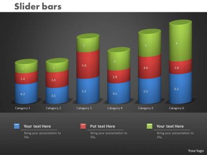
Feeling that too many things are going on at the same time? Capture your business sales and projects targets using our 0414 slider bar graph column chart PowerPoint graph. Smart organization and professionally crafted presentation for all events – client meetings, shareholder conferences, employee engagement sessions, and performance review meetings, project progress reviews and what not! Pack a punch with our PowerPoint Presentation design and capture the attention of your audience. Brilliant backdrops are the essence of our PPT templates. Guaranteed to illuminate the minds of your viewers. Use this slide diagram and give form to your wondrous ideas. This slide template can fit your business strategies, marketing campaign results, cost cutting initiatives, project timelines and global industrial collaboration efforts, all within a single super-concentrated pack of powerful information yielding capsule. Use our superbly crafted PPT slide to rivet your audience to that dream entrepreneurial venture you have always wanted to fructify or to your awesome performance in all key result areas in the last financial year. That promotion can be yours, we tell you!. Align your guns with our 0414 Slider Bar Graph Column Chart Powerpoint Graph. The cross hairs will get centered correctly.
People who downloaded this PowerPoint presentation also viewed the following :
0414 slider bar graph column chart powerpoint graph with all 3 slides:
Our 0414 Slider Bar Graph Column Chart Powerpoint Graph are fairly expansive. They cover an amazing extent.
FAQs for 0414 slider bar graph column
Slider bar graph column charts in PowerPoint offer interactive data visualization, real-time parameter adjustment, enhanced audience engagement, simplified complex comparisons, and dynamic scenario modeling capabilities. These interactive elements streamline presentations by enabling presenters to demonstrate multiple data scenarios seamlessly, with many organizations finding that slider-enabled charts significantly improve stakeholder comprehension and decision-making processes.
Slider bar graphs enhance audience engagement by providing interactive control, real-time data exploration, and dynamic visual storytelling that traditional column charts cannot match. Through interactive elements, presenters can demonstrate data relationships across different time periods, scenarios, or variables in real-time, keeping audiences actively involved while delivering more compelling, memorable presentations that encourage participation and deeper understanding.
Integrating slider bar graphs into existing PowerPoint themes requires maintaining consistent color schemes, font families, and visual hierarchy while ensuring the slider elements complement your template's design language. Strategic integration involves matching chart colors to theme palettes, aligning slider positioning with existing content blocks, and incorporating brand-specific styling elements, with many organizations finding that cohesive integration enhances presentation flow and delivers more professional, engaging stakeholder communications.
Slider bar graphs enhance visual storytelling by allowing presenters to dynamically reveal data comparisons, control narrative pacing, and guide audience attention through sequential insights. These interactive elements enable speakers to build compelling arguments progressively, especially in sales presentations and executive briefings, while maintaining audience engagement and delivering clearer, more memorable data narratives that drive decision-making.
Slider bar graphs excel at displaying comparative data across categories, time-series progressions, survey results, performance metrics, and budget allocations where interactive exploration enhances understanding. These dynamic visualizations enable audiences to manipulate variables and observe real-time changes, with financial services, healthcare analytics, and retail performance teams finding that slider functionality transforms static presentations into engaging, exploratory experiences that drive deeper insights.
Yes, slider bar graphs can be animated in PowerPoint using entrance, emphasis, and exit animations, along with custom animation sequences and trigger-based interactions. Through PowerPoint's Animation Pane, you can create dynamic presentations by animating individual data series, adding morph transitions between slides, and incorporating interactive elements like action buttons, with many presenters finding that animated slider charts significantly enhance audience engagement and data storytelling effectiveness.
Common mistakes include using inconsistent scales, overcrowding data points, poor color contrast, missing labels, and failing to align slider elements properly. These errors reduce chart readability and professional appearance, with many presenters finding that simplifying data ranges, ensuring adequate spacing between elements, and using clear visual hierarchies ultimately delivers more impactful presentations and better audience comprehension.
Ensuring clarity in slider bar graphs requires consistent color coding, clear axis labels, adequate spacing between elements, and readable font sizes throughout the presentation. These design principles enhance audience comprehension by minimizing visual clutter, highlighting key data comparisons, and maintaining professional consistency, with many presenters finding that strategic use of contrasting colors and simplified legends ultimately delivers more impactful and memorable data storytelling.
**INPUT**: What software or tools integrate well with PowerPoint for creating slider bar graphs? **OUTPUT**: Tools that integrate seamlessly with PowerPoint for slider bar graphs include Excel for dynamic data linking, Tableau with direct export capabilities, Power BI for real-time dashboards, and specialized add-ins like Think-Cell. These solutions enhance presentation effectiveness by enabling automatic data updates, interactive elements, and professional formatting, with many organizations finding that integrated workflows significantly streamline reporting processes while delivering more engaging stakeholder presentations. [Word count: 60]
Customizing slider bar graphs involves modifying color schemes, fonts, border styles, background themes, and visual elements through PowerPoint's formatting tools. These adjustments enable organizations to maintain brand consistency across presentations, with many companies finding that cohesive visual styling enhances professional credibility, reinforces brand recognition, and delivers more impactful stakeholder communications.
Slider bar graphs offer interactive functionality allowing users to filter, adjust time periods, or modify parameters in real-time, while traditional bar graphs display static data comparisons. These interactive elements enhance presentations by enabling dynamic exploration of datasets, facilitating deeper audience engagement during sales pitches, financial reviews, and strategic planning sessions, ultimately delivering more compelling and persuasive data storytelling experiences.
Slider bar graphs enable dynamic data exploration during live presentations by allowing presenters to adjust variables, timeframes, and scenarios in real-time while audiences observe immediate visual changes. Through interactive controls, presenters can demonstrate "what-if" analyses, compare different periods or segments, and respond to audience questions with instant data manipulation, ultimately creating more engaging and persuasive presentations that drive deeper understanding.
**INPUT**: What metrics should be considered when choosing between a slider bar graph and a column chart? **OUTPUT**: Key metrics include data complexity, audience interaction needs, presentation format, time constraints, and visual clarity requirements. Column charts excel for straightforward comparisons and static presentations, while slider bar graphs enhance engagement through interactive exploration, with many organizations finding that interactive formats improve audience retention and decision-making effectiveness.
Incorporating user feedback on slider bar graphs involves analyzing audience comprehension, visual clarity preferences, data interpretation accuracy, and interaction effectiveness from previous presentations. Organizations can enhance future presentations by adjusting color schemes, simplifying data ranges, refining animation speeds, and optimizing slide layouts based on viewer responses, ultimately delivering more engaging and comprehensible data visualizations that improve audience retention.
Creative approaches include interactive slider animations, multi-layered data comparisons, color-coded categorical breakdowns, time-series progressions, and comparative scenario modeling. These techniques enable presenters to guide audiences through complex financial data, market trends, or performance metrics dynamically, ultimately delivering clearer insights and more engaging stakeholder presentations.
-
Qualitative and comprehensive slides.
-
Great designs, really helpful.