


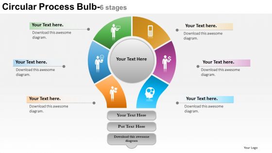
0614 six staged circular financial process diagram powerpoint template slide




Try Before you Buy Download Free Sample Product
 Impress Your
 Audience
 100%
100% Editable
 Save Hours
 of Time


A process when well defined to all its contributors fetches fruitful result. And for this purpose we need a well laid down platform like 0614 six staged circular financial process diagram PowerPoint template slide. In the provided financial process PPT PowerPoint presentation visual we have a series of steps marked with unique color code and PPT icon so as to ensure ease of understanding on the part of the audience. Sufficient text space has been provided alongside each step icon in order to define each step a bit. Our team of experts has worked out all essentials to come up with a process flow PowerPoint slide design background which is aesthetically sound and professionally proficient. Let your knowledge get molded in the cast of creativity designed by us under the label six staged circular financial process PPT presentation diagram. Download without any hassle the expertly crafted process steps defined PPT presentation model and use it to your benefit and smartness. God is in the details for our 0614 Six Staged Circular Financial Process Diagram Powerpoint Template Slide. Ensure each one gets appropriate coverage.
People who downloaded this PowerPoint presentation also viewed the following :
0614 six staged circular financial process diagram powerpoint template slide with all 5 slides:
The comfort of our 0614 Six Staged Circular Financial Process Diagram Powerpoint Template Slide is exhilarating. You will forget all about fatigue.

FAQs for 0614 six staged circular financial process diagram
You'll need the basic building blocks - process boxes for each action, diamond shapes for decision points, and arrows connecting everything. Start/end points too, obviously. If multiple teams are involved, throw in some swimlanes (those horizontal sections that show who does what). Honestly, swimlanes are a lifesaver for avoiding confusion later. Don't forget to mark any systems or documents that feed into each step. Add timing notes if deadlines matter. My advice? Map out what you're currently doing first, then worry about making it better once you can see the whole mess laid out.
So basically, these diagrams map out your whole reporting workflow step-by-step. No more confusion about who's supposed to do what. You'll catch bottlenecks and redundant stuff that's messing up your reports - honestly it's like finally having directions instead of just winging it every month. Training new people becomes way simpler too. Auditors eat this stuff up, which is a nice bonus. I'd start with your month-end close process since that's where everything usually goes sideways anyway. The visual aspect really helps - way better than trying to explain everything verbally.
For financial process diagrams, most people go with Visio, Lucidchart, or draw.io. Visio's huge in finance since it plays nice with Office and handles compliance stuff well. I'm personally a fan of Lucidchart though - web-based and makes collaboration super easy. Draw.io won't cost you anything and works better than you'd expect. Some teams get fancy with Bizagi or ARIS, but that's probably way more than you need right now. Honestly? Start with whatever your company already pays for. You can always switch later if you're missing features.
So basically, these diagrams let you see where your money's actually going - like a map of your cash flow. Super helpful for catching bottlenecks and dumb inefficiencies that eat up time. When approvals get stuck or costs start piling up somewhere weird, you'll spot it right away. Everyone stays on the same page about processes, which honestly saves so many headaches later. Oh, and leadership loves the visual stuff when you're pitching changes - way better than just throwing numbers at them. I'd start with whatever process costs you the most or takes forever. Makes the biggest impact.
Honestly, these diagrams are total lifesavers during audit time. Instead of stumbling through verbal explanations, you just walk auditors through the visual flow of money and controls. They can see exactly where approvals happen and verification steps kick in. Super helpful for spotting control gaps before auditors find them (which is way less embarrassing). Oh, and definitely update them quarterly - I learned the hard way that outdated diagrams are almost worse than having none. They're basically your compliance roadmap, showing exactly how cash moves through everything. Makes the whole process so much smoother.
Start by mapping what you actually do - like your AP process or budgeting stuff. Then grab a standard template and tweak it to match your weird quirks. Most tools let you change colors, add custom shapes, whatever. The main thing is getting your team involved since they know all those random edge cases that'll bite you later. Don't worry about making it look perfect - I'd rather have something messy that people actually use than some gorgeous diagram sitting in a folder somewhere. Focus on your approval chains and which software you're using. That's what makes it yours instead of just another generic flowchart.
Map out what you actually do first - not what you think you should be doing. Nobody can follow those pretty diagrams that don't match reality! Use simple symbols and make your yes/no decision points super obvious. Don't forget about everyone who touches the process, especially handoffs and approval steps. Oh, and any system integrations too. One page is your goal - cluttered flowcharts are useless. Here's what I always do: walk through a real example with your team before you call it done. You'll catch weird gaps that way.
Honestly, process diagrams are a game-changer for spotting bottlenecks. They show you exactly where stuff gets stuck - like invoices waiting for three approvals or expense reports disappearing between departments for weeks. Super frustrating but so common! You'll literally see work piling up in certain spots. The visual makes patterns obvious that you'd miss otherwise. Start by timing each step in your current process, then hunt for the longest delays. Those backup points? That's where you need to focus. Once it's mapped out, the problem areas just jump off the page.
So for measuring financial process effectiveness, I'd focus on cycle time first - that's how long each step actually takes. Error rates matter too, plus cost per transaction. Honestly, bottleneck identification is probably the most eye-opening since you'll see exactly where everything gets stuck. Track your processing volume and throughput to know how much work you're cranking through. Approval times are huge, especially if you've got multiple sign-offs. Don't forget exception handling frequency - those weird edge cases can really mess with your flow. Start with maybe 3 metrics that match your biggest headaches, then build some basic dashboards.
Honestly, I'd say quarterly if you can manage it, but at minimum once a year. Whenever there's a regulatory change or system update, you've gotta update those diagrams right away or they become totally useless. High-growth companies especially need to stay on top of this since processes change so fast. Nothing's worse than training new people on outdated workflows - been there, done that, it's a mess. Set a calendar reminder so you're not panicking when auditors show up asking questions. Trust me, keeping them current saves you way more headaches than letting them get stale.
Oh man, you're gonna hate the documentation part - everyone guards their "tribal knowledge" like it's state secrets. Finance will swear their process map is gospel while operations thinks they're completely wrong. Expect some pretty awkward meetings about who's "right." Honestly, the worst part is keeping everything updated since processes change but nobody bothers fixing the docs. My advice? Find one person in each department who actually gives a damn about this project succeeding. Work through them instead of trying to wrangle everyone at once. Way less headache that way.
Honestly, flowcharts are a game-changer for explaining financial stuff to people. When stakeholders can actually *see* how money moves through the company instead of reading some boring manual, everything clicks way faster. Non-finance people especially love this - they can spot where things get stuck or inefficient just by looking. Budget approvals, reporting chains, all that complicated stuff becomes so much clearer. I learned this the hard way after watching too many eyes glaze over during presentations. Start with the big picture first, then get into details when people ask questions. Trust me on this one.
Honestly, connecting your financial diagrams to other business tools is a game changer. Hook them up to your ERP, project management stuff like Asana, risk frameworks - whatever you're already using. I've seen people link expense approval flows straight into their accounting software which is pretty slick. Don't let those diagrams just sit there collecting dust though. Embed them in compliance docs, operation manuals, even customer onboarding if it makes sense. The trick is picking your first integration based on what'll cut down your manual busywork the most. Start there and build from it.
So high-level diagrams are your 30,000-foot view - major steps like "get invoice," "approve payment," done. Perfect for showing executives without drowning them in details. Detailed ones? They map every tiny step and decision point. Super messy looking but that's where you actually find the problems. I'd start high-level for getting buy-in from stakeholders first. Then go detailed when your team needs to fix or automate stuff. The detailed versions honestly look like spaghetti sometimes, but they're worth it for process improvement work.
Honestly, you'll want someone to own this thing or it'll just sit there getting more useless by the day. Build in review cycles - quarterly works for most teams, but if you're moving fast maybe monthly. Get the actual people doing the work to give feedback, not just their bosses (they're the ones who know what's really broken). Set up regular check-ins where stakeholders can call out outdated stuff or missing pieces. Oh and definitely use version control so you can see what changed when - saved my butt more times than I can count. The key is making it feel routine, not like extra homework.
-
Use of different colors is good. It's simple and attractive.
-
Innovative and attractive designs.