


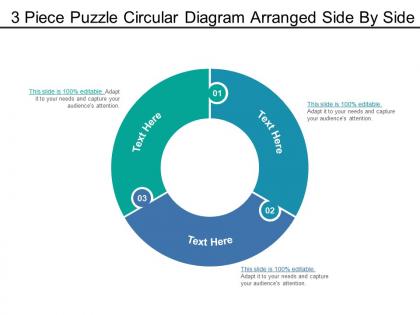
3 piece puzzle circular diagram arranged side by side
You must be logged in to download this presentation.




Try Before you Buy Download Free Sample Product
 Impress Your
 Audience
 100%
100% Editable
 Save Hours
 of Time


Leave the design work to us. Our 3 Piece Puzzle Circular Diagram Arranged Side By Side are working overtime to keep your presentations fresh.
People who downloaded this PowerPoint presentation also viewed the following :
3 piece puzzle circular diagram arranged side by side with all 5 slides:
Avoid acting in a heavy handed fashion with our 3 Piece Puzzle Circular Diagram Arranged Side By Side. They enable you to handle delicate aspects.
FAQs for 3 piece puzzle circular diagram arranged
Dude, circular diagrams are perfect for showing stuff that repeats or loops back around. Your audience immediately understands it's a continuous process - like project cycles or feedback systems. Way more engaging than another slide of bullet points (honestly, those put me to sleep). They naturally pull your eye around the whole thing, so people actually pay attention longer. I always use them when I'm explaining anything that connects back to where it started. Oh, and they just look cooler than regular charts. Definitely try one next time you're presenting something cyclical!
So here's the thing - circular diagrams are perfect when you've got processes that loop back around. Linear charts totally miss those feedback connections, but circles make it super obvious how everything connects. Like with supply chains or user flows where the end feeds back to the start? Game changer visually. Honestly, they just look way cooler than regular bar charts too (probably shouldn't admit that but whatever). Just make sure your segments are sized right and clearly labeled or people won't follow the flow. It's all about showing those cyclical relationships that would be invisible otherwise.
Circular diagrams are great when your data loops back on itself or shows how things connect to one main idea. Perfect for process flows, org charts, seasonal patterns - stuff like that. They definitely grab attention in presentations, which is nice. But here's the thing: don't force it if your data is just straightforward A-to-B information. That'll look weird. I always sketch mine out first to see if the circle actually makes sense. Sometimes you think it'll work and then... nope, basic bar chart would've been way clearer. Just make sure the circular layout actually adds something useful.
Okay so circular diagrams are basically magic for keeping people engaged. They guide your eye in this natural loop that makes even complicated stuff easier to follow. Linear diagrams? Those feel like textbooks. But circles create this satisfying visual flow - people unconsciously trace around them instead of just scanning and leaving. There's something weirdly pleasing about complete shapes too, maybe we're just wired that way. Oh, and here's a random tip: put your most important info at the top ("12 o'clock" position) since that's usually where people's eyes land first. Trust me on this one.
Don't cram too much text in each section - it gets messy quick. Keep your segments roughly proportional unless there's a real reason not to. Color-wise, avoid anything that clashes or looks too similar (learned that one the hard way). Flow direction trips people up constantly, especially with processes. Your arrows need to actually make sense to someone seeing this for the first time. Short, punchy labels work best. Honestly, just run it by someone else before you finalize - you'll be shocked what seems "obvious" to you but confuses everyone else.
Dude, color theory is a game changer for circular diagrams! I'd use complementary colors to make opposing ideas pop - like red vs green for pros/cons. Different shades of the same color work perfectly for grouping stuff together too. Made this disaster rainbow chart once that looked cool but confused everyone lol. Smooth gradients around the circle show progression really well. Honestly, pick 3-4 colors max and actually assign them meanings instead of just going with whatever's pretty. Your brain will thank you later when you're not squinting at a hot mess trying to figure out what connects to what.
Honestly, I'd go with **Lucidchart** first - their templates are clutch and will save you so much time. **Visio** works too if you already have it. **Canva** surprised me recently, super pretty results but not great if you need exact measurements or anything. Oh and **Draw.io** is free which is nice. I've seen some gorgeous stuff made in **Adobe Illustrator** but that's like using a Ferrari to go grocery shopping unless you're already good with it. Start with Lucidchart though, seriously.
You'd be surprised how many places use circular diagrams! Business folks love them for mapping customer journeys and product lifecycles. Hospitals track patient care cycles with them. Schools use them for curriculum planning - though honestly, I think teachers just like drawing circles. Manufacturing companies map their quality control processes this way too. The trick is they work best when your process loops back on itself or has stages that connect to each other. Next time you're planning something, try drawing it as a circle instead of a straight line. You'll probably catch relationships between steps that weren't obvious before.
Honestly, circular diagrams are way better than those endless bullet point slides everyone does. You can map out cause-and-effect stuff, show how different people interact around a problem, or demonstrate cycles. They're perfect when things aren't linear - like most real-world issues, right? Your audience gets the big picture instantly instead of trying to connect dots in their head. I used one last month for a project about supply chain issues and it clicked for people immediately. Next time you're dealing with interconnected problems, just sketch out a circle and see what happens.
So basically, figure out what each group actually cares about first. Executives just want the big picture stuff - outcomes, numbers, what it means for business strategy. They'll zone out if you dump too much detail on them, trust me. Students are totally different though - they need way more explanation and context since they're trying to learn. Also switch up your language. Use business terms with execs but keep it simple for students. Pick your 2-3 main points and build everything around those. Oh and colors matter too - probably sounds obvious but it's easy to forget when you're focused on content.
Definitely break those circular diagrams into pieces instead of showing everything at once. Start with the center, then fade in each segment from the outside. Honestly, the "grow from center" animation is my go-to - looks way cleaner than most other effects. Don't forget to animate any connecting lines between segments too. Keep your timing around 0.5 seconds per element so it doesn't feel sluggish. Oh, and seriously test it beforehand because I've learned the hard way that smooth editing doesn't always mean smooth presenting when you're actually clicking through live.
Honestly, circular diagrams are perfect when you've got something that loops back on itself - like cycles, feedback systems, or processes that repeat. They just click in people's brains way faster than regular flowcharts. But don't force your data into a circle if it doesn't naturally belong there (I've seen some truly awful attempts at this). Step-by-step stuff? Go linear. Org charts need hierarchy. The circular thing really shines when you want people to see how everything connects and flows back to the start. They're also weirdly satisfying to look at.
Honestly, you want templates where you can customize the ring segments and mess with colors easily. Scalable vector stuff is key - nobody wants pixelated circles, trust me. The real game-changer though? Smart layouts that auto-adjust spacing when you add sections. Saves so much annoying formatting work later. Oh, and make sure text curves naturally around the circle if you're into that look. Good alignment guides are clutch too. I always end up picking templates with these features because otherwise you'll spend forever tweaking instead of actually working on your content.
Definitely grab feedback right after while it's still fresh - ask specific stuff like which parts of your circular diagram made zero sense. Honestly, I always hate that moment when you realize you've been staring at something for weeks and can't spot the obvious problems anymore! Watch where people look first and what they ask about flow or connections. Then fix your labels, throw in clearer arrows, maybe break those complex cycles into smaller pieces. Oh and test the updated version with like 2-3 people before your next big presentation. Trust me on that one.
Oh yeah, tons of places use these! McKinsey's basically built their reputation on circular strategy frameworks - helps clients see how business processes loop back on themselves. Schools love them too, from water cycle diagrams in elementary to mapping customer journeys in MBA programs. I tried one last quarter for our product development process and honestly? Game changer. Stakeholders got it right away. The thing is, some workflows just aren't linear - they circle back. Worth sketching your next process as a loop instead of straight arrows. You'll probably catch stuff you missed going the traditional route.
-
Useful
-
Thanks for all your great templates they have saved me lots of time and accelerate my presentations. Great product, keep them up!
-
Great designs, Easily Editable.
-
Nice Template to show Insights revolving around lifecycle/journey!