

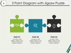
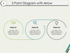
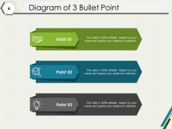
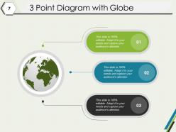
3 Point Slide Arrows Intersecting Circle Diagram Puzzle Comparison Globe




Try Before you Buy Download Free Sample Product
 Impress Your
 Audience
 100%
100% Editable
 Save Hours
 of Time


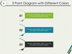
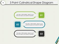
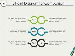
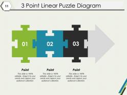
Include all the incentives folks could expect with our 3 Point Slide Arrows Intersecting Circle Diagram Puzzle Comparison Globe. Capture the imagination of your clients.
People who downloaded this PowerPoint presentation also viewed the following :
3 Point Slide Arrows Intersecting Circle Diagram Puzzle Comparison Globe with all 12 slides:
Campaign for the disabled with our 3 Point Slide Arrows Intersecting Circle Diagram Puzzle Comparison Globe. Encourage folks to give every assistance they can.
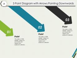
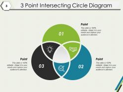
FAQs for 3 Point Slide Arrows Intersecting Circle Diagram
Effective diagrams incorporate clear visual hierarchy, consistent design elements, appropriate use of color and typography, logical flow patterns, and strategic white space management. These elements work together by reducing cognitive load, guiding viewer attention, and enhancing information retention, with many organizations finding that well-designed diagrams significantly improve stakeholder comprehension and decision-making processes.
Different types of diagrams serve presentation purposes by organizing complex information visually, clarifying relationships between concepts, and enhancing audience comprehension through targeted formats. Flowcharts streamline process explanations, organizational charts clarify hierarchies, and infographics deliver data insights, with many presenters finding that strategic diagram selection significantly improves message retention and stakeholder engagement.
**INPUT**: What are the best practices for designing diagrams in a professional presentation? **OUTPUT**: Best practices for designing professional presentation diagrams include maintaining visual hierarchy, using consistent color schemes, limiting text density, ensuring scalable fonts, and incorporating strategic white space. These design principles streamline audience comprehension by enhancing readability, reducing cognitive load, and directing focus to key insights, with many organizations finding that well-structured diagrams ultimately deliver clearer communication and more persuasive presentations. [Word count: 60 words]
Color theory enhances diagram clarity by using contrasting hues for differentiation, complementary colors for emphasis, and consistent palettes for categorization and visual hierarchy. Through strategic color application, organizations streamline complex data visualization, improve audience comprehension, and accelerate decision-making processes, with many businesses finding that well-designed color schemes significantly boost presentation effectiveness and stakeholder engagement.
Popular diagramming software includes Microsoft Visio, Lucidchart, Draw.io, Canva, and Adobe Illustrator, each offering distinct capabilities for professional visualization needs. These platforms streamline diagram creation through intuitive interfaces, extensive template libraries, and collaborative features, with many organizations finding that cloud-based solutions like Lucidchart and Draw.io enhance team productivity while reducing design costs.
Hierarchy in diagrams establishes visual importance through size, position, color, and spacing, guiding viewers through information systematically from primary to secondary elements. This structural approach enables organizations to communicate complex relationships clearly, with flowcharts, org charts, and process diagrams delivering improved comprehension and decision-making efficiency across departments.
**INPUT**: How can you effectively integrate diagrams with text in a presentation? **OUTPUT**: Effective diagram integration involves strategic placement alongside complementary text, consistent visual hierarchy, and balanced information distribution that guides audience attention naturally. Through coordinated color schemes, progressive disclosure techniques, and aligned messaging, presenters streamline complex information delivery, enhance audience comprehension, and ultimately create more engaging presentations, with many organizations finding that integrated visual-text approaches significantly improve stakeholder understanding and decision-making outcomes.
Common diagram mistakes include cluttered layouts, inconsistent formatting, unclear labels, inappropriate color choices, and missing hierarchical structure. These errors confuse audiences and diminish message impact, with many organizations finding that streamlined designs, consistent visual elements, and logical flow patterns enhance comprehension, reduce presentation time, and ultimately deliver more persuasive business communications.
Diagrams streamline complex information by breaking down intricate concepts into visual components, showing relationships between elements, and eliminating text-heavy explanations that can overwhelm audiences. Through strategic visualization, organizations enhance comprehension rates, reduce training time, and improve decision-making processes, with many companies finding that visual communication delivers faster stakeholder alignment and clearer strategic outcomes.
Static diagrams are fixed visual representations that display information without user engagement, while interactive diagrams allow users to click, hover, zoom, and manipulate elements for dynamic exploration. Interactive versions enable deeper data analysis, real-time updates, and personalized viewing experiences, with many organizations finding that interactive formats significantly enhance audience engagement, comprehension, and decision-making processes.
Audience feedback influences diagram design by revealing comprehension gaps, visual preferences, clarity issues, and information hierarchy needs through surveys, usability testing, and direct comments. This input enables designers to adjust color schemes, simplify complex elements, reorganize layouts, and optimize content density, ultimately delivering more intuitive visual communications that enhance understanding and engagement across diverse stakeholder groups.
Successful diagram implementations include McKinsey's strategic framework visualizations for client presentations, medical institutions using anatomical diagrams for patient education, and tech companies employing system architecture diagrams for stakeholder alignment. These visual approaches streamline complex information delivery, enhance audience comprehension, and accelerate decision-making processes, with many organizations finding that well-designed diagrams reduce meeting times while improving strategic clarity.
Cultural differences significantly impact diagram interpretation through varying color associations, reading patterns, symbolic meanings, and spatial relationships. For example, while red signifies danger in Western contexts, it represents prosperity in many Asian cultures, and left-to-right reading patterns versus right-to-left orientations affect information flow comprehension, ultimately requiring culturally adaptive design strategies for global business communications.
Current diagram design trends include interactive elements, animated transitions, minimalist aesthetics, data-driven visualizations, and mobile-responsive formats. These design approaches enhance audience engagement by streamlining complex information, enabling real-time collaboration, and delivering seamless experiences across devices, with many organizations finding that modern diagram strategies significantly improve presentation effectiveness and stakeholder comprehension.
Ensuring accessibility in diagram creation involves using high contrast colors, clear readable fonts, alternative text descriptions, logical information hierarchy, and multiple format options. These design principles enhance comprehension across diverse audiences, with organizations in healthcare, education, and financial services finding that accessible diagrams improve stakeholder engagement, reduce communication barriers, and ultimately deliver more inclusive business outcomes.
No Reviews