


6 banner element slide with icons and numbering




Try Before you Buy Download Free Sample Product
 Impress Your
 Audience
 100%
100% Editable
 Save Hours
 of Time


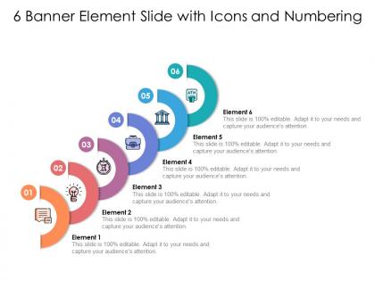
Highlight important instances with our 6 Banner Element Slide With Icons And Numbering. Deliberate on the facts that emerge.
People who downloaded this PowerPoint presentation also viewed the following :
6 banner element slide with icons and numbering with all 2 slides:
Deliberate on the facts that emerged with our 6 Banner Element Slide With Icons And Numbering. Highlight important instances.

FAQs for 6 banner element slide with
Effective presentation banners should include a compelling headline, clear value proposition, relevant visuals or imagery, consistent branding elements, and strategic call-to-action placement. These components work together by capturing attention immediately, communicating core messages efficiently, and guiding audience focus, with many organizations finding that well-designed banners significantly enhance audience engagement and message retention.
Color psychology significantly influences banner effectiveness by triggering emotional responses, enhancing message retention, and guiding audience attention through strategic visual hierarchies. Different hues evoke specific reactions, with blue conveying trust in financial presentations, red creating urgency in sales materials, and green suggesting growth in corporate reports, ultimately enabling presenters to reinforce their key messages and drive desired audience behaviors.
Typography best practices for banner elements include selecting readable fonts, maintaining proper hierarchy through size variation, ensuring sufficient contrast against backgrounds, limiting font families to two maximum, and optimizing text size for viewing distance. These practices enhance message clarity by improving legibility, strengthening brand consistency, and maximizing visual impact, with many marketing teams finding that strategic typography choices significantly boost engagement rates and conversion performance.
Images and graphics enhance banner messages by creating immediate visual impact, reinforcing key concepts, and improving information retention through visual storytelling. These elements streamline communication by breaking down complex ideas, establishing emotional connections with audiences, and enabling faster message comprehension, with many organizations finding that strategic visual integration significantly increases engagement and brand recall.
Whitespace enhances banner readability by creating visual breathing room, directing attention to key messages, establishing hierarchy, and preventing cluttered layouts that overwhelm viewers. This strategic spacing enables faster message comprehension, improved brand recognition, and higher engagement rates, with many marketing teams finding that well-balanced whitespace significantly increases click-through performance.
Animation or motion enhances banner presentations by capturing attention, guiding viewer focus, and emphasizing key messages through strategic movement timing. These dynamic elements streamline information delivery by highlighting important data progressively, creating visual hierarchy, and maintaining audience engagement, with many marketing teams finding that subtle animations ultimately deliver higher click-through rates and improved message retention.
Common banner mistakes include cluttered layouts, poor font choices, inconsistent branding, inadequate contrast, and oversized elements that overwhelm content. These design pitfalls undermine message clarity and professional credibility, with many organizations finding that streamlined banners with strategic white space, readable typography, and cohesive visual hierarchy ultimately enhance audience engagement and brand perception.
Different social media platforms influence banner design through varying dimensions, audience behaviors, visual algorithms, and content formats. Each platform's unique characteristics, from LinkedIn's professional aesthetic to Instagram's visual-centric approach to Facebook's community focus, requires strategic design adaptations that optimize engagement, ensure brand consistency, and maximize reach across diverse user demographics.
**INPUT**: What tools or software are recommended for creating professional banners? **OUTPUT**: Professional banner creation tools include Adobe Photoshop, Canva, Adobe Illustrator, Figma, and Bannersnack, each offering templates, design flexibility, and export options for various platforms. These solutions streamline design workflows by providing pre-built templates, brand consistency features, and scalable formats, with many marketing teams finding that integrated platforms ultimately deliver faster campaign deployment and enhanced visual impact.
Call-to-action elements integrate effectively through strategic placement, compelling copy, contrasting colors, appropriate sizing, and clear visual hierarchy that guides viewer attention. These design principles streamline user engagement by creating obvious pathways, minimizing decision fatigue, and enhancing conversion rates, with many marketing teams finding that well-positioned CTAs ultimately deliver significantly higher click-through rates and campaign performance.
Accessible banner strategies include high color contrast ratios, alternative text for images, readable typography, keyboard navigation compatibility, and screen reader optimization. These approaches enhance user experience by ensuring clear visibility, seamless navigation across devices, and inclusive design compliance, with many organizations finding that accessible banners significantly expand their audience reach and improve overall engagement rates.
Banner dimensions vary significantly across presentation formats, with standard slides typically using 16:9 ratios (1920x1080), widescreen formats requiring 21:9 dimensions, and mobile presentations needing vertical 9:16 orientations. These dimensional considerations enable designers to optimize visual impact, text readability, and brand consistency across platforms, with many organizations finding that format-specific banner templates streamline their presentation workflows while maintaining professional standards.
Branding consistency significantly enhances banner effectiveness by building recognition, trust, and professional credibility across all marketing touchpoints. When organizations maintain consistent colors, fonts, logos, and messaging in their banner elements, audiences develop stronger brand recall and engagement, with many companies finding that cohesive visual identity ultimately delivers higher conversion rates and competitive market positioning.
Testing banner effectiveness involves A/B testing different versions, conducting user surveys, analyzing click-through rates, performing heat map analysis, and gathering focus group feedback. Through these methods, organizations can compare design elements like color schemes, messaging, and layouts across target audiences, ultimately identifying which combinations drive higher engagement and conversions before committing resources to final production.
Current banner design trends for digital presentations include minimalist layouts, bold typography, animated micro-interactions, gradient overlays, and immersive video backgrounds. These design approaches enhance visual engagement by reducing cognitive load, improving brand recall, and creating dynamic storytelling experiences, with many organizations finding that strategic visual simplification ultimately delivers higher audience retention and more effective message communication.
No Reviews