

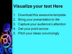
Abstract colorful gears background powerpoint templates and powerpoint backgrounds 0411





Try Before you Buy Download Free Sample Product
 Impress Your
Audience
 100%
Editable
 Save Hours
of Time


Create checklists with our Abstract Colorful Gears Background PowerPoint Templates And PowerPoint Backgrounds 0411. Diagnose problems step by step.
People who downloaded this PowerPoint presentation also viewed the following :
Abstract colorful gears background powerpoint templates and powerpoint backgrounds 0411 with all 3 slides:
Over ten thousand designs of Abstract Colorful Gears Background PowerPoint Templates And PowerPoint Backgrounds 0411 are ready made and waiting to fit your needs.


FAQs for Abstract colorful gears background powerpoint templates and
Key elements include vibrant color gradients, interconnected gear mechanisms, balanced composition, strategic white space, and cohesive color schemes that align with brand identity. These design components enhance visual engagement by creating dynamic movement, establishing technological credibility, and supporting content hierarchy, with many presenters finding that well-crafted gear backgrounds effectively communicate concepts of teamwork, process optimization, and systematic innovation.
Colorful gears in backgrounds enhance comprehension by creating visual metaphors for interconnected processes, using color coding to distinguish different components, and providing intuitive representations of workflow progression. These design elements help audiences quickly grasp complex operational concepts, with many organizations finding that gear imagery effectively communicates how departments, systems, and processes work together to deliver strategic outcomes.
Abstract colorful gears backgrounds are most effective in business strategy presentations, technology showcases, process improvement workshops, innovation pitches, and operational efficiency reports. These dynamic visuals enhance presentations by symbolizing interconnected systems, streamlining complex concept communication, and maintaining audience engagement, with many organizations finding that colorful gear imagery effectively conveys teamwork, mechanical precision, and forward momentum in corporate environments.
**INPUT**: What emotions or themes can be communicated through the color choices in gear-themed backgrounds? **OUTPUT**: Color choices in gear-themed backgrounds communicate themes ranging from innovation and energy through vibrant oranges and blues, to trust and stability via deeper blues and greens. These strategic color combinations enhance presentations by conveying professionalism in corporate settings, creativity in tech industries, and reliability in manufacturing sectors, ultimately delivering visual messaging that aligns with organizational brand identity and audience expectations.
Customizing colorful gears backgrounds involves adjusting color palettes to match brand guidelines, modifying gear sizes and arrangements to reflect organizational hierarchy, and incorporating brand-specific typography or logos within the design elements. Through strategic color selection and layout modifications, companies in manufacturing, consulting, and technology sectors enhance brand recognition while maintaining visual consistency across presentations, ultimately delivering stronger brand messaging and professional credibility.
Popular color palettes for abstract gears designs include monochromatic blues and grays for professional presentations, vibrant orange-red-yellow combinations for energy themes, metallic silver-gold-copper for industrial contexts, and gradient purple-blue schemes for technology topics. These palettes enhance visual hierarchy by creating depth through contrasting gear elements, enabling clearer information flow and stronger audience engagement in business presentations.
Ensuring text legibility against busy abstract gears backgrounds involves using high contrast ratios, semi-transparent overlay boxes, strategic color choices, and adequate font sizing. These design techniques work by creating visual separation, enhancing readability through contrast principles, and maintaining professional presentation standards, with many designers finding that subtle background opacity adjustments and complementary color palettes ultimately deliver clearer communication while preserving the dynamic visual appeal.
Abstract colorful gears backgrounds work effectively across business and creative presentations by providing visual metaphors for collaboration, process efficiency, and innovation while maintaining professional appeal. These versatile designs enhance presentations in sectors like manufacturing, consulting, and technology companies, with many organizations finding that the gear symbolism communicates teamwork and systematic approaches while adding engaging visual interest.
When integrating gears into presentation slides, follow principles of visual hierarchy, balanced composition, consistent color schemes, and purposeful animation that supports your message flow. These design elements enhance audience engagement by creating logical information sequences, maintaining professional aesthetics, and reinforcing mechanical or process-driven concepts, with many presenters finding that strategic gear placement guides viewer attention while strengthening overall slide coherence.
Abstract gears symbolize collaboration and teamwork by visually representing interconnected processes, shared responsibilities, and synchronized effort toward common goals. These mechanical metaphors resonate across industries like manufacturing, healthcare, and financial services, where teams must coordinate seamlessly, with many organizations finding that gear imagery effectively communicates operational unity and collective efficiency.
**INPUT**: What software or tools are recommended for creating custom colorful gears backgrounds? **OUTPUT**: Recommended tools include Adobe Illustrator, Photoshop, Canva, Figma, and CorelDRAW for professional gear graphics creation. These platforms streamline design workflows by offering vector capabilities, gradient controls, and layering functions, with many designers finding that combining multiple tools ultimately delivers enhanced visual impact and scalability.
Different gear colors and shapes carry varied cultural meanings globally, with red symbolizing prosperity in Asia but danger in Western contexts, while circular gears represent harmony in Eastern cultures versus efficiency in Western business environments. When creating international presentations, consider that geometric complexity may appear sophisticated to German audiences but overwhelming to Scandinavian viewers who prefer minimalism, ultimately requiring cultural adaptation for maximum engagement.
Abstract backgrounds in modern presentations have evolved toward minimalist sophistication, strategic color psychology, and enhanced visual hierarchy that supports rather than competes with content. This shift reflects organizations' growing understanding that subtle geometric patterns, gradient overlays, and conceptual imagery like interconnected gears can reinforce brand messaging while maintaining professional credibility, with many companies finding that thoughtfully designed abstracts improve audience engagement and message retention.
Visual hierarchy guides audience attention through strategic placement of text, graphics, and contrasting colors against abstract gear backgrounds, ensuring key messages remain prominent while supporting elements complement the design. With gears naturally creating movement patterns, presenters can leverage directional flow and color contrast to emphasize critical data points, ultimately delivering clearer communication and enhanced audience engagement across business presentations.
Gear movement creates visual flow and progression that guides audience attention through key points, transitions, and data sequences. This kinetic element transforms static slides into engaging narratives, with rotating gears symbolizing operational processes, collaborative workflows, and systematic problem-solving, ultimately delivering more memorable presentations and enhanced audience retention across business communications.
-
Easy to edit slides with easy to understand instructions.
-
Use of different colors is good. It's simple and attractive.