


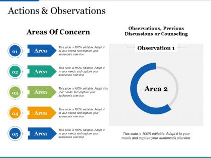
Actions and observations ppt infographics clipart images




Try Before you Buy Download Free Sample Product
 Impress Your
 Audience
 100%
100% Editable
 Save Hours
 of Time


Build on the benefits with our Actions And Observations Ppt Infographics Clipart Images. Your thoughts will have farreaching effect.
People who downloaded this PowerPoint presentation also viewed the following :
Actions and observations ppt infographics clipart images with all 5 slides:
Indulge in carefree celebration with our Actions And Observations Ppt Infographics Clipart Images. Generate a bit of joie-de-vivre.
FAQs for Actions and observations ppt
Effective infographics include clear visual hierarchy, compelling data visualizations, concise text, strategic color schemes, and logical flow that guides the reader's eye. These elements work together by simplifying complex information, enhancing comprehension through visual storytelling, and creating memorable content that audiences can quickly digest and share, ultimately delivering stronger engagement and improved information retention across diverse communication needs.
Choosing the right infographic depends on your data type, audience needs, and presentation goals, with statistical data requiring charts and graphs, processes needing flowcharts, and comparisons utilizing side-by-side layouts. Strategic alignment between content complexity and visual format enhances audience comprehension, streamlines information delivery, and ultimately strengthens message retention, with many presenters finding that matching infographic style to core objective maximizes engagement.
Effective color schemes for infographics include high-contrast combinations like navy and white, complementary palettes such as blue and orange, and monochromatic variations with strategic accent colors. These approaches enhance readability by creating clear visual hierarchy, reducing eye strain, and guiding viewer attention, with many organizations finding that strategic color choices significantly improve information retention and audience engagement across diverse demographics.
Determine important infographic data by identifying your core message, understanding your target audience's needs, and selecting statistics that directly support your key objectives. Focus on data that tells a compelling story, eliminates confusion, and drives action, while ensuring information is current, credible, and visually representable, ultimately delivering clarity and engagement for maximum impact.
Typography serves as the visual hierarchy backbone of infographics, guiding reader attention through strategic font choices, sizing, and spacing that enhance readability and comprehension. Effective typography ensures information flows logically from headlines to details, with many organizations finding that consistent, well-chosen fonts significantly improve audience engagement and message retention across marketing materials.
Balancing visual elements and text in infographics requires strategic hierarchy, with visuals carrying 70-80% of communication weight while text provides essential context and data points. Successful infographics use white space strategically, limit text to key insights and headlines, and ensure visual elements like charts, icons, and graphics directly support the narrative, ultimately delivering clearer messaging and improved audience engagement across marketing campaigns.
Common infographic mistakes include cluttered layouts, poor color schemes, inconsistent fonts, inaccurate data representation, and lack of visual hierarchy. These design pitfalls can confuse audiences and diminish message effectiveness, with many marketing teams finding that streamlined visuals, strategic color usage, and clear data storytelling ultimately deliver better engagement rates and improved information retention.
Infographics significantly enhance audience engagement by presenting complex data through visual storytelling, interactive elements, and memorable design patterns that traditional slides cannot match. While traditional presentations often overwhelm with text-heavy content, infographics streamline information processing, increase retention rates by up to 65%, and deliver more compelling narratives, ultimately creating stronger emotional connections and driving better decision-making outcomes.
Infographics enhance storytelling in presentations by transforming complex data into visual narratives, creating emotional connections through compelling imagery, and guiding audiences through logical information flows with clear visual hierarchies. Through strategic color schemes, iconography, and data visualization, presenters streamline complex concepts while maintaining audience engagement, ultimately delivering memorable stories that drive action and decision-making across organizations.
Infographics can be tailored through strategic visual design, content complexity, color schemes, cultural references, and platform-specific formatting that resonates with target demographics. By adapting data visualization styles, language complexity, imagery choices, and distribution channels, organizations effectively engage diverse audiences across age groups, industries, and cultural backgrounds, ultimately delivering more impactful communication and enhanced audience engagement.
Recommended infographic tools include Canva, Adobe Illustrator, Piktochart, Venngage, and Infogram, each offering distinct templates, design elements, and data visualization capabilities. These platforms streamline the design process by providing drag-and-drop functionality, customizable charts, and professional layouts, with many organizations finding that user-friendly tools like Canva deliver professional results without extensive design expertise.
Ensuring infographic accessibility involves using high contrast colors, readable fonts, alternative text descriptions, logical information hierarchy, and screen reader compatibility. These design principles enhance usability for visually impaired users, those with cognitive differences, and diverse learning preferences, while ultimately delivering broader audience reach and improved engagement across all demographics.
Best practices for sourcing data and statistics in infographics include using reputable government databases, peer-reviewed research studies, industry reports from recognized organizations, official corporate disclosures, and established statistical agencies like census bureaus. These sources enhance credibility by providing verified information, supporting compelling narratives, and ensuring accuracy, with many marketing teams and research organizations finding that reliable data significantly improves audience trust and engagement rates.
Incorporating branding elements into infographic design involves using consistent brand colors, typography, logos, and visual style throughout the layout, while maintaining design hierarchy and readability. Through strategic placement of brand markers, consistent color palettes, and signature design elements, organizations create cohesive visual narratives that reinforce brand recognition, enhance credibility, and ultimately deliver memorable content experiences across marketing channels.
Key metrics for evaluating infographic success include engagement rates, sharing frequency, click-through rates, audience retention time, and feedback quality from stakeholders. These performance indicators help organizations measure knowledge transfer effectiveness, brand visibility impact, and content resonance, with many finding that combining quantitative data with qualitative audience responses delivers the most comprehensive assessment of their visual communication strategy.
No Reviews