

Affinity diagram for improving customer experience ppt example





Try Before you Buy Download Free Sample Product
 Impress Your
 Audience
 100%
100% Editable
 Save Hours
 of Time


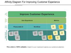
Value your customers with our affinity diagram for improving customer experience PPT template design. In case if, you want to manage your customer base for your business than this customer experience PPT diagram will help you to do so. As it involves the ideas, thoughts and ideas which are being developed by your different business teams towards the process of improving your clients experience. Use this customer experience management PowerPoint slide design to build some adequate strategies for your business which will help in enhancing your customer retention and satisfaction rate. Thus, define the various benefits of representing your customer decisions model graphically with our affinity mapping PPT image layout. It helps in improving your market reputation and also results in bringing more revenues for your company. Apart from the above, you can also use this customer experience strategy PowerPoint slide template to explain the various factors which may affect your client satisfaction rate. Therefore, bring value to your clients as well to your business structure by simply downloading this affinity diagram PPT slide design. Describe events as they actually happened with our Affinity Diagram For Improving Customer Experience Ppt Example. It helps furnish the facts.
People who downloaded this PowerPoint presentation also viewed the following :
Affinity diagram for improving customer experience ppt example with all 5 slides:
Figure out the attributes with our Affinity Diagram For Improving Customer Experience Ppt Example. Find out the characteristics desired.

FAQs for Affinity diagram for improving customer
An affinity diagram is a visual tool that groups related customer feedback, insights, and data points into meaningful clusters to identify patterns and themes. It enhances customer experience analysis by organizing vast amounts of qualitative data, revealing hidden pain points, and uncovering improvement opportunities, with many organizations finding that this systematic approach streamlines decision-making and delivers more targeted, effective customer solutions.
Affinity diagrams reveal customer pain points by clustering related feedback, survey responses, and behavioral data into meaningful themes, enabling teams to spot recurring issues and unmet needs. Through this visual grouping process, organizations systematically identify priority improvement areas, with retail companies finding that clustered customer complaints often reveal deeper service gaps, ultimately delivering more targeted solutions and enhanced customer experiences.
Affinity diagrams facilitate team collaboration by creating shared understanding of customer pain points, enabling diverse perspectives to merge into cohesive insights, and providing visual frameworks for prioritizing improvement initiatives. Through collaborative grouping sessions, cross-functional teams streamline decision-making processes, enhance communication between departments like marketing and customer service, and ultimately deliver more targeted solutions that address real customer needs.
Creating effective affinity diagrams for customer feedback involves collecting diverse feedback data, writing individual insights on sticky notes, grouping related themes without predetermined categories, labeling clusters with descriptive headers, and identifying priority patterns. This structured approach enables organizations to transform scattered customer voices into actionable insights, with many retail and service companies finding that systematic clustering reveals previously hidden pain points, ultimately delivering enhanced customer experiences and strategic improvement roadmaps.
Businesses integrate affinity diagrams with customer journey maps, personas, and feedback analytics by clustering insights from surveys, interviews, and behavioral data into thematic patterns. This strategic combination enables organizations to identify pain points across touchpoints, prioritize improvement initiatives based on customer impact, and create more targeted experience strategies, ultimately delivering enhanced satisfaction and competitive advantage.
Challenges include data overwhelming teams with excessive groupings, subjective interpretation leading to biased clusters, time-intensive sorting processes, and difficulty achieving consensus on pattern significance. While these obstacles can complicate analysis, organizations in retail, healthcare, and financial services find that structured facilitation, diverse team perspectives, and iterative refinement ultimately streamline insights and enhance customer experience strategies.
Affinity diagrams help prioritize customer experience initiatives by clustering related feedback, identifying pain point patterns, and revealing high-impact opportunity areas through visual data organization. This systematic grouping enables teams to focus resources on the most frequently mentioned issues, streamline improvement efforts across touchpoints, and ultimately deliver targeted solutions that address customer needs more strategically and efficiently.
**INPUT**: What types of customer data are most valuable when creating an affinity diagram? **OUTPUT**: Valuable customer data for affinity diagrams includes direct feedback, behavioral analytics, support interactions, survey responses, and social media insights. These data sources enable organizations to identify patterns across touchpoints, streamline customer journey mapping, and enhance service delivery, with many companies finding that combining qualitative feedback with quantitative metrics delivers deeper insights and competitive advantage.
Visual representation in affinity diagrams improves understanding of customer experiences by transforming scattered feedback into clear patterns, identifying pain points across touchpoints, and revealing emotional journeys that text alone cannot convey. Through color-coded clusters and spatial relationships, teams can quickly recognize recurring themes, prioritize improvement opportunities, and develop targeted solutions, ultimately enabling organizations to create more intuitive customer experiences.
Empathy and customer personas serve as foundational elements in affinity diagram development, enabling teams to group insights from authentic customer perspectives, identify genuine pain points, and prioritize solutions based on real user needs rather than assumptions. Through persona-driven empathy mapping, organizations in sectors like retail, healthcare, and financial services can create more targeted customer experience improvements, ultimately delivering personalized solutions and enhanced satisfaction rates.
Affinity diagrams can be adapted for real-time customer feedback through digital collaboration tools, live clustering during feedback sessions, and rapid categorization of incoming responses during events or product launches. While traditional affinity mapping requires reflection time, teams can streamline the process by assigning dedicated members to sort feedback into emerging themes as it arrives, enabling immediate pattern recognition and faster response to customer concerns, ultimately delivering more responsive customer experiences.
Cultural differences significantly impact affinity diagrams through varying communication styles, decision-making processes, hierarchy expectations, and problem-solving approaches that influence how team members group and categorize insights. Through culturally-aware facilitation and diverse team composition, organizations across global markets streamline cross-cultural collaboration, enhance inclusive design thinking, and ultimately deliver more comprehensive customer experiences that resonate across different cultural contexts.
Common mistakes include rushing the grouping process, forcing data into predetermined categories, allowing personal biases to influence clustering, and creating too many or too few groupings. These errors can lead to misinterpreted customer insights, with many organizations finding that systematic approaches, diverse team perspectives, and iterative refinement deliver more accurate customer experience mapping and actionable improvement strategies.
Digital tools streamline affinity diagram creation through automated data collection, real-time collaboration platforms, AI-powered pattern recognition, and interactive clustering features. These technologies enable customer experience teams to rapidly process feedback from surveys, social media, and support interactions, while facilitating remote collaboration and generating deeper insights that ultimately enhance customer satisfaction and strategic decision-making.
Customer experience affinity diagrams generate metrics including customer satisfaction scores, pain point frequency, journey completion rates, support ticket volume by category, and Net Promoter Score improvements. These grouped insights enable organizations to track resolution effectiveness, measure experience enhancement initiatives, and prioritize resource allocation, with many companies finding that targeted improvements based on clustered feedback deliver measurable increases in customer retention and operational efficiency.
-
Great product with highly impressive and engaging designs.
-
Great product with effective design. Helped a lot in our corporate presentations. Easy to edit and stunning visuals.