


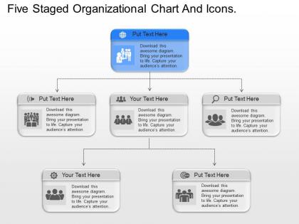
Al five staged organizational chart and icons powerpoint template




Try Before you Buy Download Free Sample Product
 Impress Your
 Audience
 100%
100% Editable
 Save Hours
 of Time


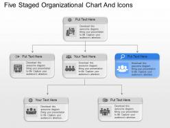
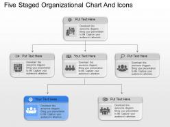
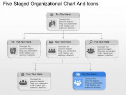
If you need an organizational charts and icons to help experts to make an organization structure PowerPoint template then our organization chart and icons PowerPoint template slides plans assist business officials with pointing up parts and duties of representatives working at various levels of hierarchical chain of command. Moreover, utilizing our presentation illustrations you can make compelling visual correspondence about chain of expert, errand portion, obligations, coordination and supervision. To put it plainly, with help of these PowerPoint topics you can make an organization structure diagram that unmistakably shows a review of your worker's operational quality. To make an organization graph exhibit more exact and fabulous here we have displayed selective PPT thoughts like of distinguish reason and objective introduction visuals, creating authoritative procedure, variables influencing hierarchical plan, biological system of progress and so forth. Just fastidiously look down to ensure you don't pass up a great opportunity any of these dazzling high determination business structure graphs. So download this readymade al five staged organizational chart and icons PowerPoint template. Equip them adequately with our al Five Staged Organizational Chart And Icons Powerpoint Template. They will feel more enlightened.
People who downloaded this PowerPoint presentation also viewed the following :
Al five staged organizational chart and icons powerpoint template with all 9 slides:
Develop greater access with our al Five Staged Organizational Chart And Icons Powerpoint Template. Acquire broader coverage for your views.
FAQs for Al five staged organizational chart and
Five-staged organizational charts in PowerPoint presentations enhance clarity by breaking complex hierarchies into digestible phases, streamline communication across departments, and enable dynamic storytelling of organizational evolution. These structured templates facilitate strategic planning sessions, merger presentations, and growth roadmaps, with many executives finding that phased visualization improves stakeholder comprehension and accelerates decision-making processes.
A five-staged organizational chart enhances structural clarity by visually mapping hierarchical levels, departmental relationships, reporting lines, communication flows, and decision-making pathways in a systematic format. This comprehensive visualization enables employees to understand their roles within the broader organization, streamlines workflow coordination, and facilitates strategic planning, with many companies finding that clear structural representation ultimately improves operational efficiency and organizational alignment.
Organizations undergoing significant growth transitions, mergers and acquisitions, or complex project implementations typically benefit most from five-staged organizational chart templates. These include expanding startups scaling their workforce, healthcare systems integrating multiple facilities, manufacturing companies implementing lean processes, and consulting firms managing multi-phase client engagements, ultimately delivering clearer role definition and streamlined communication pathways.
Yes, a five-staged organizational chart effectively illustrates leadership hierarchies and reporting relationships by providing clear visual layers for executive leadership, senior management, department heads, team leaders, and front-line employees. This structured approach streamlines communication flows, clarifies accountability chains, and enhances operational efficiency, with many organizations finding that well-defined hierarchical visualization ultimately delivers improved decision-making processes and stronger organizational alignment.
Visual appeal significantly enhances audience engagement by capturing attention, improving information retention, and creating professional credibility that keeps viewers focused throughout presentations. Well-designed templates like organizational charts streamline complex hierarchical information, reduce cognitive load, and enable presenters to communicate structure more effectively, with many organizations finding that visually compelling presentations generate better stakeholder buy-in and decision-making outcomes.
**INPUT**: What design elements should be included in a five-staged organizational chart for optimal readability? **OUTPUT**: Essential design elements include clear hierarchical spacing, consistent color coding across stages, readable font sizes, distinct connecting lines, and balanced visual proportions between sections. These elements enhance comprehension by creating logical flow patterns, reducing visual clutter, and enabling quick navigation through complex organizational structures, with many companies finding that strategic color differentiation and uniform spacing ultimately deliver improved stakeholder understanding and operational clarity.
Yes, five-staged organizational chart templates are highly customizable, allowing you to modify hierarchy levels, departmental structures, reporting relationships, color schemes, and formatting to match your specific organizational design. These templates enable seamless adaptation for various industries, from healthcare systems with multiple service divisions to manufacturing companies with regional operations, ultimately delivering visual clarity that enhances communication and streamlines organizational understanding across all stakeholder levels.
Animations and transitions enhance five-staged organizational charts by revealing each stage sequentially, using fade-ins, slide transitions, and progressive disclosure to maintain audience focus. These visual techniques help presenters control information flow, emphasize hierarchical relationships, and guide viewers through complex organizational structures, ultimately delivering clearer communication and more engaging presentations that enhance audience comprehension.
Presenters should establish clear context by explaining the progression logic, use visual cues to guide attention through each stage, and connect roles to strategic objectives rather than just titles. Interactive elements like highlighting current stage focus, pausing for questions between transitions, and relating organizational evolution to business outcomes helps audiences grasp structural relationships, ultimately delivering enhanced comprehension and stakeholder buy-in across complex organizational frameworks.
A five-staged organizational chart provides multi-dimensional visualization of hierarchies, reporting relationships, departmental connections, growth phases, and strategic alignment, while traditional single-layer charts show only basic reporting structures. These comprehensive charts enable organizations to visualize complex matrix relationships, cross-functional dependencies, and operational workflows more effectively, with many enterprises finding that multi-staged approaches streamline decision-making processes and enhance organizational transparency.
Essential features include smart connectors for automatic line adjustments, hierarchical layout tools, customizable shape libraries, data linking capabilities, and real-time collaboration functions. These PowerPoint tools streamline chart creation by enabling drag-and-drop positioning, automatic formatting consistency, and seamless updates across all five stages, ultimately delivering professional organizational visuals that enhance strategic planning and improve stakeholder communication.
Colors and shapes in organizational charts communicate hierarchy, relationships, and functional distinctions, with darker colors typically representing senior leadership, lighter shades indicating junior roles, and geometric shapes like rectangles, circles, and diamonds conveying different departmental functions or authority levels. These visual elements enable viewers to quickly understand reporting structures, identify decision-making pathways, and recognize cross-functional relationships, ultimately enhancing organizational transparency and communication effectiveness.
**INPUT**: Are there any potential drawbacks to using a five-staged organizational chart in certain presentations? **OUTPUT**: Five-staged organizational charts can present challenges when displaying simple structures, overwhelming audiences with unnecessary complexity, or misrepresenting non-linear organizational relationships. While these templates work well for large corporations and multi-departmental institutions, smaller organizations may find that simplified formats better serve their presentation goals, ultimately delivering clearer communication and enhanced audience engagement.
Presenters can incorporate feedback mechanisms by using interactive polling during each stage transition, implementing real-time Q&A sessions, and creating breakout discussions around specific organizational levels. These approaches enable audience engagement through digital feedback tools, structured comment periods, and collaborative workshops, with many organizations finding that interactive organizational presentations deliver enhanced stakeholder buy-in and strategic alignment.
Healthcare systems, financial services, manufacturing companies, technology startups, and consulting firms have successfully utilized five-staged organizational charts to illustrate growth trajectories, departmental evolution, and strategic restructuring initiatives. These industries find that staged organizational presentations effectively communicate transformation timelines, merger integrations, and expansion phases to stakeholders, ultimately delivering clearer strategic vision and enhanced organizational transparency.
-
Best Representation of topics, really appreciable.
-
Excellent template with unique design.