Annual Revenue And Cost Budget Gap KPI Dashboard

Rating:
90%
Annual Revenue And Cost Budget Gap KPI Dashboard Annual Revenue And Cost Budget Gap KPI Dashboard
Slide 1 of 7

or

Favourites Favourites

Try Before you Buy Download Free Sample Product

Audience Impress Your
Audience
Editable 100%
Editable
Time Save Hours
of Time
The Biggest Sale is ending soon in
0
0
:
0
0
:
0
0
Rating:
90%
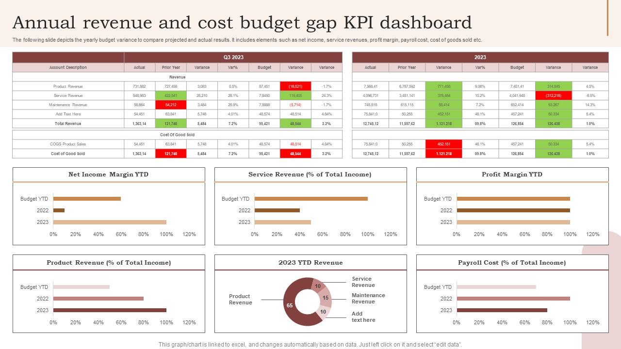
The following slide depicts the yearly budget variance to compare projected and actual results. It includes elements such as net income, service revenues, profit margin, payroll cost, cost of goods sold etc. Introducing our Annual Revenue And Cost Budget Gap KPI Dashboard set of slides. The topics discussed in these slides are Service Revenue, Net Income Margin, Product Revenue. This is an immediately available PowerPoint presentation that can be conveniently customized. Download it and convince your audience.

FAQs for Annual Revenue And Cost Budget

Effective KPI dashboard components include real-time data visualization, customizable metrics display, drill-down capabilities, automated alerts, and mobile accessibility. These elements streamline performance monitoring by providing instant insights, enabling quick decision-making, and facilitating cross-departmental transparency, with many organizations finding that well-designed dashboards enhance operational efficiency and strategic alignment.

Choose KPIs by aligning metrics with your strategic business objectives, focusing on actionable data that drives decision-making, and selecting indicators that measure performance across key areas like revenue, customer satisfaction, operational efficiency, and growth targets. Effective dashboards combine leading indicators with lagging metrics, enabling organizations to track progress while anticipating future trends, ultimately delivering enhanced visibility and competitive advantage through data-driven insights.

Best practices for designing visually appealing KPI dashboards include using clean layouts, consistent color schemes, appropriate chart types, clear hierarchies, and intuitive navigation. These design principles streamline decision-making by reducing cognitive load, enhancing data comprehension, and enabling quick performance assessments, with many organizations finding that well-designed dashboards significantly improve executive reporting and operational efficiency.

KPI dashboards should be updated based on data criticality and business needs, with real-time updates for operational metrics, daily updates for sales and customer data, and weekly or monthly updates for strategic indicators. Financial services and retail organizations often find that automated, frequent updates enhance decision-making speed and accuracy, ultimately delivering competitive advantage through timely insights.

Data visualization transforms raw KPI data into intuitive charts, graphs, heat maps, and interactive elements that enable instant pattern recognition and trend analysis. Through strategic visual design, executives and managers can quickly identify performance gaps, spot emerging opportunities, and make data-driven decisions faster, ultimately enhancing organizational responsiveness and competitive advantage.

**INPUT**: How can I ensure my KPI dashboard is user-friendly and accessible? **OUTPUT**: Ensure KPI dashboard user-friendliness through intuitive navigation, clear visual hierarchy, consistent color schemes, responsive design, and accessible fonts. These design principles streamline data interpretation by minimizing cognitive load, enhancing mobile compatibility, and supporting diverse user needs, with many organizations finding that well-designed dashboards ultimately deliver faster decision-making and improved operational efficiency. **Word count: 54 words**

Common pitfalls include overcrowding dashboards with excessive metrics, using unclear visualizations, lacking stakeholder input, ignoring mobile responsiveness, and failing to align KPIs with strategic objectives. These issues undermine dashboard effectiveness by creating confusion, reducing user adoption, and delivering misleading insights, with many organizations finding that simplified, stakeholder-driven designs ultimately enhance decision-making and operational efficiency.

KPI dashboard integration involves connecting APIs, database queries, automated data feeds, cloud connectors, and ETL processes to consolidate information from various systems. Through platforms like Tableau, Power BI, or custom solutions, organizations streamline reporting by eliminating manual data collection, ensuring real-time accuracy, and creating unified views that enhance decision-making across departments.

Leading KPIs predict future performance through metrics like pipeline value, employee engagement scores, and customer acquisition rates, while lagging KPIs measure past results including revenue, profit margins, and customer retention. Dashboard representation should position leading indicators prominently with trend analytics and forecasting visuals, alongside lagging metrics displayed through comparative charts, enabling organizations to balance strategic foresight with performance accountability.

Predictive analytics transforms KPI dashboards by forecasting future trends, identifying potential risks, and recommending proactive actions based on historical data patterns. Through machine learning algorithms and statistical modeling, organizations can anticipate market shifts, predict customer behavior, and optimize resource allocation, ultimately delivering strategic foresight and competitive advantage in increasingly data-driven business environments.

Tools for creating customizable KPI dashboards include Tableau, Power BI, Google Data Studio, Klipfolio, and Sisense, along with specialized platforms like Geckoboard and Databox. These solutions enable organizations to streamline data visualization, automate reporting processes, and enhance decision-making capabilities across departments, with many businesses finding that integrated dashboards deliver improved operational efficiency and faster strategic insights.

KPI dashboard effectiveness is measured by tracking user adoption rates, decision-making speed improvements, data accuracy levels, and goal achievement percentages against baseline metrics. Organizations typically assess whether executives access dashboards regularly, make faster strategic decisions, and achieve targeted business outcomes, with many finding that effective dashboards reduce reporting time by 40-60% while improving performance visibility.

**INPUT**: What approaches can I take to ensure that my team engages with the KPI dashboard regularly? **OUTPUT**: Effective engagement approaches include establishing regular review meetings, setting role-specific access permissions, creating automated alerts for critical metrics, implementing gamification elements, and providing comprehensive training sessions. These strategies enhance adoption by making dashboards relevant to daily workflows, enabling proactive decision-making, and fostering accountability, with many organizations finding that consistent leadership modeling and celebrating data-driven wins ultimately delivers sustained engagement and improved performance outcomes.

Tailor KPI dashboards by customizing metrics, visualization depth, and data granularity for each stakeholder's role and decision-making needs. Executive dashboards emphasize high-level strategic metrics and trends, while operational managers require detailed performance data and real-time alerts, ultimately enabling targeted insights that drive relevant actions across organizational levels.

Industry-specific metrics include customer acquisition cost and lifetime value for retail, patient readmission rates and bed occupancy for healthcare, loan default rates and processing times for banking, and production efficiency and quality scores for manufacturing. These targeted KPIs enable organizations to monitor critical performance drivers unique to their sector, ultimately delivering more strategic insights and competitive advantage than generic business metrics alone.

Ratings and Reviews

90% of 100
Review Form
Write a review
Most Relevant Reviews
  1. 100%

    by Daniel Robinson

    A fantastic collection of templates. I'll likely use this as my go-to resource for future templates and support.
  2. 80%

    by Clair Gray

    Best way of representation of the topic.

2 Item(s)

per page: