


Assessment And Evaluation Monotone Icon In Powerpoint Pptx Png And Editable Eps Format




Try Before you Buy Download Free Sample Product
 Impress Your
 Audience
 100%
100% Editable
 Save Hours
 of Time


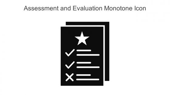
This Assessment and evaluation monotone icon in powerpoint pptx png and editable eps format is a 100 percent editable icon. The downloaded file will have this icon in EPS, PNG and Powerpoint pptx format and is perfect for your next project. It has a simple yet stylish design.
People who downloaded this PowerPoint presentation also viewed the following :
Assessment And Evaluation Monotone Icon In Powerpoint Pptx Png And Editable Eps Format with all 6 slides:
Use our Assessment And Evaluation Monotone Icon In Powerpoint Pptx Png And Editable Eps Format to effectively help you save your valuable time. They are readymade to fit into any presentation structure.





FAQs for Assessment And Evaluation Monotone Icon In Powerpoint Pptx Png And
Effective assessment evaluation icons include clear visual hierarchy, intuitive symbols like checkmarks or progress bars, consistent color coding for different performance levels, scalable design elements, and recognizable metaphors such as stars or grades. These components work together by ensuring immediate comprehension, maintaining visual consistency across platforms, and enabling quick decision-making, with many organizations finding that well-designed icons significantly enhance user engagement and streamline evaluation processes.
Assessment evaluation icons enhance presentation clarity by providing instant visual recognition of performance levels, progress indicators, rating scales, feedback categories, and measurement criteria. These visual elements streamline complex data interpretation, reduce cognitive load for audiences, and enable faster decision-making processes, with many organizations finding that standardized iconography significantly improves stakeholder comprehension and engagement rates.
Color theory enhances assessment evaluation icons through strategic use of red-green scales for pass-fail indicators, warm colors like orange for progress states, and cool blues for informational elements. Educational platforms and corporate training systems leverage these psychological associations to create intuitive visual hierarchies, with many organizations finding that consistent color coding significantly improves user comprehension and reduces assessment completion time.
Cultural differences significantly influence icon interpretation through varying visual literacy traditions, symbolic meanings, color associations, and reading patterns across different societies. While Western cultures may interpret checkmarks as positive, other cultures might prefer different symbols, with many international organizations finding that culturally-neutral icons and localized design elements ultimately deliver more accurate assessments and inclusive user experiences.
Common mistakes when designing assessment evaluation icons include using overly complex details, inconsistent visual styles, unclear symbolism, poor color contrast, and inadequate scalability across different sizes. These design flaws confuse users and reduce accessibility, with many educational institutions and corporate training programs finding that simple, universally recognizable symbols with consistent styling ultimately deliver clearer communication and better user experiences.
Icons facilitate understanding of complex assessment metrics by translating numerical data into intuitive visual symbols, using color coding for performance levels, and creating standardized representations that transcend language barriers. Through visual hierarchy and immediate recognition patterns, organizations streamline data interpretation across departments, enabling faster decision-making and clearer communication of performance insights, ultimately enhancing strategic assessment processes.
Visual hierarchy and layout significantly enhance assessment evaluation icons by guiding attention, establishing clear information flow, and ensuring intuitive navigation through evaluation data. Through strategic positioning, size variation, and color contrast, organizations streamline decision-making processes, reduce cognitive load, and improve user comprehension, with many educational institutions and corporate training departments finding that well-structured layouts ultimately deliver faster assessments and better user experiences.
User feedback integration involves conducting usability testing, analyzing click-through patterns, gathering accessibility reviews, and implementing iterative design cycles based on user interactions with assessment icons. Through surveys, focus groups, and A/B testing methodologies, designers can identify which visual elements resonate most effectively with educators and students, ultimately delivering more intuitive assessment interfaces and enhanced user experiences across educational platforms.
Best practices include maintaining visual consistency with existing design elements, using intuitive symbols that align with assessment categories, ensuring adequate sizing for readability, and strategically placing icons near relevant content sections. These approaches enhance audience comprehension by providing immediate visual cues, reducing cognitive load during data interpretation, and creating professional presentations that facilitate clearer communication of evaluation outcomes and performance metrics.
Animated icons improve engagement by drawing attention to key assessment metrics, guiding viewers through complex data flows, and making statistical information more visually digestible. These dynamic elements help presenters highlight critical performance indicators, demonstrate progress over time, and simplify complex evaluation processes, with many educational institutions and corporate training departments finding that strategic animation ultimately enhances information retention and audience focus.
Text-based assessments excel in complex evaluations requiring detailed explanations, critical thinking, and nuanced responses, while icon-based assessments are more effective for quick comprehension checks, visual learners, and cross-cultural environments. Educational institutions and corporate training programs increasingly find that combining both approaches enhances engagement and accessibility, ultimately delivering more comprehensive evaluation outcomes across diverse learning styles.
Assessment evaluation icons streamline data interpretation by providing instant visual recognition of performance levels, progress indicators, quality ratings, and outcome categories across complex datasets. These standardized symbols enable stakeholders to quickly identify critical insights, track trends, and make informed decisions without parsing through detailed reports, ultimately delivering faster analysis and enhanced communication efficiency in organizational reviews.
Adobe Illustrator, Figma, Sketch, Canva, and Iconify are most effective for creating custom assessment evaluation icons, offering vector capabilities, comprehensive symbol libraries, and collaborative features. These platforms streamline icon development by providing scalable graphics, consistent design systems, and template resources, with many educational institutions and corporate training departments finding that vector-based tools ultimately deliver professional, adaptable icons for diverse assessment formats.
Icons enhance accessibility by providing visual cues that support diverse learning styles, reduce language barriers, and help users with cognitive or reading difficulties quickly comprehend information. In educational settings and corporate training, well-designed assessment icons enable faster content recognition, improve navigation for users with disabilities, and create more inclusive presentation experiences, ultimately delivering clearer communication and broader audience engagement across organizations.
Different shapes in assessment evaluation icons carry distinct psychological meanings: circles suggest completeness and cycles, squares represent stability and structure, triangles indicate progress and hierarchy, checkmarks denote completion, and stars symbolize excellence. These visual elements enhance user comprehension by creating intuitive associations, with educational platforms and corporate training systems finding that thoughtfully designed icons improve navigation efficiency and reduce cognitive load during assessment processes.
-
I was confident and well prepared for my presentation for the first time ever. With SlideTeam’s templates, I could deliver one of my best presentations. Will be coming back for more!
-
Commendable slides with attractive designs. Extremely pleased with the fact that they are easy to modify. Great work!