

Audit kpi dashboard showing lead time average entry variance and amount contribution




Try Before you Buy Download Free Sample Product
 Impress Your
 Audience
 100%
100% Editable
 Save Hours
 of Time


Join the clues with our Audit Kpi Dashboard Showing Lead Time Average Entry Variance And Amount Contribution. Interlink the diverse information available.
People who downloaded this PowerPoint presentation also viewed the following :
Content of this Powerpoint Presentation
Description:
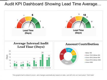
The image is of a PowerPoint slide titled "Audit KPI Dashboard Showing Lead Time Average..." which contains various data visualization tools to present key performance indicators (KPIs) related to audit lead times and amount contributions.
The slide includes the following elements:
1. Two speedometer-like gauges indicating lead time in days. The first gauge shows a lead time of 6 days, and the second shows 18 days.
2. A bar graph labeled "Average Internal Audit Lead Time (Days)" with bars representing different months.
3. A doughnut chart labeled "Amount Contribution" that segments contributions into various ranges with associated percentages.
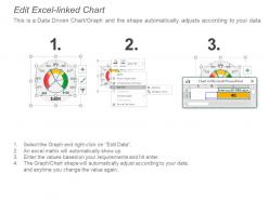
4. Each chart includes a note that it is linked to Excel and can be updated by editing the data.
Use Cases:
This slide could be utilized in a variety of industries for performance tracking, including:
1. Finance:
Use: Monitoring audit efficiency.
Presenter: Chief Financial Officer
Audience: Audit committee, financial analysts
2. Manufacturing:
Use: Tracking production lead times.
Presenter: Operations Manager
Audience: Production team, management
3. Retail:
Use: Evaluating supply chain efficiency.
Presenter: Supply Chain Director
Audience: Vendors, internal management
4. Healthcare:
Use: Assessing patient care process times.
Presenter: Healthcare Administrator
Audience: Medical staff, department heads
5. IT Services:
Use: Measuring response times for service requests.
Presenter: IT Service Manager
Audience: IT support staff, service management team
6. Consulting:
Use: Reviewing project delivery timelines.
Presenter: Senior Consultant
Audience: Clients, project teams
7. Education:
Use: Analyzing administrative process efficiency.
Presenter: School Administrator
Audience: Educational staff, school board
Audit kpi dashboard showing lead time average entry variance and amount contribution with all 6 slides:
Instil a feeling of awe with our Audit Kpi Dashboard Showing Lead Time Average Entry Variance And Amount Contribution. Folks will express a high degree of admiration.
FAQs for Audit kpi dashboard showing lead time average entry variance
So you'll definitely want to track audit completion rates and how long each audit takes. Findings by severity level is huge too - plus what percentage are repeat issues (that one's honestly pretty depressing sometimes). Budget variance and team utilization are the boring but necessary ones. The findings trend over time though? That's where the real story is. Shows whether you're actually moving the needle on risk stuff. Oh, and don't forget management response times to your recommendations. Track how many high-risk findings get fixed within your target windows too. Start with these basics - you can always pile on more metrics later based on what leadership actually cares about.
Definitely go with interactive dashboards that update in real-time. Color coding is your friend for risk levels, and trend lines will show audit progress clearly. Heat maps are actually amazing for this stuff - you can see department coverage patterns instantly, which saves tons of time. Put your most important metrics right at the top: overdue findings, cycle times, risk ratings. Add drill-down features so people can click into specific issues when they need details. The whole point is someone should be able to glance at it and immediately know what's urgent and what's not.
Dude, real-time data changes everything for audit dashboards. You'll catch problems while they're actually happening instead of finding out weeks later from some dusty report. Honestly, I can't go back to static reports now - feels like flying blind. Set up alerts for your most critical KPIs so your phone buzzes the second something goes sideways. That way you can jump on issues before they turn into total disasters. It's basically like having your finger on the pulse of everything... well, assuming your data feeds don't randomly break on you.
First thing - nail down who owns each KPI and where the data actually comes from. Trust me, you don't want to be that person finding out your completion rates were garbage for three months straight! Get automated checks running to catch weird outliers before they show up on dashboards. Cross-check your dashboard against source systems regularly, and write down how you're calculating stuff (future you will thank you). Oh, and sit down with data owners every quarter to make sure nothing's changed. Processes shift all the time and nobody tells the data people.
Don't cram everything onto one screen - I've learned this the hard way. People just get overwhelmed and stop using it entirely. Also skip the vanity metrics that look cool but tell you nothing useful. Like "number of audits completed" - who cares if they're all garbage quality, right? Focus on maybe 5-6 metrics that actually connect to audit effectiveness and real business outcomes. Keep your visualizations super clear. Honestly, test it with actual users first before going live - they'll catch stuff you missed. Start basic and build from there based on feedback.
Honestly, these dashboards are game-changers for spotting compliance issues fast. You'll see stuff like overdue fixes, controls that keep failing, repeat audit problems - all in real time. Way better than drowning in Excel sheets, trust me. The visual setup lets you catch red flags instantly, plus you can spot weird patterns like certain teams always missing deadlines. I'd definitely set up alerts for the critical stuff so problems don't snowball. The trending info is pretty solid for figuring out what risks to tackle first.
So for your dashboard, track cycle times and cost per hour - that's the basics. Internal audits usually cover more day-to-day operations while external ones focus on financial stuff. Honestly, internal teams tend to get better satisfaction scores since they actually understand how your company works. You'll want to measure audit quality too through defect rates and what regulators say. Finding resolution rates are clutch. Set up those metrics side by side so you can see which type of audit is actually worth it. Oh and don't forget coverage scope - that tells you a lot about where you're getting value.
Yeah, you can totally customize these things! Most dashboards let you filter data and pick which KPIs to show. Time periods are adjustable too. Drag and drop widgets around, switch up chart types - pretty standard stuff. Honestly though, some platforms are way better at this than others, so you might get stuck with whatever your company picked. Start by figuring out what decisions you're actually trying to make, then build around those data points. Oh, and create separate views for different people - your exec team wants the big picture while audit managers need all the nitty-gritty details.
Honestly, I'd go with Power BI first - integrates nicely with most audit systems and won't break the bank. Tableau's solid but yeah, expensive as hell once you scale up. Excel works fine if your data's pretty straightforward, though it gets messy fast with complex stuff. Qlik Sense is decent for real-time data if that's what you need. But here's the thing - whatever your team already knows how to use is probably your best starting point. Don't overthink it. Run a quick pilot with tools you've got licenses for already, see what sticks. Half the battle is just getting people to actually open the damn dashboard.
Monthly updates are probably your sweet spot, unless your audit cycles run quarterly - then match that instead. Real-time sounds fancy but audit metrics barely budge day-to-day anyway, so why stress about it? Think about when leadership actually reviews this stuff. If they're looking monthly, then update monthly. Pretty straightforward. Don't make it more complicated than it needs to be - I've seen people obsess over dashboards nobody even opens. Start with monthly and see if people are actually using it to make decisions. You can always tweak the timing later if it's not hitting right.
Look, predictive analytics basically turns your audit dashboard into a fortune teller - you'll spot problems before they blow up. Instead of reacting to last quarter's mess, you can see which departments are heading for trouble. Budget overruns, compliance fails, weird patterns that usually mean bad news? Your dashboard flags them early. Honestly, it's pretty game-changing for deciding where to focus your team's energy. The trick is figuring out your most common failure patterns first - that's where you'll get the most bang for your buck building these forecasting models. Way better than playing catch-up all the time.
So basically these dashboards give everyone a shared view of what's happening with audits in real-time. No more drowning in "hey what's the update on project X?" emails - thank god. Your stakeholders can actually see timelines and findings themselves instead of bugging your team constantly. Plus you can catch bottlenecks and issues early before they blow up. The automated alerts are clutch too - sends notifications to the right people when deadlines hit or action items come up. It just becomes this central hub where all the audit conversations and decisions happen. Way cleaner than juggling spreadsheets and email threads.
Look, benchmarking basically gives your audit KPIs some real meaning. Otherwise you're just staring at random numbers that don't tell you anything useful. Compare your stuff against industry standards or similar organizations - that's how you figure out if you're actually crushing it or totally behind. Think of it like... trying to know if you're fast without seeing what everyone else runs, you know? Historical data works too if you can't find good comparables. The whole point is setting realistic goals and spotting what the top performers do differently. I'd start with finding 2-3 organizations that are actually similar to yours.
Try turning qualitative stuff into visual indicators or simple scoring systems next to your numbers. Traffic light systems are honestly pretty clutch for this - way easier than overcomplicating it. Add comment boxes for big findings, use color codes for audit themes, maybe throw in some trend arrows showing if control effectiveness is getting better or worse. Brief narrative summaries work too, or risk ratings that actually complement your hard data. The trick is not letting qualitative insights get buried under everything else. They should help tell the story your numbers are already showing, not fight against it.
Start with making sure people can actually find what they need - clean layout, obvious navigation. Color-code your risk levels consistently and put the important stuff where they'll see it right away. Filters need to be easy to spot too. God, I've seen dashboards that are just chart vomit everywhere! Keep your drill-down paths simple so auditors can go from big picture to details without getting lost. Oh, and definitely test with real users first - they'll spot weird stuff you'd never notice. Trust me on that one.
-
Great product with highly impressive and engaging designs.
-
Topic best represented with attractive design.