

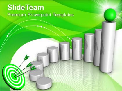
Bar Graphs And Histograms Success Powerpoint Templates Themes
You must be logged in to download this presentation.




Try Before you Buy Download Free Sample Product
 Impress Your
 Audience
 100%
100% Editable
 Save Hours
 of Time


Use the power of visualization to create powerful stories that hit the mark. This you can only achieve with our Bar Graphs And Histograms Success Powerpoint Templates Themes.
People who downloaded this PowerPoint presentation also viewed the following :
Bar Graphs And Histograms Success Powerpoint Templates Themes with all 3 slides:
Our Bar Graphs And Histograms Success Powerpoint Templates Themes will give you a different look. Exhibitan air of confidence.
FAQs for Bar Graphs And Histograms Success
So bar graphs are for comparing different categories - like sales by region or whatever. The bars have gaps between them. Histograms are totally different though - they show continuous data like age ranges or test scores, and the bars actually touch each other. That touching part matters because it shows the data flows from one range to the next. I always mess this up in presentations tbh. Just make sure you're spacing your bars right depending on what type of data you've got. Categories = gaps, continuous data = no gaps.
Honestly, templates are lifesavers for data presentations. You get clean bar charts and histograms that actually make sense instead of people glazing over at spreadsheet dumps. The colors and fonts are already figured out - no more of those hideous rainbow disasters we've all sat through. Just find one that fits your data type and drop in your numbers. Trends pop out way easier when everything's formatted right. Your audience can spot patterns and weird outliers without squinting. Makes you look like you know what you're doing too, which is always a bonus.
Go with high-contrast colors - blues, oranges, greens work great. Just don't do red and green together since colorblind people can't tell them apart. Skip the fancy 3D effects and gradients, they're honestly pretty tacky now and make everything harder to read. Make sure your text is big enough that people in the back can actually see it. Space your bars consistently too. Oh and definitely test it on the actual projector beforehand if you can - I learned this the hard way when my "perfect" colors looked completely washed out during my presentation!
Bar graphs are for comparing different categories - like survey results or sales by department. Histograms show distributions of continuous data (ages, test scores, that kind of thing). The visual difference is pretty obvious once you notice it: bar graphs have spaces between bars since the categories are separate, but histogram bars touch because the data connects. Honestly, histograms confuse people way more than they should. Quick test for your PowerPoint - are you comparing distinct groups or showing how data is distributed? That'll tell you which one to use.
Try "Wipe" or "Fly In" animations to reveal each bar individually - builds nice suspense. The "Grow/Shrink" effect is honestly my favorite because bars literally grow from zero, which just feels right for data. You can animate different series separately if you're comparing categories. Don't get tempted by those bouncy effects though, they're distracting as hell. Set timing to "After Previous" with maybe 0.5-1 second delays between bars. Oh and definitely practice the timing beforehand - nothing worse than frantically clicking through slides while people are watching.
Ugh, don't use those cheesy 3D effects - they're so 2005 and make your data look weird. Space your bars evenly and pick colors that actually show up against your background. I learned this the hard way once when half my chart disappeared on the projector. Keep it simple - cramming tons of data just confuses people. Start your y-axis at zero (unless you've got a solid reason not to), make your labels clear, and for the love of all that's holy, use fonts people can actually read. Oh, and always test it on the screen you're presenting with first.
First thing - figure out your min and max values, then break that range into maybe 5-10 chunks that actually make sense. Round numbers are your friend here because nobody wants to decode 47.382 on a chart. Always start your scale at zero unless there's some compelling reason not to (trust me, people will call you out if the proportions look wonky). I learned this the hard way in a meeting once. Quick test: show it to someone for 5 seconds. Can they get the main point? If they're confused about what they're looking at, your scale needs work.
Dude, seriously - labels and legends will save your charts from being completely useless. Without them you're just showing people random colored bars that could mean literally anything. I learned this the hard way during a work presentation once, oof. Make your axis labels super specific too - like "Monthly Revenue (Thousands)" instead of just "Data" or whatever. Your legend needs to explain what each color means. Honestly, the best test is whether someone could look at your chart and get it immediately without you standing there explaining everything. Trust me on this one.
Honestly, the easiest way is linking your PowerPoint charts to Excel spreadsheets that pull live data. Create your chart through Insert > Chart, then right-click "Edit Data" to open the linked Excel sheet. From there you can connect to databases, APIs, or CSV files that refresh regularly. PowerPoint's kinda clunky for real-time updates since it's really just a presentation tool, but the Excel connection does the heavy lifting. Oh, and don't forget to set your refresh intervals in Excel - otherwise you'll be stuck with stale data every time you open the deck.
Honestly, templates are a lifesaver. They come with all the color schemes and spacing figured out already, so you don't have to mess around with that stuff for hours. I used to spend way too much time just moving legends around and picking fonts - such a waste. The readability thing is huge too since they position everything where people expect to see it. Your whole presentation ends up looking consistent instead of like a hot mess. Just plug in your data and you're good to go. Way more polished than anything I could design myself.
Tell a story with your numbers instead of just dumping data on them. Colors should highlight the important stuff - make those key findings jump out. Animation works great (just don't go crazy with it lol). Build your charts step by step so they can actually follow along. I always throw in questions to keep people awake and engaged. The real trick though? Connect everything back to stuff they actually care about in their daily lives. You want them walking away thinking "damn, that actually affects me."
Honestly, just use Excel first - way better charts than PowerPoint's basic stuff, and you can copy-paste right over. If you need something fancier, Tableau Public is amazing for interactive dashboards but it's kinda tricky to learn at first. Google Sheets is perfect when you're working with other people since everyone can edit together. Power BI's decent too if your work already has Microsoft everything. I've even seen people do cool stuff with Python matplotlib, though that might be overkill lol. But yeah, Excel's your best bet to start.
First thing - hit up Design > Variants > Colors and either grab a preset or make your own palette that actually fits your brand. Fonts are under that same menu too. For the charts themselves, just right-click the bars and go to "Format Data Series" - that's where you can mess with colors, add gradients, change spacing, whatever. Honestly, the default stuff always looks super bland anyway, so might as well make it yours. Oh, and once you've got it looking good, save it as a template so you don't have to do this whole dance again next time.
So basically, stacked bar graphs are clutch when you need to show totals AND what makes up those totals. Like if you're looking at quarterly sales - you can see the overall numbers plus how each region or product contributed. Regular bars can't pull that off. They're money for budget stuff, demographics, or when people keep asking "okay but WHY are the numbers like that?" Just make sure your colors actually look different - I've seen too many where everything blends together and nobody can read it. The labels matter too, obviously.
When you put histograms next to each other, you'll catch patterns you'd never see otherwise. Similar distributions become obvious. Outliers jump out across different categories. You can watch how your data shifts between conditions too - honestly it's way more effective than trying to describe everything with numbers. Just make sure your scales and bin sizes match up, otherwise you're comparing apples to oranges. I usually arrange them chronologically or by group size so people can actually follow what's happening. It's probably my go-to move for quick data storytelling.
-
Awesome use of colors and designs in product templates.
-
Helpful product design for delivering presentation.