


Barriers and solutions powerpoint presentation slides




Try Before you Buy Download Free Sample Product
 Impress Your
 Audience
 100%
100% Editable
 Save Hours
 of Time


Understand different types of barriers to the business by utilizing these Barriers And Solutions Powerpoint Presentation Slides. Take the advantage of these complications and solutions PPT visuals to explain the different groups of barrier namely capital, knowledge and persistence. Adopt new solutions to encounters barriers like skeptics in the ranks, integration issues, budget allocation, etc by utilizing these challenges PowerPoint layout. Incorporate the principles to deal with the business challenges with this readily available obstacles & solutions PPT deck. Utilize the objections & solutions PPT design to highlight some useful tips that will help you handle the workplace challenges with ease. Present the start-up barriers such as capital, technical knowledge base, access to materials, patents, government regulation, etc. with the help of problems & solutions PowerPoint visuals. Showcase the hindrances that make business difficult to enter a given market by taking aid of this professionally designed success & failures PPT theme. Provide the strategies to overcome the challenges of the business by downloading this ready to use obstructions & solutions PPT presentation.
People who downloaded this PowerPoint presentation also viewed the following :
Content of this Powerpoint Presentation
Slide 1: This slide introduces Barriers and Solutions. State Your Company Name and begin.
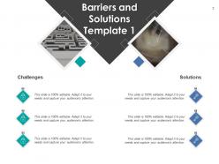
Slide 2: This slide shows Barriers and Solutions Template 1. Add data accordingly.
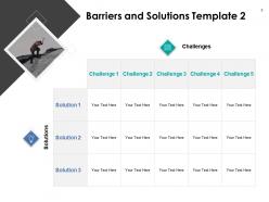
Slide 3: This slide presents Barriers and Solutions Template 2.
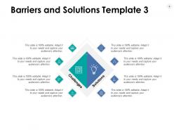
Slide 4: This slide displays Barriers and Solutions Template 3 with related icons.
Slide 5: This slide represents Barriers and Solutions Template 4.
Slide 6: This slide showcases Barriers and Solutions Template 5. You can add or edit data as per needs.
Slide 7: This slide is titled as One Solution to Many Challenges.
Slide 8: This slide displays Barriers and Solutions Icons.
Slide 9: This slide is titled as Additional Slides for moving forward.
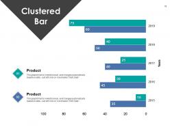
Slide 10: This slide represents Clustered Bar chart with two products comparison.
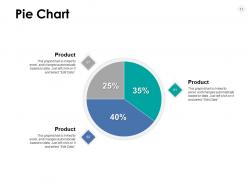
Slide 11: This slide shows Pie Chart with data in percentage.
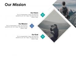
Slide 12: This is Our Mission slide with related imagery and text.
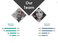
Slide 13: This is Our Team slide with names and designation.
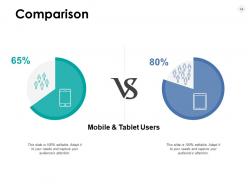
Slide 14: This is a Comparison slide to state comparison between commodities, entities etc.
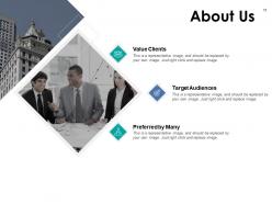
Slide 15: This is About Us slide to show company specifications etc.
Slide 16: This is an Idea Generation slide to state a new idea or highlight information, specifications etc.
Slide 17: This is a Quotes slide to convey message, beliefs etc.
Slide 18: This slide is titled as Post it Notes. Post your important notes here.
Slide 19: This is a Thank You slide with address, contact numbers and email address.
Barriers and solutions powerpoint presentation slides with all 19 slides:
Use our Barriers And Solutions Powerpoint Presentation Slides to effectively help you save your valuable time. They are readymade to fit into any presentation structure.

FAQs for Barriers and solutions
Honestly, nerves mess up most people - you end up rushing or mumbling through everything. Structure's another killer though. Like, if your slides don't flow logically, everyone gets confused halfway through. Oh and knowing your audience is huge! You can't just wing it with generic content. Tech problems are obvious but whatever, that's why you test stuff beforehand. Practice out loud first (seriously, it helps), keep one main point per slide, and don't try cramming too much info. The audience connection thing is what really makes or breaks it in my experience.
Honestly, every 3-5 minutes you gotta throw in something interactive or people just zone out. Polls work great, or call someone out by name with a question. I made this mistake once - did like a 45-minute straight talk and literally watched people's video squares go black one by one lol. Super awkward. Keep everyone's cameras on if you can, and actually use that chat feature! Makes it feel less like you're talking to a wall. Oh and stand up while presenting - sounds weird but your energy completely changes. If you're monotone and sitting there looking dead inside, they'll definitely tune out.
Ugh, tech issues are the worst - you'll definitely deal with connectivity problems, software crashes, and hardware just straight up dying on you. Murphy's Law is real. Always test everything beforehand and bring backup adapters because venue setups are weirdly specific. Save your slides in multiple formats too. I got burned once when a projector completely died during an important pitch - never again. Oh, and get a mobile hotspot if you don't have one already. Venue WiFi is basically designed to fail at the exact moment you need it most. Honestly, just assume everything will break.
Dude, you really need to research your audience's cultural norms first - like, what flies in New York could totally flop in Tokyo. Communication styles are huge too. Some cultures expect direct talk, others find it rude. Colors matter more than you'd think (red means luck in China but danger elsewhere, random but true). Allow extra Q&A time since some people won't speak up right away. Oh, and hierarchy stuff - who you address first, how formal to be. If you can find someone from that culture to review your slides beforehand, do it. They'll spot weird things you'd miss completely.
Okay so first thing - pick your 3 main points and ditch everything else. I know it's tempting to cram everything in but trust me, less really is better when you're rushed. Practice with a timer! Figure out exactly how long each part takes. Always build in like 5 extra minutes because your laptop will freeze or someone will ask a random question. During the actual presentation, use phrases like "most importantly" so people know what to focus on. If you're running long (happens to everyone), just say "I'm watching our time" and skip to your conclusion. Oh and always end with what they should actually DO with this info - otherwise they'll just forget everything in an hour.
Oh man, feedback is a game-changer for presentations! You literally can't see what's not working when you're up there. Like, you think you're being super clear, but then someone asks a question that makes you realize half the room was lost five minutes ago. Body language tells you everything too - I've learned more from watching people's faces than actual comments sometimes. The trick is asking for it instead of just hoping people will speak up. Do quick check-ins during longer talks, or honestly just grab a colleague beforehand and run through your main points. Trust me, you'll be surprised what blind spots you have!
Honestly, just pick one main thing you want them to walk away with and lead with that. Don't try to squeeze everything in - I've watched way too many presentations where people just word-vomit all their research and lose everyone. Break your topic into maybe 3-4 chunks max. Use comparisons they'll actually get. Like, if you're explaining cloud storage to your parents, compare it to a safety deposit box or whatever makes sense. Visuals are clutch - sometimes a simple chart saves you from explaining something badly for 10 minutes. And honestly? If you can't break it down simply, you probably need to understand it better yourself first.
Ugh, it's mostly your brain being a total jerk to you. Fear of judgment is huge - you convince yourself everyone's just waiting for you to bomb. Then there's perfectionism, which honestly might be worse? You'll rehearse like crazy but the second something goes off-script, you completely freeze up. Imposter syndrome kicks in too. Even when you're literally the person they invited to speak, you assume everyone knows way more than you do. Wild, right? The game-changer is flipping your mindset from "please don't let me screw this up" to actually wanting to help people. Your whole energy shifts when you focus on them instead of your fears.
Dude, simple is everything when it comes to visuals. One idea per slide, high contrast colors, big fonts - you don't want people squinting from the back row. White space is your friend! I swear, some presentations look like a crayon explosion happened. Stick to a consistent color scheme and throw in icons or diagrams instead of paragraph dumps. Oh, and definitely test your slides on a few people beforehand - just ask what they're seeing. You'll catch confusing stuff way before you're standing in front of everyone wondering why they look lost.
Honestly, practice your opening lines until you could say them in your sleep - that first minute is everything and it'll cut your nerves in half. I swear by the 4-7-8 breathing thing too. Look for the friendly faces when you're up there (there's always at least one person nodding along). Getting there early to mess with the tech is clutch - nothing worse than fumbling with a clicker while everyone watches. Oh, and people genuinely want you to do well, which sounds cheesy but it's true. Just pick one or two of these next time instead of trying everything at once.
Dude, the room setup can absolutely kill your presentation before you even open your mouth. Bad lighting, annoying noise, uncomfortable chairs - your audience looks bored but they're actually just miserable. I watched this amazing speaker bomb because the projector wouldn't stop buzzing! Walk through the space beforehand if you can. Test the sound, fix the lights, check if it's freezing or boiling. Can't change anything? Just call it out. "Yeah, I know it's loud in here" actually connects with people way more than pretending everything's perfect. Sometimes the honest approach works best.
Honestly, it's mostly about money and how confusing everything is. Adobe Creative Suite costs a fortune, and the free alternatives? Good luck figuring them out without a degree in graphic design. Accessibility is another mess - most presentation tools are terrible for people using screen readers or who need proper color contrast. Language support is pretty spotty too, especially if you're not working in English. My advice? Figure out what your team actually *needs* first. Then find tools that were built with accessibility in mind from day one. Way easier than trying to fix it later.
So basically you want to give people different ways to access your content. Captions for videos, high contrast colors, alt text for images - that stuff. Also offer things in multiple formats like audio or large print. Here's the thing though - it's way simpler than people make it out to be! Just design for everyone from the get-go instead of trying to fix it later. Ask yourself: could someone with vision or hearing issues actually participate? Clear fonts help tons. Oh, and make sure your navigation actually makes sense. These small tweaks honestly make such a huge difference for accessibility.
So you know how everyone's brain just shuts off when you start throwing data at them? Stories fix that. People automatically follow along because narratives hit different parts of your brain - not just the boring analytical stuff. It's like you're building a bridge from what they already get to the new thing you're teaching. Our brains are literally wired for that beginning-middle-end flow, which is why they'll remember it better too. Honestly, bullet points are the worst. Next time just start with "Here's what happened when..." and watch how much more engaged everyone gets.
Honestly, you've gotta hit people with the same info like 3-5 times or it just disappears. Mix it up though - send an email, mention it in person, maybe throw together a quick visual or follow-up text. I learned this after watching so many "important" announcements get completely ignored lol. Space them out over a few days instead of bombarding everyone at once. Oh and always connect it back to what they actually care about. Those little reference cards or one-pagers work great too since people will definitely forget the details later. Trust me on the repetition thing - it works.
-
Visually stunning presentation, love the content.
-
Qualitative and comprehensive slides.
-
Graphics are very appealing to eyes.
-
Informative design.