

Bc bar graph style timeline diagram for business powerpoint template




Try Before you Buy Download Free Sample Product
 Impress Your
 Audience
 100%
100% Editable
 Save Hours
 of Time


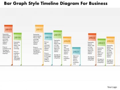
Here is our Bc Bar Graph Style Timeline PowerPoint Slide. You can explain the concept of business result analysis with this exclusive diagram. This PPT diagram contains the graphic of bar graph style timeline. Use the PPT diagram for business and marketing related presentations. A graphic timeline is a very effective way to visualize information over time. Whether for project management purposes or to outline historical events, you can plot time-related information as a sequence of points. The slide has beautiful colors and shapes which can be tailored as per your business requirements. With the help of timeline, you can make complex ideas into understandable pictures. It organizes your thoughts. It also helps you to set realistic time frames. Our PowerPoint template slide enables you to show the decided time and work schedules for every job. Monitoring and control are easier and can be done within a minimum time frame and at the lowest cost. So, download now and make full use of this slide design. Benefit from the groundwork done by our Bc Bar Graph Style Timeline Diagram For Business Powerpoint Template. Get all the data you may desire.
People who downloaded this PowerPoint presentation also viewed the following :
Bc bar graph style timeline diagram for business powerpoint template with all 5 slides:
Generate happiness with our Bc Bar Graph Style Timeline Diagram For Business Powerpoint Template. Give them a glimpse of cheerful days ahead.
FAQs for Bc bar graph style timeline diagram for
Bar graph timeline diagrams enhance presentations by combining temporal progression with quantitative data visualization, enabling clearer trend analysis, comparative insights across time periods, and simplified communication of complex datasets. These visual tools streamline audience comprehension by presenting historical performance, project milestones, and growth trajectories simultaneously, with many organizations finding that this dual-purpose approach significantly improves stakeholder engagement and decision-making efficiency.
A bar graph timeline diagram enhances project visualization by clearly displaying task durations, dependencies, overlapping activities, and milestone markers in a single, intuitive format. This visual approach streamlines project tracking by enabling managers to quickly identify bottlenecks, resource conflicts, and critical path elements, ultimately delivering improved scheduling accuracy and enhanced team coordination across complex project landscapes.
Bar graph timeline diagrams excel at representing quantitative data that changes over time, including sales figures, revenue trends, population growth, market share evolution, and performance metrics across quarters or years. These visualizations enable businesses to track progress, identify seasonal patterns, and compare multiple data series simultaneously, with many organizations finding that combining temporal flow with quantitative comparison delivers clearer insights for strategic decision-making.
Bar graph timelines display data as discrete rectangular bars across time periods, emphasizing individual data points and categorical comparisons, while traditional line graphs use connected points to show continuous trends and relationships. This structural difference enables bar timelines to highlight specific intervals, comparative volumes, and distinct time-based categories more effectively, with many organizations finding that bar formats deliver clearer insights for project milestones, resource allocation, and performance metrics across departments.
**INPUT**: What software or tools are recommended for creating bar graph timeline diagrams? **OUTPUT**: Recommended tools include Microsoft Excel, Tableau, PowerBI, Google Charts, and specialized presentation software like SlideTeam templates. These platforms streamline timeline visualization by combining temporal data with quantitative metrics, enabling clear progress tracking and milestone communication, with many organizations finding that integrated dashboard solutions ultimately deliver enhanced project transparency and stakeholder engagement across departments.
Bar graph timeline diagrams are most commonly utilized in project management, manufacturing, healthcare, finance, and construction industries. These visual tools streamline project tracking, resource allocation, and milestone monitoring by displaying progress data chronologically, with many organizations finding that they enhance operational efficiency, improve stakeholder communication, and ultimately deliver better project outcomes.
Key design elements include consistent time intervals, clear axis labels, contrasting colors for different data series, appropriate bar spacing, and readable fonts. These elements work together by eliminating visual confusion, enabling quick data interpretation, and maintaining professional presentation standards, with many organizations finding that well-designed timeline diagrams significantly enhance stakeholder comprehension and decision-making processes.
Color coding in bar graph timelines enhances audience comprehension by creating visual distinctions between categories, highlighting trends across time periods, and enabling quick pattern recognition. Through strategic color choices, viewers can instantly identify different data series, track performance changes, and compare multiple variables simultaneously, while reducing cognitive load and processing time, ultimately delivering clearer insights and more effective data-driven presentations.
Common mistakes include using inconsistent time intervals, overcrowding data points, choosing inappropriate bar widths, neglecting proper axis labeling, and using confusing color schemes. These errors compromise data clarity and reader comprehension, with many organizations finding that standardized formatting, strategic spacing, and clear visual hierarchy ultimately deliver more effective presentations and better stakeholder understanding.
Bar graph timelines adapt for digital presentations through interactive elements, animation sequences, and clickable data points, while print formats emphasize static clarity, high-contrast colors, and comprehensive labeling. Digital versions enable dynamic storytelling with progressive data reveals and hover-over details, whereas print designs focus on immediate visual impact and self-contained information, with many organizations finding that tailored formatting significantly enhances audience engagement and comprehension.
Interactivity enhances modern bar graph timeline diagrams by enabling real-time filtering, dynamic data exploration, hover-over details, customizable time ranges, and drill-down capabilities. These interactive features streamline data analysis for financial services, project management, and healthcare organizations, ultimately delivering faster decision-making, improved stakeholder engagement, and enhanced presentation effectiveness across industries.
Historical data can be effectively illustrated using bar graph timeline diagrams by displaying quantitative values across chronological periods, enabling clear trend identification, comparative analysis between time intervals, and visual pattern recognition. Through color coding, consistent scaling, and strategic labeling, organizations in sectors like retail sales tracking, financial performance reporting, and market research find these diagrams streamline data interpretation while delivering enhanced stakeholder comprehension.
Scaling in bar graph timelines determines data visibility and comparison accuracy, directly influencing how viewers interpret trends, proportions, and relative changes over time. Inappropriate scaling can distort perceptions, making minor variations appear dramatic or significant differences seem negligible, while proper scaling enhances clarity and enables stakeholders to make informed strategic decisions based on accurate visual representation.
Bar graph timeline diagrams illustrate complex project milestones by combining visual bars with chronological sequencing, showing task durations, dependencies, resource allocation, and critical path elements simultaneously. These versatile tools enable project managers across industries like construction, software development, and manufacturing to track progress, identify bottlenecks, and communicate status effectively, ultimately delivering enhanced project visibility and stakeholder alignment.
Creative storytelling approaches for bar graph timeline presentations include narrative arcs that follow data progression, character-driven scenarios where stakeholders experience the timeline journey, thematic frameworks connecting data points to compelling business stories, and visual metaphors that transform bars into meaningful symbols. These techniques enhance audience engagement by transforming statistical information into relatable narratives, with many organizations finding that storytelling increases retention and decision-making speed.
-
Informative presentations that are easily editable.
-
Enough space for editing and adding your own content.