


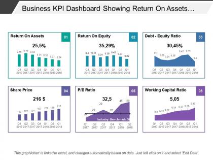
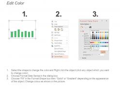
Business kpi dashboard showing return on assets debt-equity ratio




Try Before you Buy Download Free Sample Product
 Impress Your
 Audience
 100%
100% Editable
 Save Hours
 of Time


Increase the desire to go harder at it with our Business Kpi Dashboard Showing Return On Assets Debt-Equity Ratio. It helps initiate incentives.
People who downloaded this PowerPoint presentation also viewed the following :
Business kpi dashboard showing return on assets debt-equity ratio with all 6 slides:
Forge fusion with our Business Kpi Dashboard Showing Return On Assets Debt-Equity Ratio. Bring folks around to aligning their energies.

FAQs for Business kpi dashboard showing return on
Critical KPIs include revenue growth, customer acquisition cost, customer lifetime value, operational efficiency metrics, and cash flow indicators. These dashboards enable organizations to monitor performance by tracking financial health, customer relationships, and operational productivity, with many companies finding that strategic KPI visualization ultimately delivers faster decision-making and competitive advantage.
KPI dashboards improve decision-making by providing real-time data visualization, centralized performance metrics, and automated reporting capabilities that eliminate guesswork. These tools enable leaders to identify trends quickly, allocate resources strategically, and respond to market changes proactively, with many organizations finding that streamlined data access accelerates response times and enhances competitive positioning.
Leading indicators predict future performance through metrics like customer acquisition rates, employee training hours, and sales pipeline velocity, while lagging indicators measure past results including revenue, customer satisfaction scores, and market share. These complementary metrics enable organizations to balance proactive strategy with performance validation, with many businesses finding that combining both types delivers comprehensive insights for strategic decision-making and operational optimization.
Visualization techniques enhance KPI dashboard effectiveness by transforming complex data into intuitive charts, graphs, color-coded indicators, and interactive elements that enable rapid comprehension and decision-making. These visual approaches streamline data interpretation through trend analysis, performance comparisons, and real-time alerts, with many organizations finding that strategic visualization ultimately delivers faster insights, improved stakeholder engagement, and more agile business responses.
Real-time data enables business KPI dashboards to provide immediate insights into performance metrics, allowing managers to identify trends, spot anomalies, and make informed decisions quickly. This immediacy proves particularly valuable in fast-paced sectors like retail and financial services, where organizations can respond to market changes instantly, ultimately delivering competitive advantage and improved operational efficiency.
Businesses can customize KPI dashboards by selecting industry-relevant metrics, configuring visual layouts for operational workflows, integrating sector-specific data sources, and establishing role-based access controls. Financial services might track loan approval rates and risk metrics, while manufacturing focuses on production efficiency and quality indicators, ultimately delivering targeted insights that enhance decision-making and competitive advantage.
Common KPI dashboard mistakes include overcrowding with too many metrics, using unclear visualizations, lacking actionable insights, ignoring user needs, and displaying outdated data. These design flaws undermine decision-making effectiveness, with many organizations finding that streamlined dashboards focusing on 5-7 strategic KPIs ultimately deliver better clarity and faster business responses.
Businesses should update their KPI dashboards based on data frequency and decision-making needs, with real-time updates for operational metrics, daily updates for sales performance, and weekly or monthly updates for strategic indicators. This strategic approach enables organizations to respond quickly to market changes, optimize resource allocation, and maintain competitive advantage through timely, data-driven decisions.
**INPUT**: What are the best practices for integrating multiple data sources into a KPI dashboard? **OUTPUT**: Best practices include establishing standardized data formats, implementing automated data pipelines, ensuring real-time synchronization, creating unified data governance protocols, and maintaining consistent update frequencies across sources. These approaches streamline operations by eliminating manual data entry, reducing errors, and enhancing decision-making speed, with many organizations finding that integrated dashboards ultimately deliver improved operational efficiency and competitive advantage.
User feedback shapes KPI dashboard evolution by identifying usability gaps, highlighting missing metrics, and revealing workflow inefficiencies that impact decision-making processes. Through regular user surveys, analytics reviews, and stakeholder interviews, organizations can prioritize dashboard enhancements, streamline data visualization, and add relevant performance indicators, ultimately delivering more intuitive interfaces and actionable insights.
Leading KPI dashboard tools include Tableau, Power BI, Google Data Studio, Qlik Sense, and Looker, each offering distinct visualization capabilities and integration features. These platforms streamline data analysis by connecting multiple sources, automating report generation, and delivering real-time insights, with many organizations finding that cloud-based solutions enhance accessibility and collaborative decision-making across teams.
Businesses should prioritize KPIs by focusing on metrics directly tied to strategic objectives, revenue impact, and operational efficiency, while ensuring alignment with stakeholder needs and decision-making frequency. Financial services and retail organizations increasingly find that displaying 5-7 critical KPIs with drill-down capabilities delivers better user engagement and faster decision-making than cluttered dashboards.
Mobile accessibility significantly enhances KPI dashboard adoption by enabling real-time decision-making, improving user engagement, and expanding accessibility across organizational levels. Through responsive design and mobile-optimized interfaces, executives and managers can monitor performance metrics anywhere, streamline workflow processes, and respond faster to critical changes, ultimately delivering competitive advantage and operational efficiency.
KPI dashboards facilitate cross-departmental collaboration by providing shared visibility into performance metrics, aligning teams around common objectives, and enabling real-time data sharing across organizational silos. Through centralized reporting, departments like sales, marketing, and operations can coordinate strategies more effectively, identify interdependencies, and streamline decision-making processes, ultimately delivering enhanced organizational efficiency and strategic alignment.
Essential customer satisfaction metrics include Net Promoter Score (NPS), Customer Satisfaction Score (CSAT), Customer Effort Score (CES), retention rates, and churn analytics. These metrics enable organizations to track loyalty trends, identify service gaps, and optimize customer experiences, with many retail and financial services companies finding that combining these measurements delivers comprehensive insights for strategic decision-making.
-
Out of the box and creative design.
-
Editable templates with innovative design and color combination.