


Butterfly chart tableau powerpoint images




Try Before you Buy Download Free Sample Product
 Impress Your
 Audience
 100%
100% Editable
 Save Hours
 of Time


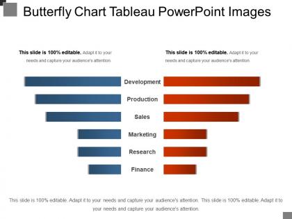
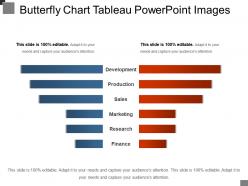
Convey your message with greater impact by using our Butterfly Chart Table and provide your audience a clear understanding of the important topics. It is a two-stage process slide where you can compare data relating to two different periods. When you want to display the percentage increase or decrease in sales, this template will best suit those places. By using this template you can add six different parameters of comparison like development, production, sales, marketing research, and finance and find out the deviations if any. It can also be used as a population chart (males and females) or for depicting product sales in different geographical locations (location A and location B). The two bar charts displayed on both sides will help you in analyzing the data within a few minutes. Prepare your presentations without much effort and deliver quality presentations to the audience by downloading the butterfly chart template.
People who downloaded this PowerPoint presentation also viewed the following :
Butterfly chart tableau powerpoint images with all 5 slides:
The fizz comes back due to our Butterfly Chart Tableau Powerpoint Images. Everyone bubbles with enthusiasm again.
FAQs for Butterfly chart
A butterfly chart is a specialized visualization that displays two datasets side-by-side with a shared central axis, creating a symmetrical, wing-like appearance that facilitates direct comparison between categories. Unlike traditional bar charts or histograms that show single datasets, butterfly charts excel at revealing differences, trends, and patterns between paired data, with organizations in demographics, finance, and market research finding them particularly effective for comparing population segments, before-and-after scenarios, and competitive analyses.
**INPUT**: What types of data are best visualized using a butterfly chart? **OUTPUT**: Butterfly charts excel at visualizing comparative demographic data, survey responses with positive/negative sentiments, before/after scenarios, and bidirectional flows like imports/exports or revenue/expenses. These visualizations streamline analysis by displaying mirrored categories side-by-side, enabling organizations to identify patterns, gaps, and trends across opposing data sets, ultimately delivering clearer insights for strategic decision-making. [Word count: 56 words]
A butterfly chart effectively illustrates comparisons between two datasets by displaying them as horizontal bars extending in opposite directions from a central axis, enabling immediate visual contrast of corresponding categories. This mirrored structure helps organizations compare metrics like sales performance across regions, budget versus actual spending, or demographic differences, ultimately delivering clearer insights for strategic decision-making.
Butterfly charts include two horizontal bar sets extending from a central axis, category labels, value scales, connecting baseline, and comparative legends for each dataset. These components streamline data comparison by positioning opposing values symmetrically, creating clear visual contrast between metrics like actual versus target performance, with many organizations finding that this structure enhances decision-making through immediate pattern recognition.
Butterfly charts are most commonly utilized in healthcare for population health analysis, finance for risk assessment and portfolio comparison, retail for customer demographics, manufacturing for quality control variations, and human resources for workforce analytics. These industries leverage butterfly charts to visualize comparative distributions and identify patterns across different groups, ultimately enabling data-driven decisions that enhance operational efficiency and strategic planning.
Several software tools enable butterfly chart creation, including Excel, Tableau, Power BI, R (with ggplot2), Python (matplotlib/seaborn), and specialized visualization platforms like D3.js and Plotly. These platforms streamline data comparison by offering templates, drag-and-drop functionality, and automated formatting, with many organizations finding that dedicated BI tools deliver enhanced interactivity and professional presentation capabilities.
Butterfly charts excel in scenarios comparing two groups across categories, such as analyzing male versus female demographics, before/after performance metrics, or regional sales comparisons. They're particularly effective in healthcare for patient outcome studies, financial services for risk assessments, and HR analytics for employee satisfaction surveys, ultimately delivering clear visual insights that enhance decision-making and strategic planning.
Common pitfalls include using inconsistent scales between left and right sides, overcrowding with too many categories, poor color choices that confuse rather than clarify, and misaligned central axis labels. These design errors significantly reduce data comprehension and decision-making effectiveness, with many organizations finding that simplified layouts and strategic color coding ultimately deliver clearer insights and stronger analytical outcomes.
The butterfly chart's symmetrical design enhances comprehension by enabling direct side-by-side comparisons of two datasets, making patterns, gaps, and relationships immediately visible through its mirrored structure. This visual approach streamlines analysis for financial teams comparing quarterly performance, HR departments analyzing workforce demographics, and marketing professionals evaluating campaign effectiveness, ultimately delivering faster insights and more informed decision-making across organizations.
Color plays a crucial role in butterfly chart effectiveness by distinguishing between comparison groups, highlighting key differences, creating visual hierarchy, and guiding audience attention to critical insights. Through strategic color choices, organizations can enhance data comprehension, emphasize performance gaps, and streamline decision-making processes, with many businesses finding that well-designed color schemes significantly improve stakeholder engagement and analytical clarity.
Butterfly charts integrate into presentation narratives by serving as comparative anchors for before-and-after analysis, demographic contrasts, or performance benchmarking across different segments or time periods. These visualizations enhance storytelling by creating clear visual moments where audiences can immediately grasp disparities, with many presenters finding that strategic placement amplifies key messages and drives decision-making conversations forward.
Butterfly charts offer superior comparative analysis by displaying two datasets side-by-side around a central axis, enabling immediate visual comparison of opposing or related metrics like demographics, before-and-after scenarios, or performance gaps. Unlike traditional charts that require separate visualizations, butterfly charts streamline data interpretation by revealing patterns, disparities, and correlations in a single view, ultimately delivering clearer insights for strategic decision-making.
Butterfly chart axes can be customized by adjusting scale ranges to emphasize key differences, using descriptive category labels instead of generic terms, applying contrasting colors to distinguish left and right sides, and formatting tick marks for optimal readability. These customizations enhance data interpretation by reducing visual clutter, highlighting critical comparisons, and enabling stakeholders to quickly identify patterns, with many organizations finding that well-designed axes significantly improve decision-making speed and accuracy.
Yes, butterfly charts require audience-specific adaptations focusing on data literacy levels, comparison complexity tolerance, and decision-making contexts. Executive audiences benefit from simplified category labels and clear trend narratives, while technical teams can handle detailed breakdowns, with healthcare professionals, financial analysts, and marketing managers finding that demographic comparisons, variance analysis, and market segment contrasts respectively deliver more actionable insights.
Butterfly chart best practices include using clear, descriptive category labels, consistent color coding for comparison groups, and strategic data label placement to avoid overcrowding. Effective annotations highlight key insights, trends, and significant variances between groups, with many organizations finding that concise legends and well-positioned callouts enhance reader comprehension while streamlining data interpretation across departments.
-
Editable templates with innovative design and color combination.
-
Unique design & color.