

Canva Investor Funding Elevator Pitch Deck Ppt Template




Try Before you Buy Download Free Sample Product
 Impress Your
 Audience
 100%
100% Editable
 Save Hours
 of Time


Canva Investor Funding Elevator Pitch Deck PPT covers online design and publishing platform elevator pitch deck. It involves problem statements and the company critical solutions to improve written communication and productivity. It also involves products and services, key facts, unique selling points, significant milestones achieved, client testimonials, business models, revenue streams, competitive analysis, financial performance, projections, and investment ask for investor funding pitch deck. Furthermore, it involves exit strategy, the team involved in the company, organizational structure, and the company shareholding pattern after getting funding from potential investors. Download it now.
People who downloaded this PowerPoint presentation also viewed the following :
Content of this Powerpoint Presentation
Slide 1: This slide showcase title Canva Investor Funding Elevator Pitch Deck.
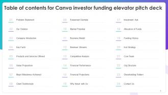
Slide 2: This slide exhibit table of content.
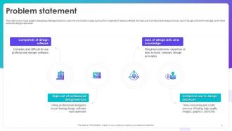
Slide 3: This slide covers major graphic designing challenges faced by customers.
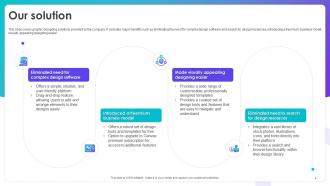
Slide 4: This slide covers graphic designing solutions provided by the company.
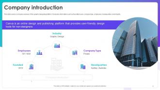
Slide 5: This slide covers a company overview of the graphic designing platform.
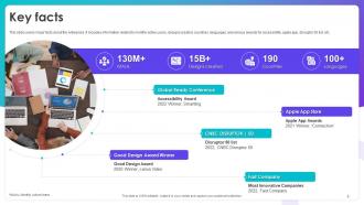
Slide 6: This slide covers major facts about the enterprise.
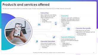
Slide 7: This slide covers major products and services provided by the company.
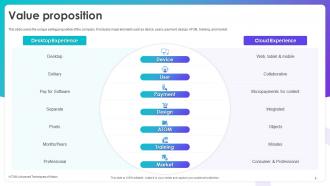
Slide 8: This slide covers the unique selling proposition of the company.
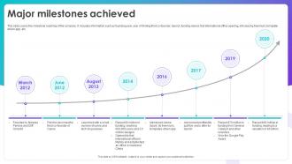
Slide 9: This slide covers the milestone roadmap of the company. It includes information such as founding year, year of finding third co-founder, launch, funding raised.
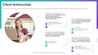
Slide 10: This slide covers customer reviews about the company.
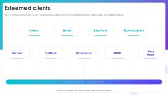
Slide 11: This slide covers key customers of the company.
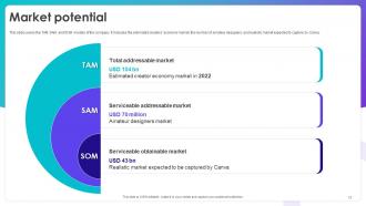
Slide 12: This slide covers the TAM SAM and SOM models of the company.
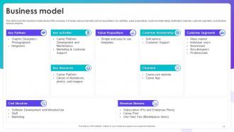
Slide 13: This slide covers the business model canvas of the company.
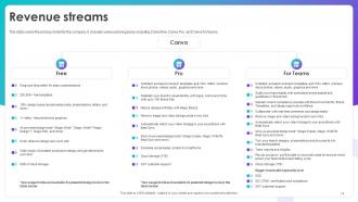
Slide 14: This slide covers the pricing model for the company.
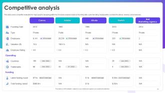
Slide 15: This slide covers competitor evaluation for major graphic designing platforms.
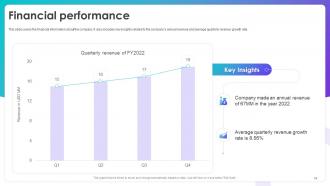
Slide 16: This slide covers the financial information about the company.
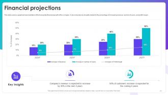
Slide 17: This slide covers a graphical representation of the forecasted financial growth of the company.
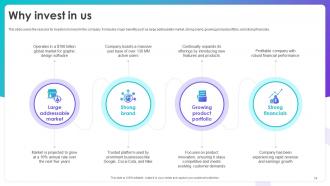
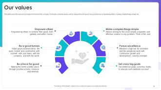
Slide 18: This slide covers the reasons for investors to invest in the company.
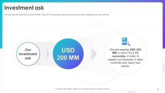
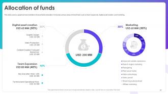
Slide 19: This slide covers the investment ask of USD 200 MM in return for 1% ownership in order to expand business in other countries and reach new customers.
Slide 20: This slide covers a graphical representation of raised funds allocation.
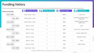
Slide 21: This slide covers the funding history of company’s various investment rounds, it includes other information.
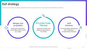
Slide 22: This slide covers the exit strategy of the graphic designing platform.
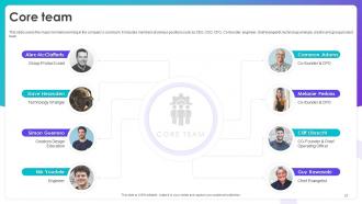
Slide 23: This slide covers the major members working in the company’s core team.
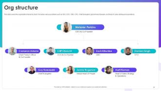
Slide 24: This slide covers the organization hierarchy chart.
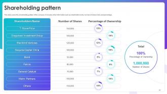
Slide 25: This slide covers the shareholding pattern of the company.
Slide 26: This slide shows all the icons included in the presentation.
Slide 27: This slide is titled as Additional Slides for moving forward.
Slide 28: This slide provides 30 60 90 Days Plan with text boxes.
Slide 29: This is a Timeline slide. Show data related to time intervals here.
Slide 30: This slide contains Puzzle with related icons and text.
Slide 31: This slide depicts Venn diagram with text boxes.
Slide 32: This slide covers the reasons for investors to invest in the company.
Slide 33: This is a Thank You slide with address, contact numbers and email address.
Canva Investor Funding Elevator Pitch Deck Ppt Template with all 41 slides:
Use our Canva Investor Funding Elevator Pitch Deck Ppt Template to effectively help you save your valuable time. They are readymade to fit into any presentation structure.









FAQs for Canva Investor Funding Elevator Pitch
Honestly, Canva's the way to go. Just drag stuff around wherever you want it - no confusing menus to deal with. They've got a massive template library so you won't be stuck staring at blank slides forever (the worst). All the stock photos and icons are already there, which is clutch. Oh, and the brand kit thing keeps your colors consistent without you having to remember hex codes or whatever. Your whole team can edit at the same time too. I'd just grab a template you like and tweak it from there - way easier than starting from scratch.
Honestly? Canva's a game-changer if you want your slides to actually look good. The templates are so much prettier than anything I could make in PowerPoint - like, night and day difference. But PowerPoint's still king for heavy data stuff and those fancy animations. I always use Canva now for client presentations because it just looks more polished. PowerPoint though... ugh, you need internet for Canva which can be annoying sometimes. For internal meetings with tons of charts and graphs, PowerPoint's probably your best bet since you get way more control over everything.
Honestly, just grab one of Canva's templates to start - saves you so much time. Keep text super minimal and go for high-contrast colors. I've sat through way too many presentations where I'm squinting to read tiny gray text on white backgrounds. Two fonts maximum, trust me on this one. High-quality images only because pixelated stuff looks awful when projected. Oh, and definitely use their brand kit thing to keep colors consistent throughout. Before you present, do a full-screen preview to catch any weird formatting issues that'll make you look unprepared.
Yeah totally! Upload your own videos or grab stuff from Canva's stock library - same goes for music and sound effects. I've done this for work presentations and it comes out pretty clean. Background music is nice for setting the tone too. One thing though - your file size limits depend on which plan you have. Oh and definitely do a test run before you present! I learned that the hard way when a video decided not to play during an actual meeting. Super awkward. But overall it works really well once you get the hang of it.
Oh Canva's actually pretty smart about this! They sort everything by industry - like restaurants, real estate, healthcare, whatever you need. Each section has the right colors and images that actually make sense for that field. There are SO many options though, it's honestly a bit much sometimes lol. But they also break it down by what you're making - social posts, flyers, presentations, etc. I'd say pick your industry filter first, then figure out what type of thing you're designing. Way easier than trying to make some random template work for your specific business.
Oh nice, Canva actually has some decent accessibility stuff! You can add alt text to images and they've got this color contrast checker so your text doesn't look terrible. There's keyboard shortcuts and screen reader compatibility too - though honestly that part's still kinda clunky. They let you add captions to videos which is cool. Oh and there's high-contrast templates if you need those. But here's the thing - definitely run their accessibility checker before you share anything. It'll catch weird issues you might miss. I learned that the hard way lol.
Hit the Share button and add everyone's emails - just make sure you pick "Can edit" in that dropdown thing. Super cool watching their cursors bounce around while they work! Changes show up right away so you won't have like 15 versions floating around. Honestly, the comment feature is a lifesaver for giving feedback without messing up the actual design. Oh, and maybe assign different slides to people so you're not all stepping on each other's toes. Works way better than I expected it to.
First thing - get your brand kit uploaded (logos, colors, fonts). Then swap out the template colors with yours using the color picker. Fonts are easy to switch too. Logo resizing can be annoying but Canva usually doesn't butcher them too bad. Try to keep your font sizes consistent for headlines - makes everything look more professional. Stock photos should get replaced with your own stuff when you can. Oh, and definitely save your finished template as a new one afterwards. Trust me on this - you'll want that branded version ready to go next time instead of doing this whole process again.
Definitely try Canva's animation stuff! Just click on any text or image and pick effects like fade in, slide, or bounce. The typewriter one is actually my favorite - makes key points feel way more dramatic. Oh, and you can animate charts too so the data builds up piece by piece, which looks pretty cool. Page transitions between slides help everything flow better. Just don't go crazy with it though, I made that mistake once and it was so distracting. Maybe start with subtle animations on your main slides first?
So there's a few ways to export from Canva - PDF, PowerPoint, PNG, or JPG. Honestly, I always go with PDF first since it keeps everything sharp and works everywhere. PowerPoint's solid if your team wants to mess with the slides later or present directly from there. For single images like emails or whatever, PNG and JPG do the trick, though sometimes the quality gets a bit wonky. Actually, I learned this the hard way when a client's logo looked terrible as a JPG. PDF's usually your safest bet for sharing or uploading anywhere.
So it's $120/year for Canva Pro, but watch out for those sneaky premium stock photo charges - they'll get you if you're not paying attention. Been there! You'll need to factor in how many people on your team need access too. Honestly? If you're doing tons of design stuff, it usually pays for itself in time saved. But definitely try the free trial first - no point paying if you won't actually use the fancy features. Oh, and maybe track what you're using that first month so you know it's worth it.
Honestly, Canva's pretty good about this - they drop new templates multiple times a week, sometimes even daily. Around holidays or big events you'll see tons of fresh stuff pop up. They were super quick with that Y2K trend too, which was kinda impressive. New ones just appear automatically in your account, so no extra work on your end. I usually browse the "New" filter maybe every other week? There's always something different. Short punchy ones, longer designs - they mix it up. Worth checking regularly if you want to stay on top of current aesthetics.
Okay so color theory totally changed my Canva game! I used to just wing it and my slides looked... rough lol. Try complementary colors (opposites on the wheel) for drama, or analogous ones (next to each other) for something more chill. The 60-30-10 rule is clutch - main color takes up most space, secondary gets less, then just a pop of accent color. Canva's brand kit feature is honestly underrated if you haven't messed with it yet. When I'm stuck, their pre-made palettes are a solid starting point. Way better than my old "this purple looks nice" approach!
So basically when you rate templates or leave reviews, you're helping Canva figure out what actually works and what sucks. They look at all that feedback to spot patterns - like if everyone's struggling with the same layout or if certain colors just aren't it. Pretty clever system honestly. Plus you can check what other people thought before you waste time on a template that might be trash. Oh and the community reviews are actually helpful, not like Amazon where everything's fake. Takes literally 30 seconds to rate something after you're done, and it genuinely makes the platform better for all of us.
Yeah, Canva's awesome for teaching! I actually switched from PowerPoint because their templates look way more professional without the hassle. Search their education section first - you'll find subject-specific layouts that'll save you tons of time. The interactive stuff is great too - charts, infographics, even videos to keep kids engaged. Real-time collaboration is clutch when you're working with other teachers. Honestly, I probably spend too much time making things look pretty now, but students definitely notice the difference. Way better design options overall.
-
Excellent template with unique design.
-
Really like the color and design of the presentation.