

Checklist quality check correct report analysis ppt icons graphics





Try Before you Buy Download Free Sample Product
 Impress Your
 Audience
 100%
100% Editable
 Save Hours
 of Time


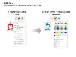
Quality products and services can do more for the long term brand image and success of your company than any other attribute; so we have brought to you a PowerPoint presentation with well-crafted PPT icons and graphics to represent the checklist for quality and checks for correct report analysis to ensure that any deliverable that moves out from your premises to the customer is top notch. Quality assurance during project execution can improve the efficiency of various processes to give optimum outputs at no change in the cost and you can plan this using our comprehensive presentation design or deploy it to showcase the measures taken for the same to your clients. Quality control during the monitoring of a project for quality checks and testing that the quality requirements are met can be equally easily and understandably summarized through the icons in this PPT slide template for demonstration to project managers and workforce. Get them to agree with our Checklist Quality Check Correct Report Analysis Ppt Icons Graphics. They will be convinced by the force of your argument.
People who downloaded this PowerPoint presentation also viewed the following :
Checklist quality check correct report analysis ppt icons graphics with all 5 slides:
Experience gaiety with our Checklist Quality Check Correct Report Analysis Ppt Icons Graphics. There will be an air of festivity all around.

FAQs for Checklist quality check correct report analysis
A quality checklist for presentation templates should include visual consistency elements like font usage, color schemes, and layout alignment, content structure components such as slide hierarchy and information flow, and technical specifications including resolution standards and compatibility requirements. These elements streamline template development by ensuring brand adherence, enhancing user experience, and maintaining professional standards, with many organizations finding that comprehensive checklists significantly reduce revision cycles and accelerate presentation creation processes.
Designers can ensure accessibility compliance through comprehensive quality checks that include color contrast ratios, keyboard navigation functionality, screen reader compatibility, font readability standards, and alternative text requirements. These systematic evaluations enable organizations to create inclusive templates that serve diverse user needs while meeting WCAG guidelines, ultimately delivering broader market reach and enhanced user experiences across all accessibility requirements.
Common pitfalls include overlooking font consistency across slides, ignoring alignment and spacing irregularities, neglecting color scheme variations, skipping placeholder text removal, and missing broken or low-resolution images. These oversights significantly impact professional credibility and audience engagement, with many organizations finding that systematic template audits streamline content creation, enhance brand consistency, and ultimately deliver more polished presentations that strengthen stakeholder confidence.
Visual hierarchy can be effectively evaluated through systematic assessment of element prominence, logical flow patterns, contrast ratios, typography consistency, and information prioritization within the checklist design. Through strategic placement and visual weight distribution, organizations streamline user comprehension, reduce processing time, and enhance task completion rates, with many finding that well-structured visual hierarchies ultimately deliver improved accuracy and operational efficiency.
User feedback serves as a critical quality indicator for presentation templates, revealing usability issues, design effectiveness, content clarity, and overall user satisfaction that internal testing might miss. Through surveys, usage analytics, and direct comments, organizations can identify which templates resonate with their audiences, streamline problematic elements, and enhance design consistency, ultimately delivering more impactful presentations and improved user experiences.
Consistency in branding is maintained through standardized quality checklists that verify logo placement, color schemes, typography, visual elements, and messaging alignment across all templates. These systematic checks ensure brand guidelines are uniformly applied, with many organizations finding that template audits streamline content creation, enhance professional credibility, and ultimately deliver cohesive brand experiences.
Common formatting oversights in presentation template quality checks include inconsistent font sizing across slides, misaligned text boxes and visual elements, irregular spacing between bullet points, and non-uniform color applications in charts and graphics. These issues significantly impact professional credibility, with many design teams finding that systematic formatting audits enhance template usability, streamline content creation processes, and ultimately deliver more polished presentations that maintain brand consistency.
Incorporating aesthetic and functional elements into quality assurance checklists involves using clear visual hierarchies, consistent formatting, intuitive layouts, and strategic color coding to enhance usability. These design principles streamline workflow efficiency by reducing cognitive load, minimizing errors, and accelerating completion times, with many organizations finding that well-designed checklists ultimately deliver improved compliance rates and operational consistency.
Quality check tools for presentation templates include design consistency analyzers, brand compliance software, accessibility checkers, content review platforms, and automated proofreading systems. These technologies streamline template evaluation by verifying brand guidelines, ensuring accessibility standards, and identifying design inconsistencies, with many organizations finding that integrated quality management platforms significantly reduce review time while maintaining professional presentation standards.
Assessing template adaptability involves checking file format compatibility across PowerPoint, Google Slides, and Keynote, testing element scaling and font rendering, and verifying design integrity during conversions. Through systematic testing across platforms, organizations can ensure seamless transitions between software environments, maintaining visual consistency and functionality while enabling teams to work with their preferred presentation tools, ultimately delivering flexible solutions that enhance collaborative workflows.
Clarity criteria include logical flow structure, consistent visual hierarchy, readable typography, appropriate white space usage, and clear messaging alignment. These elements streamline audience comprehension by eliminating cognitive overload, enhancing information retention, and ensuring seamless navigation, with many organizations finding that well-structured templates significantly improve presentation effectiveness and stakeholder engagement.
**INPUT**: How can we ensure that templates are optimized for various screen sizes through a quality check? **OUTPUT**: Template optimization involves systematic testing across multiple devices, checking responsive design elements, verifying font scalability, and ensuring consistent formatting across desktop, tablet, and mobile displays. This comprehensive approach streamlines user experiences by maintaining visual clarity, accessibility, and professional presentation standards, with many organizations finding that thorough quality checks ultimately deliver enhanced engagement and broader audience reach.
Validating intellectual property rights in presentation templates involves conducting thorough source verification, reviewing licensing agreements, confirming attribution requirements, checking trademark usage, and documenting ownership chains for all visual elements, fonts, and graphics. Organizations across industries, from consulting firms to educational institutions, increasingly implement systematic IP audits before template deployment, ensuring legal compliance while avoiding costly infringement issues and protecting their professional reputation.
Engagement metrics factor into quality assessment by measuring user interaction rates, download frequencies, viewing duration, and feedback scores across different template categories. These analytics help identify which design elements, layouts, and content structures resonate most effectively with audiences, with many organizations finding that templates generating higher engagement rates ultimately deliver better communication outcomes and stronger audience retention.
Collaboration between designers and content creators enhances template quality checking through combined visual expertise and content strategy knowledge, cross-functional feedback loops, and shared quality standards. This strategic partnership enables comprehensive reviews covering design consistency, messaging alignment, and user experience optimization, with many organizations finding that collaborative workflows reduce revision cycles by 40% while delivering more polished, market-ready templates.
-
Great product with highly impressive and engaging designs.
-
Topic best represented with attractive design.