

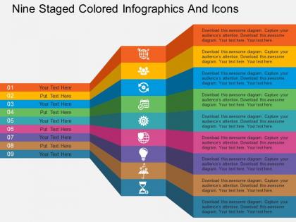
Cn nine staged colored infographics and icons flat powerpoint design




Try Before you Buy Download Free Sample Product
 Impress Your
 Audience
 100%
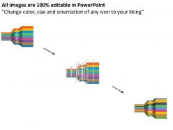
100% Editable
 Save Hours
 of Time


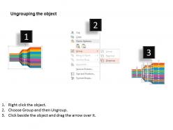
In order to create lifelong impact on your clients, potential investors and other concerned departments it is important to choose a presentation which can narrate a story with the help of exclusive visuals, useful features, and the content. And this is what you can achieve by downloading our professionally designed Cn Nine Staged Colored Info graphics and Icons Flat PowerPoint Diagram. These graphical PPT slides can change the mindset of the user by providing incomparable benefits. Moreover, this carefully modeled PowerPoint template adds a point of attraction to the entire presentation due to its unique style and coloring scheme. Apart from this, these illustrations can be customized in whatever way the user wants by adding icons, changing colors, inserting logos and unlinking the objects. Overall, use this template if you want your Presentation to have an impressive layout and easy understanding.Our Cn Nine Staged Colored Infographics And Icons Flat Powerpoint Design can be cheeky and fun. They allow you to be a bit eccentric.
People who downloaded this PowerPoint presentation also viewed the following :
Cn nine staged colored infographics and icons flat powerpoint design with all 4 slides:
Our Cn Nine Staged Colored Infographics And Icons Flat Powerpoint Design create examples others choose to follow. Always establish fresh benchmarks.

FAQs for Cn nine staged colored infographics and icons
Nine-staged colored infographics deliver enhanced visual storytelling, improved audience comprehension, systematic process breakdown, memorable information retention, and professional aesthetic appeal. These design elements streamline complex workflows by creating logical progression paths, reducing cognitive load through color-coded segments, and enabling presenters to guide audiences through detailed processes, ultimately delivering clearer communication and stronger engagement across business presentations.
Icons enhance PowerPoint designs by simplifying complex information, creating visual hierarchy, improving audience comprehension, and establishing professional consistency throughout presentations. These visual elements streamline communication by replacing dense text blocks, guiding viewer attention to key points, and enabling faster information processing, with many organizations finding that strategic icon usage ultimately delivers more engaging presentations and improved audience retention.
Nine-staged infographic layouts excel at representing sequential processes, project timelines, customer journey mapping, product development cycles, and multi-step strategic frameworks. These layouts particularly benefit complex business transformations like digital adoption roadmaps, employee onboarding sequences, or market expansion strategies, with many organizations finding that the structured visual progression enhances stakeholder comprehension and decision-making processes.
Color choices in infographics significantly impact audience engagement by enhancing comprehension, directing attention, and creating emotional connections with content. Strategic color combinations improve information retention by up to 80%, with businesses finding that consistent brand colors increase recognition, while contrasting hues highlight key data points, ultimately delivering more memorable presentations and stronger audience response rates.
Icon integration best practices include maintaining consistent sizing and alignment, using sufficient white space between elements, choosing icons that directly support your message, and ensuring color harmony with your overall design scheme. Strategic placement of icons alongside text enhances comprehension and retention, with many presenters finding that left-aligned icons with right-positioned text or integrated icon-text blocks create professional, scannable content that ultimately delivers clearer communication and stronger audience engagement.
Educators can leverage nine-staged infographics by breaking complex concepts into digestible sequential steps, visualizing learning progressions, mapping curriculum frameworks, illustrating problem-solving methodologies, and demonstrating cause-and-effect relationships across subjects. These visual tools enhance student comprehension through structured information flow, accommodate different learning styles, and enable teachers to present multi-layered content systematically, ultimately improving knowledge retention and engagement in increasingly visual learning environments.
Infographics help convey complex information by transforming dense data into visual narratives, using charts, diagrams, icons, and color coding to highlight key patterns and relationships. Through strategic visual hierarchy and simplified design elements, organizations across sectors like healthcare, finance, and manufacturing find that infographics significantly enhance audience comprehension, reduce information processing time, and ultimately deliver more engaging presentations that drive better decision-making outcomes.
Adobe Illustrator, Canva, PowerPoint, Figma, and Visme are top choices for creating custom nine-staged infographics, each offering unique templating and design capabilities. These platforms streamline complex data visualization by providing drag-and-drop functionality, extensive icon libraries, and collaborative features, with many organizations finding that PowerPoint's familiarity enhances team adoption while professional tools deliver enhanced visual impact.
Colored infographics enhance marketing presentations by simplifying complex data, increasing audience engagement, and improving information retention through visual storytelling. Businesses across sectors like retail, healthcare, and financial services leverage these tools to transform statistical reports into compelling narratives, ultimately delivering clearer messaging and stronger audience connection during pitch meetings and client presentations.
Consistency in design creates visual cohesion by ensuring flat icons share similar stroke weights, color palettes, sizing proportions, and stylistic approaches throughout presentations. This unified approach enhances professional credibility, reduces cognitive load for audiences, and strengthens brand recognition, with many organizations finding that consistent icon systems significantly improve message clarity and audience engagement across multiple presentation formats.
**INPUT**: How can you ensure that your infographic is accessible and easy to understand for all audiences? **OUTPUT**: Accessible infographics require clear visual hierarchy, high color contrast, readable fonts, simple language, and alternative text descriptions for screen readers. These design principles streamline information consumption by eliminating cognitive barriers, supporting diverse learning styles, and ensuring compliance standards, with many organizations finding that inclusive design ultimately delivers broader audience engagement and enhanced communication effectiveness.
Common mistakes include overcrowding stages with excessive text, using inconsistent color schemes across the nine stages, poor visual hierarchy that confuses the sequential flow, and neglecting mobile responsiveness. These design flaws can overwhelm audiences and diminish message clarity, with many organizations finding that streamlined layouts, consistent branding, and clear progression markers significantly enhance comprehension and engagement.
Cultural differences significantly impact color interpretation in infographics, as red symbolizes luck in China but danger in Western cultures, while white represents purity in America but mourning in some Asian countries. These variations affect audience comprehension and engagement across global markets, with many international organizations finding that culturally-adaptive color schemes enhance communication effectiveness and reduce misinterpretation risks.
Visuals like icons significantly enhance learning by reducing cognitive load, improving information retention, and accelerating comprehension through dual-channel processing. Educational content with strategic icon integration enables learners to process complex concepts more efficiently, with studies showing visual elements increase retention rates by up to 65%, while simultaneously reducing mental fatigue and enhancing engagement across diverse learning environments.
Animating infographic elements significantly boosts audience retention by creating visual interest, guiding attention to key data points, and breaking complex information into digestible segments. These dynamic presentations help presenters control information flow, maintain engagement throughout longer presentations, and ensure critical insights resonate with audiences, with many organizations finding that animated elements increase comprehension rates and meeting effectiveness.
-
Presentation Design is very nice, good work with the content as well.
-
Much better than the original! Thanks for the quick turnaround.