


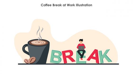
Coffee Break At Work Illustration




Try Before you Buy Download Free Sample Product
 Impress Your
 Audience
 100%
100% Editable
 Save Hours
 of Time


Use this Coffee break at work illustration and create amazing PowerPoint presentations or graphics with ease. This downloaded file is available in all the editable formats such as EPS, PNG and Powerpoint pptx.
People who downloaded this PowerPoint presentation also viewed the following :
Coffee Break At Work Illustration with all 9 slides:
Use our Coffee Break At Work Illustration to effectively help you save your valuable time. They are readymade to fit into any presentation structure.








FAQs for Coffee Break
Honestly, just focus on that "ahh, finally" coffee moment we all crave. Warm browns and creams work great - maybe throw in some color from pastries or whatever's in the background. Steam rising from mugs is perfect, or scatter some coffee beans around for texture. But people are what really matter here! Show someone's shoulders relaxing with that first sip, or friends actually laughing together. The whole thing should feel like "this is MY moment." I always think balanced compositions work better than stiff ones. Oh, and definitely include something that makes viewers go "ugh yes, I need this right now."
Honestly, coffee break visuals are genius because people instantly chill out when they see them. Your audience connects those images to their own downtime - makes everything feel way less stuffy and corporate. I've watched boring presentations come alive just by throwing in coffee cups instead of those terrible generic icons everyone uses. They're clutch for transition slides too, especially when you need people to actually absorb what you just said. Drop them right before big points or during natural pauses. Trust me, your audience will stay engaged and remember your stuff way better than with standard slides.
Hey! So for coffee break illustrations, you'll want clean line art or those minimalist flat designs. Watercolor works too if it's subtle. I swear I've seen a thousand of those simple vector people chatting with steaming mugs - but they're popular for a reason, right? They don't fight with corporate branding and everyone gets it instantly. Scattered coffee beans around office spaces is another safe route. Just avoid anything too cartoonish or busy. Neutral colors are your friend here. Oh, and definitely check what's trending in the "business casual" section on stock sites first.
Dude, colors make such a huge difference! Browns and creams give you that cozy café feeling - like you want to curl up with your latte. Blues and grays? More corporate-y, but I've actually seen some gorgeous minimalist stuff in those shades. Orange or yellow screams "morning energy boost!" while muted tones look way more upscale. Honestly depends what vibe you're going for - is it a chill hangout spot or more of a quick productivity break? Oh, and darker colors can hide coffee stains better too (learned that the hard way).
Honestly, humor works like magic for resetting people's brains during presentations. Think of it as hitting a refresh button - everyone gets a mental break before you dive back into the heavy stuff. I mean, half your audience is probably scrolling Instagram anyway, so might as well grab their attention back! The trick is making your jokes actually connect to what you're talking about. Skip the random memes. Try poking fun at common workplace stuff or even joke about your own presentation quirks. Makes you seem way more relatable, and people will actually stay tuned in.
Match the illustrations to your actual audience - that's the whole trick. Tech companies? Laptops and sleek offices work great. Healthcare? Think scrubs and hospital break rooms instead. Even the coffee matters (okay, maybe I'm weird about details, but whatever) - fancy lattes for creative agencies, basic mugs for manufacturing. Colors and clothing should reflect who you're targeting too. You want people looking at it thinking "yep, that's totally us during break time." Demographics matter just as much as the setting.
Start with your main coffee visuals - cups, beans, steam - and make those pop with size and bold colors. Then layer your text using good contrast so it's actually readable. I've honestly seen way too many coffee designs that just cram everything together and look messy! Pick a cohesive palette - warm browns and creams work great, maybe throw in one accent color. White space is your friend here. Don't be afraid to use it! Icons beat text blocks every time when you can swing it. Oh, and test how it looks on different screen sizes since people view stuff everywhere these days. The key is guiding someone's eye naturally without making them work for it.
Oh, I'd definitely start with steam rising from the coffee cups - looks super cozy and natural. Parallax scrolling is money too, where background stuff moves at different speeds when you scroll. Even tiny things like people sipping their drinks or a little wiggle on coffee beans can totally bring it to life. Honestly, the bubbling animation in brewing equipment might be my favorite touch. Just keep everything slow and smooth so it matches that chill coffee vibe. Don't go crazy with it though - micro-animations work way better than flashy stuff. Pick one element first, then add more!
Honestly, I'd go with Illustrator for vector stuff - coffee cups and steam swirls look super clean and you can scale them forever. Procreate's my favorite though if you have an iPad, the coffee art people make on there is just *chef's kiss*. Figma's really good too, especially for web stuff since everything stays sharp. Canva works but feels kinda limiting once you get into it. Oh and don't stress about picking the "right" one - just use whatever you're already comfortable with. You can always mess around with other tools later once you figure out your style.
Honestly, timing these things is pretty straightforward - just drop them right before you switch topics or after you've hit people with heavy stuff like data dumps. Your audience's brains are basically screaming for a break at those moments anyway. I'd avoid the very beginning or end of your presentation though, that feels weird. For longer talks, maybe every 10-15 minutes? But don't get too rigid about it. Sometimes you'll have a perfect spot that just feels right, even if it's only been 8 minutes. Trust your gut on this one.
Honestly, the worst thing you can do is go overboard with cheesy stock photos. Those fake corporate shots with people laughing at laptops? Nobody's buying it. Also don't let your cute little graphics steal the show from your actual point - I've sat through way too many presentations where the coffee cup illustrations were more distracting than helpful. Keep it simple and make sure whatever you pick actually relates to what you're saying. Oh, and definitely run through your slides beforehand to check that everything flows right. You want your visuals supporting your message, not fighting with it.
Try the classic "problem, discovery, solution" thing - tired person finds amazing coffee, then boom, they're energized. Works every time! Sequential panels are great for this, or even just before/after shots. I always get carried away with little details, but honestly that's what sells it. Scattered papers on the desk? Instant "busy workday" vibe. Friends huddled around mugs tells its own story. Even one illustration can hint at something bigger if you're smart about the background stuff. Don't overthink it though - just pick a relatable moment your audience will totally get.
Coffee break illustrations hit different when you drop them right after heavy content. Like during product demos - show "Sarah's chaotic morning before vs. her smooth routine after using our app." People actually need that breather, and it reinforces your point without feeling pushy. Training sessions do this with "day in the life" stuff all the time. Honestly? Sometimes folks pay more attention during these little breaks than the actual presentation. Just don't make it random fluff - connect it back to what you just talked about. Maybe sketch out 2-3 mini-stories that actually tie to your main points.
Look at what gets people actually engaging - which styles make them stop scrolling, what scenarios they comment on. I get so wrapped up in my own ideas that I totally forget what people actually want to see! Comments are where the real insights hide. Notice patterns about colors, character types, or coffee moments that feel genuine to them. Short polls work great too - just ask what coffee scenes they'd love illustrated. Sometimes the responses surprise me. Use all that to shape your next pieces. The stuff you think is brilliant might flop while something random takes off.
Honestly, ditch those boring stock photos everyone's using. Authentic illustrations that actually look like your audience are way better right now. Interactive stuff is killer - like animated elements or graphics that build as you present. Hand-drawn and minimalist styles feel way more personal than corporate clipart. Oh, and people are so over seeing the same generic coffee cup thing everywhere lol. Just pick something that matches your vibe! Don't play it safe with bland graphics when you could use something with actual personality instead.
-
Understandable and informative presentation.
-
Great quality slides in rapid time.