

Color Palette With Five Shade Buttercup Rusty Nail Raw Sienna Web Orange Dark Ebony





Try Before you Buy Download Free Sample Product
 Impress Your
Audience
 100%
Editable
 Save Hours
of Time


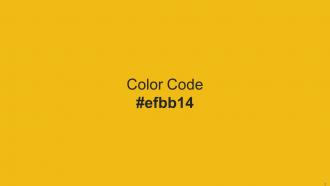
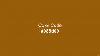
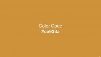
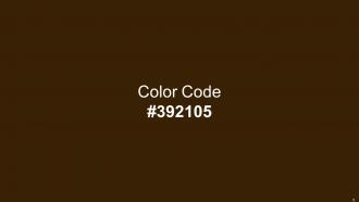
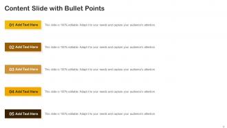
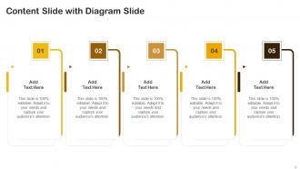
Heres a visually-pleasing color palette with Five Color Shades With Hex Code efbb14, 985d09, ce933a, efa800, 392105. These colors are intuitively picked to ignite the spark of brilliance in your designs and creativity.
People who downloaded this PowerPoint presentation also viewed the following :
Color Palette With Five Shade Buttercup Rusty Nail Raw Sienna Web Orange Dark Ebony with all 14 slides:
Use our Color Palette With Five Shade Buttercup Rusty Nail Raw Sienna Web Orange Dark Ebony to effectively help you save your valuable time. They are readymade to fit into any presentation structure.







FAQs for Color Palette With Five Shade Buttercup Rusty Nail Raw Sienna Web
When selecting a color palette for presentations, consider brand alignment, audience preferences, cultural associations, accessibility requirements, and visual hierarchy needs. These factors work together by ensuring professional consistency, enhancing readability through sufficient contrast, and supporting your message effectively, with many organizations finding that strategic color choices significantly improve audience engagement and information retention.
Color psychology significantly influences audience perception by evoking specific emotions, enhancing comprehension, and directing attention through strategic visual hierarchy. Warm colors like red and orange create urgency and energy for sales presentations, while cool blues and greens build trust in financial reports, with many organizations finding that consistent, psychology-based color choices increase audience retention and engagement rates.
Effective color combinations for visual hierarchy include high-contrast pairs like navy and white, complementary schemes such as blue and orange, and monochromatic gradients from light to dark tones. These strategic combinations enhance readability, guide audience attention through content flow, and create professional presentations, with many organizations finding that consistent color hierarchy improves message retention and audience engagement significantly.
Cultural differences significantly affect color interpretation through varying symbolic meanings, religious associations, and emotional responses across different societies. For example, while white represents purity in Western cultures, it symbolizes mourning in many Asian countries, and red signifies luck in China but danger in Western contexts, making cultural awareness essential for global presentations and international business communications.
Color palette tools include Adobe Color, Coolors, Paletton, ColorHunt, and Canva's palette generator, along with traditional color wheel principles and brand guideline resources. These platforms streamline palette creation by offering pre-tested combinations, accessibility checking, and export features, with many designers finding that digital tools combined with brand consistency frameworks ultimately deliver cohesive visual identities and enhanced user experiences.
A presentation's color palette should include 3-5 colors for optimal impact, consisting of a primary color, secondary color, neutral base, and one accent color for emphasis. This strategic combination enhances visual hierarchy, maintains audience focus, and ensures professional consistency, with many organizations finding that limiting colors streamlines brand messaging while delivering memorable, cohesive presentations.
Contrast ensures text remains legible by creating sufficient visual separation between foreground text and background colors, preventing eye strain and improving accessibility. Strong contrast ratios enhance readability across different viewing conditions, lighting environments, and devices, while meeting accessibility standards that benefit users with visual impairments, ultimately delivering better user experiences and broader content reach.
Strategic incorporation involves using brand colors as accents rather than dominant elements, applying the 60-30-10 rule where brand colors comprise 30% or less of the palette, and balancing with neutral tones. This approach enables consistent brand recognition while maintaining visual harmony, with many organizations finding that selective color placement in headers, key graphics, and call-to-action elements delivers professional aesthetics without overwhelming audiences.
Common mistakes include using too many colors, choosing low contrast combinations, ignoring brand guidelines, selecting overly bright or distracting hues, and failing to consider accessibility needs. These missteps can undermine message clarity and audience engagement, with many organizations finding that strategic color choices enhance comprehension, maintain professional credibility, and ultimately deliver more impactful presentations.
Gradient colors enhance presentation templates by creating visual depth, establishing hierarchy, guiding audience attention, and adding modern sophistication to slide designs. These color transitions work particularly well in backgrounds, data visualizations, and section dividers, with many presenters finding that subtle gradients from brand colors to complementary tones deliver professional polish while maintaining readability and visual engagement.
Color accessibility ensures presentations are inclusive for audiences with visual impairments, color blindness, or varying visual capabilities by using sufficient contrast ratios, alternative text descriptions, and universally distinguishable color combinations. This approach enables organizations to reach broader audiences effectively, comply with accessibility standards like WCAG guidelines, and ultimately deliver more impactful communication experiences, with many institutions finding that inclusive design enhances comprehension for all viewers.
Background color choice significantly influences presentation mood by affecting audience perception, attention levels, and emotional response through psychological associations and visual contrast. Warm colors like blues and greens create calming, trustworthy atmospheres ideal for corporate settings, while cooler tones enhance focus and professionalism, with many organizations finding that strategic color selection ultimately delivers stronger audience engagement and more memorable messaging.
Color saturation and brightness significantly impact visual hierarchy by drawing attention to critical information, enhancing readability, and creating emotional emphasis within presentations. Higher saturation and brightness naturally guide viewers' eyes to key points, while muted tones recede, with many organizations finding that strategic contrast in these elements improves audience retention and message clarity by up to 40%.
**INPUT**: How can seasonal color trends influence the design of presentation templates? **OUTPUT**: Seasonal color trends significantly influence presentation template design by aligning visual aesthetics with audience expectations, enhancing brand relevance, and creating timely emotional connections through strategic color choices. Organizations across retail, hospitality, and marketing sectors leverage seasonal palettes to strengthen audience engagement, improve message retention, and maintain contemporary visual appeal, ultimately delivering more impactful presentations. **Word count: 54 words**
A consistent color palette reinforces cohesive storytelling by creating visual continuity, establishing emotional tone, guiding audience attention, highlighting key themes, and strengthening brand recognition throughout presentations. This strategic approach enables presenters to seamlessly connect complex narratives, enhance message retention, and maintain professional credibility, with many organizations finding that cohesive color schemes significantly improve audience engagement and comprehension.
-
It’s really cool, and you can find pretty much everything you could need for your work or school.
-
“I always have a wonderful experience with SlideTeam. It's my ""go to"" when I need a template.”