

Color Palette With Five Shade Cyan Aqua Pastel Green Chartreuse Yellow Gold Tips Orange





Try Before you Buy Download Free Sample Product
 Impress Your
Audience
 100%
Editable
 Save Hours
of Time


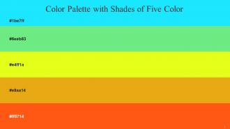
Heres a visually-pleasing color palette with Five Color Shades With Hex Code 1be7ff, 6eeb83, e4ff1a, e8aa14, ff5714. These colors are intuitively picked to ignite the spark of brilliance in your designs and creativity.
People who downloaded this PowerPoint presentation also viewed the following :
Color Palette With Five Shade Cyan Aqua Pastel Green Chartreuse Yellow Gold Tips Orange with all 17 slides:
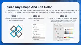
Use our Color Palette With Five Shade Cyan Aqua Pastel Green Chartreuse Yellow Gold Tips Orange to effectively help you save your valuable time. They are readymade to fit into any presentation structure.









FAQs for Color Palette With Five Shade Cyan Aqua Pastel Green Chartreuse Yellow
Colors in presentations significantly influence audience emotions, attention, and comprehension, with warm colors like red and orange creating energy and urgency, while cool blues and greens promote trust and calm focus. Strategic color choices enhance message retention by up to 80%, with many organizations finding that consistent, psychology-based palettes improve audience engagement and decision-making outcomes.
A cohesive color palette enhances audience engagement by creating visual harmony, reinforcing brand recognition, and guiding viewer attention through strategic color placement. Through consistent color application, organizations streamline communication clarity, reduce cognitive load, and strengthen emotional connections, with many marketing teams finding that cohesive palettes increase message retention and audience response rates significantly.
Color palette tools include Adobe Color, Coolors.co, Canva Color Palette Generator, Paletton, and ColorHunt, along with built-in features in PowerPoint and Google Slides. These platforms streamline palette creation by offering color harmony algorithms, brand color extraction, and accessibility testing, with many designers finding that strategic color combinations enhance audience engagement and reinforce brand consistency across presentations.
Color palette significantly influences brand perception by evoking specific emotions, reinforcing brand identity, and establishing visual hierarchy within slides. Strategic color combinations enhance credibility and memorability, with financial services often using blue for trust, while healthcare organizations leverage green for wellness, ultimately creating stronger audience connections and more impactful presentations.
**DO** use a maximum of 3-4 colors with one dominant shade, ensure sufficient contrast between text and backgrounds, and maintain consistency throughout all slides. **DON'T** mix warm and cool tones randomly, use overly bright combinations that strain viewers' eyes, or ignore your brand guidelines, as strategic color harmony enhances audience engagement and reinforces professional credibility across presentations.
Color contrast improves readability by creating clear visual separation between text and backgrounds, reducing eye strain, and ensuring content remains accessible across different viewing conditions and devices. High contrast combinations, such as dark text on light backgrounds or white text on deep blues, enable audiences to quickly process information during presentations, while proper contrast ratios enhance comprehension and maintain professional appearance standards.
Color strategically directs audience focus by creating visual hierarchy, emphasizing key information, and establishing clear pathways through content. Through contrasting colors for critical data, consistent branding elements, and purposeful accent choices, presenters enhance comprehension, reduce cognitive load, and maintain engagement, with many organizations finding that strategic color application significantly improves message retention and audience response rates.
**INPUT**: How to adapt color palettes for different cultural interpretations? **OUTPUT**: Adapting color palettes for different cultures requires researching regional color symbolism, testing combinations with local focus groups, and incorporating culturally appropriate alternatives while maintaining brand consistency. Many global companies, especially in retail and financial services, enhance customer engagement by adapting red for prosperity in Asian markets or using green differently across Western versus Middle Eastern contexts, ultimately delivering culturally resonant experiences. [Word count: 60]
Trending color palettes for 2023 presentations include warm earth tones, sage green combinations, bold coral accents, monochromatic blues, and sophisticated burgundy schemes. These contemporary palettes enhance audience engagement by creating visual harmony, improving readability, and establishing brand credibility, with many organizations finding that strategic color choices significantly boost presentation impact and professional perception.
Color gradients enhance slide design by creating visual depth, guiding audience attention, and establishing sophisticated backgrounds without overwhelming content. Through subtle transitions between complementary colors, presentations achieve modern aesthetics while maintaining readability, with many designers finding that strategic gradient applications in headers, overlays, and accent elements ultimately deliver enhanced visual hierarchy and professional polish.
Color consistency across presentation slides creates visual cohesion, reinforces brand identity, enhances audience comprehension, and establishes professional credibility throughout the deck. This strategic approach streamlines message delivery by reducing visual distractions, enabling smoother information flow, and ultimately delivering stronger audience engagement, with many organizations finding that consistent palettes significantly improve presentation effectiveness and brand recognition.
Selecting an industry-aligned color palette involves researching competitor branding, understanding sector-specific color psychology, analyzing target audience preferences, and considering cultural associations within your market. Financial services often favor blues and greens for trust, while healthcare utilizes calming blues and whites, with many organizations finding that strategic color alignment enhances brand credibility and customer recognition.
Common color palette mistakes include using too many colors, choosing low contrast combinations, relying on color alone for critical information, ignoring brand guidelines, and selecting colors that don't reproduce well across different devices or printing methods. These missteps can significantly reduce readability, confuse audiences, and diminish professional credibility, with many presenters finding that strategic color restraint and accessibility considerations ultimately enhance message clarity and audience engagement.
Accessibility considerations shape color palette choices by ensuring sufficient contrast ratios, avoiding color-only communication, and accommodating color vision deficiencies through strategic combinations. Organizations prioritize WCAG-compliant palettes, alternative visual indicators like patterns or textures, and testing with accessibility tools, ultimately delivering inclusive experiences that reach broader audiences while enhancing usability for all users.
**INPUT**: What are the best practices for using photos and graphics alongside color palettes? **OUTPUT**: Best practices include maintaining consistent color temperature, extracting accent colors directly from imagery, ensuring sufficient contrast ratios, balancing visual weight distribution, and creating cohesive brand alignment. Through strategic color sampling and complementary palette selection, organizations streamline their visual communications, enhance brand recognition, and deliver more engaging customer experiences, ultimately strengthening their competitive positioning across marketing materials. *[Word count: 55 words]*
-
Professionally designed slides with color coordinated themes and icons. Perfect for enhancing the style of the presentations.
-
I am extremely pleased with these PPT slides that we used for our event. They were easy to modify and came out great in all aspects!