

Color Palette With Five Shade Juniper Cascade Summer Green Tea Green Chiffon





Try Before you Buy Download Free Sample Product
 Impress Your
Audience
 100%
Editable
 Save Hours
of Time


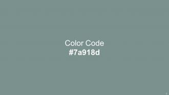
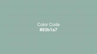
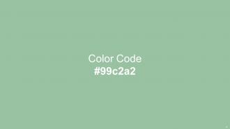
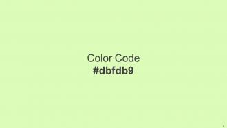
Heres a visually-pleasing color palette with Five Color Shades With Hex Code 7a918d, 93b1a7, 99c2a2, c5edac, dbfdb9. These colors are intuitively picked to ignite the spark of brilliance in your designs and creativity.
People who downloaded this PowerPoint presentation also viewed the following :
Color Palette With Five Shade Juniper Cascade Summer Green Tea Green Chiffon with all 14 slides:
Use our Color Palette With Five Shade Juniper Cascade Summer Green Tea Green Chiffon to effectively help you save your valuable time. They are readymade to fit into any presentation structure.









FAQs for Color Palette With Five Shade Juniper Cascade Summer Green
When choosing a presentation color palette, consider brand alignment, audience preferences, content type, accessibility requirements, and cultural context. These factors work together by ensuring visual consistency, enhancing readability, and supporting message clarity, with many organizations finding that strategic color choices significantly improve audience engagement and professional credibility.
Color psychology significantly influences audience perception by triggering emotional responses, enhancing memory retention, and guiding attention to key information throughout presentations. Strategic color choices enable presenters to build trust through blues, convey urgency with reds, and highlight important data points, with many organizations finding that thoughtful palette selection increases audience engagement and message comprehension.
Current color trends for modern presentations include earthy neutrals like sage green and terracotta, bold jewel tones such as emerald and sapphire, monochromatic gradients, and high-contrast pairings of navy with coral. These palettes enhance visual engagement by creating sophisticated hierarchies, improving readability, and establishing emotional connections with audiences, with many organizations finding that strategic color choices significantly boost message retention and professional credibility.
A consistent color palette reinforces brand recognition, creates visual cohesion, and builds professional credibility across all presentation materials. When organizations maintain uniform color schemes throughout their slides, they strengthen audience recall, establish trust through consistency, and differentiate themselves from competitors, with many companies finding that strategic color consistency significantly enhances their overall brand perception and messaging effectiveness.
Tools for selecting effective presentation color palettes include Adobe Color, Coolors.co, Canva's color palette generator, PowerPoint's built-in Designer feature, and brand style guides. These resources streamline color selection by offering pre-tested combinations, accessibility compliance checks, and industry-specific themes, with many designers finding that systematic color tools ultimately deliver more cohesive visual storytelling and enhanced audience engagement.
Cultural differences significantly impact color interpretations, as red symbolizes prosperity in China but danger in Western cultures, while white represents purity in America but mourning in some Asian countries. Understanding these variations enables presenters to tailor their color choices for global audiences, ultimately enhancing communication effectiveness and avoiding potential misunderstandings across diverse cultural contexts.
Contrast ensures text readability by creating sufficient visual separation between foreground text and background colors, preventing eye strain and enhancing comprehension across different viewing conditions. Strategic contrast ratios enable audiences to quickly process information, especially in varying lighting environments like conference rooms or virtual presentations, ultimately delivering clearer communication and more professional, accessible slide presentations.
Complementary color schemes enhance message communication by creating visual contrast, emphasizing key points, and guiding audience attention through strategic color placement. These opposing colors streamline information hierarchy by highlighting critical data, supporting brand consistency, and reducing cognitive load, with many organizations finding that complementary palettes ultimately deliver clearer presentations and stronger audience engagement.
Accessibility best practices for presentation color choices include ensuring sufficient contrast ratios, avoiding color-only information conveyance, using colorblind-friendly palettes, providing alternative text indicators, and testing across different viewing conditions. These approaches enhance comprehension by supporting diverse visual needs, improving readability in various lighting environments, and ensuring critical information remains accessible, with many organizations finding that inclusive design ultimately delivers broader audience engagement and professional credibility.
Color palettes can be adapted by adjusting saturation levels, incorporating thematic accent colors, and varying brightness ratios while maintaining core brand consistency across different content sections. Through strategic color mapping, presenters enhance audience engagement by using warmer tones for motivational content, cooler palettes for analytical data, and neutral schemes for technical information, ultimately delivering cohesive visual storytelling that reinforces key messages.
Limited color palettes create cohesive, professional designs that enhance brand recognition and visual hierarchy, while extensive palettes offer creative flexibility but risk overwhelming audiences and diluting brand consistency. Many organizations find that strategic color limitation streamlines decision-making, reduces production costs, and delivers stronger visual impact across marketing materials, with financial services and healthcare sectors particularly benefiting from this focused approach.
Presenters create visual harmony by using monochromatic schemes with varying saturations, implementing the 60-30-10 rule for color distribution, and maintaining consistent undertones throughout their palette. This approach ensures cohesive slide transitions, reduces visual fatigue, and enhances audience focus, with many corporate presentations finding that strategic color variation within a unified palette delivers professional credibility and improved message retention.
Common mistakes include using too many colors, selecting low-contrast combinations, ignoring color blindness accessibility, choosing colors that clash with brand guidelines, and using overly bright or distracting hues. These errors undermine message clarity and audience engagement, with many organizations finding that strategic color restraint, accessibility considerations, and brand alignment ultimately deliver more professional presentations and better audience retention.
Presenters can utilize color strategically by employing high contrast combinations for emphasis, using warm colors like red or orange for critical data points, and applying consistent color coding across charts and graphics. Through deliberate color hierarchy and selective highlighting, organizations enhance audience comprehension, reduce cognitive load, and improve information retention, ultimately delivering more impactful presentations and clearer business communications.
Effective transitions include using bridge colors that appear in both palettes, gradually shifting hue intensity across slides, maintaining consistent accent colors, and employing neutral backgrounds as stabilizing elements. These techniques enable seamless visual flow by creating subtle connections between sections, preserving brand consistency, and guiding audience attention, with many presenters finding that strategic color bridging enhances comprehension while maintaining professional cohesion.
-
The visual appeal of the templates is just unparalleled! I was so worried about the design of my presentation but SlideTeam made it all so easy.
-
I can say with full confidence that all your business, academic, or professional work requirements will be sufficed with SlideTeam. Their gallery is as rich as 2Million+!!