

Company Pitch Deck Ppt Template





Try Before you Buy Download Free Sample Product
 Impress Your
 Audience
 100%
100% Editable
 Save Hours
 of Time


Company Pitch Deck gives an overview of the company, which will help the entrepreneurs to understand the financing rounds of investments. Check out our efficiently designed Company Pitch Deck that covers the problem faced by the customers and the solutions offered by our company. We have also provided an outline of the company and its objectives. The details of the product and services are covered in this deck, along with target customers, business model, go-to-market plans, and roll-out plans. To understand the market better, we have focused on the competitors, competitive analysis, and market size of the company. In this PowerPoint presentation, we have discussed the funding investments, project performance over the years, company traction, milestones, business strategy, team details, and client testimonials. Customize this 100 percent editable pitch deck based on your specific business needs.
People who downloaded this PowerPoint presentation also viewed the following :
Content of this Powerpoint Presentation
Slide 1: This slide introduces Company Pitch Deck. State your company name and begin.
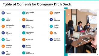
Slide 2: This slide shows Table of Content for the presentation.
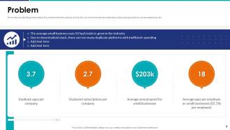
Slide 3: This slide provides the glimpse about the problem faced by people all over the world such as decentralized stack, duplicate applications, various SaaS tools, etc.
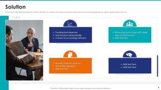
Slide 4: This slide provides the glimpse about the solution offered by our company for expense tracking and optimization.
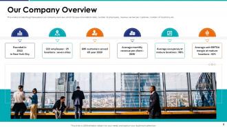
Slide 5: This slide provides the glimpse about our company overview which focuses o foundation date, number of employees, revenue earned per customer, etc.
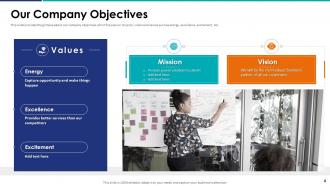
Slide 6: This slide provides the glimpse about our company objectives which focuses on mission, vision and values such as energy, excellence, excitement, etc.
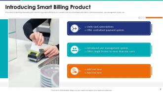
Slide 7: This slide provides the glimpse about the smart billing product offered by our company such as unified SaaS subscription, centralized payment, etc.
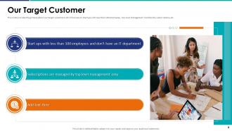
Slide 8: This slide exhibits target customers which focuses on startups with less than 100 employees, top level management handles the subscriptions, etc.
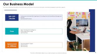
Slide 9: This slide provides the glimpse about our business model which focuses on user activity track system, cancellations management, application usage, etc.
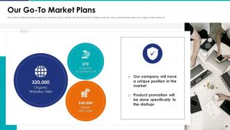
Slide 10: This slide highlights company’s go to market plan which focuses on organic website visits, customer acquisition cost, organic video views, etc.
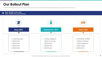
Slide 11: This slide illustrates roll out plan which focuses on our future plan such as beta release, intelligence features in our app, monthly active users, etc.
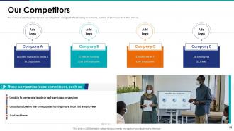
Slide 12: This slide provides the glimpse about our competitors along with their funding investments, number of employees and other details.
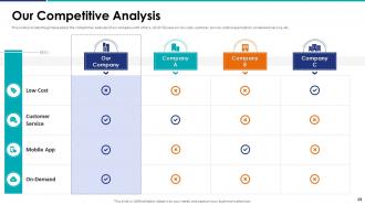
Slide 13: This slide displays competitive analysis of our company with others, which focuses on low cost, customer service, mobile application, on demand service, etc.
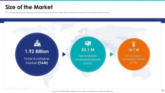
Slide 14: This slide provides the glimpse about the size of the market which focuses on TAM, SAM and SOM that showcase the fundamental market size metrics.
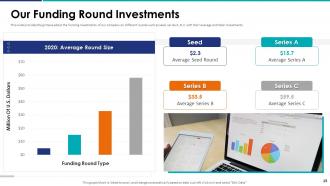
Slide 15: This slide presents funding investments of our company on different rounds such as seed, series A, B, C with their average and total investments.
Slide 16: This slide provides the glimpse about our project performance in the organization which focuses on growth rate of our project and how our company is performing.
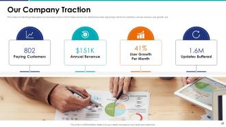
Slide 17: This slide exhibits business traction which measures how our startup business is growing in terms of customers, annual revenue, user growth, etc.
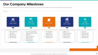
Slide 18: This slide displays company milestones which focuses on business process tracking and our plan has been implemented within the organization.
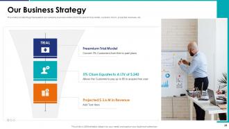
Slide 19: This slide provides the glimpse about our company business model which focuses on trial model, customer churn, projected revenues, etc.
Slide 20: This slide provides the glimpse about our company organization structure which focuses on different departments and their team members.
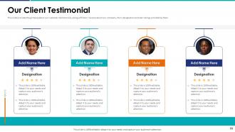
Slide 21: This slide presents customer testimonials, along with their reviews about our company, their designation and star ratings provided by them.
Slide 22: This slide contains all the icons used in this presentation.
Slide 23: This slide is titled as Additional Slides for moving forward.
Slide 24: This is Our Team slide with names and designation.
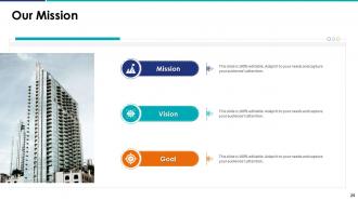
Slide 25: This is Our Mission slide with related imagery and text.
Slide 26: This is a Comparison slide to state comparison between commodities, entities etc.
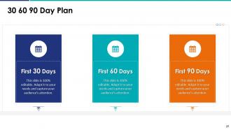
Slide 27: This slide provides 30 60 90 Days Plan with text boxes.
Slide 28: This slide presents Roadmap with additional textboxes.
Slide 29: This slide shows Post It Notes. Post your important notes here.
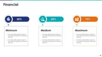
Slide 30: This is a Financial slide. Show your finance related stuff here.
Slide 31: This slide depicts Venn diagram with text boxes.
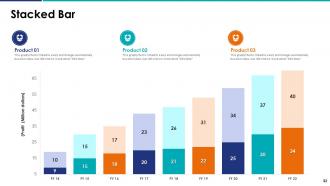
Slide 32: This slide represents Stacked Bar chart with two products comparison.
Slide 33: This is a Timeline slide. Show data related to time intervals here.
Slide 34: This is a Thank You slide with address, contact numbers and email address.
Company Pitch Deck Ppt Template with all 39 slides:
Use our Company Pitch Deck Ppt Template to effectively help you save your valuable time. They are readymade to fit into any presentation structure.















FAQs for Company Pitch
Honestly, your pitch deck lives or dies on three things: find a problem that makes people go "ugh yes, I hate dealing with that," show how you'll fix it better than anyone else, and prove you're not just talking - you can actually build this thing. Story-wise, hit the usual suspects: problem, solution, market size, how you make money, any traction you've got, your team, numbers. Keep slides visual because nobody wants to read paragraphs (learned that the hard way). The real magic happens when you can show momentum - actual customers, revenue going up, solid partnerships, whatever. But honestly? Practice your pitch until you're not stumbling over words. Your excitement about the idea will convince people way more than fancy slides.
Dude, visuals are everything for pitch decks. They make your ideas stick and help investors get your concept fast. Those boring text walls? Total snoozefest. Charts turn your financials into actual stories people care about. Screenshots make abstract stuff feel real - honestly wish more founders understood this. Good visuals also make you look legit, like you've done your homework. Just keep them crisp and relevant to whatever point you're making. Oh, and stick to one main visual per slide or you'll overwhelm everyone.
Dude, slides packed with text are the worst - investors want to hear YOU talk. Practice your actual pitch way more than messing with slide designs, trust me. Keep it to 10-12 slides max and don't hide your ask somewhere random. Your problem/solution fit better be solid, and please don't say you'll magically get 1% of some huge market (eye roll). The team slide needs to show why you specifically can pull this off, not just fancy titles. Oh and realistic financial projections - nothing kills credibility faster than absurd numbers. Your story matters way more than pretty graphics anyway.
Think of your pitch deck like explaining a movie plot to someone. Start with the problem - that's your villain. Then your solution becomes the hero. Show what happens if this problem doesn't get solved (creates good tension), then boom - here's how you fix it. Don't use boring bullet points. Real customer stories work way better, trust me. Make sure each slide flows into the next one naturally. Oh and here's the thing investors actually care about - they're betting on YOU and your team, not just some abstract idea. So put yourselves in the story too.
Dude, you HAVE to research your audience first. Figure out who's in that room - are they conservative VCs who hate risk, or angels who love crazy ideas? Same pitch hits totally different depending on who's listening. I've watched founders crash and burn pitching tech specs to business people (or the opposite). Stalk their portfolio, recent deals, even their LinkedIn if you have to. What keeps them up at night? What makes them actually write checks? Then shape your whole deck around that - slide order, messaging, everything. It's literally the difference between a follow-up and radio silence.
Okay so first thing - one idea per slide, seriously. Don't cram everything together or people zone out. Skip the text walls and throw in some charts or simple graphics instead. I always try to tell a story with my data rather than just listing random facts (way more engaging). Start with your main point upfront, then back it up with evidence. Here's the thing though - if you can't explain each slide in like 30 seconds, it's probably too complicated. You might need to simplify or honestly, maybe you don't get the concept well enough yet. Practice makes perfect!
Honestly, stick to 10-12 slides max - that's like 10-20 minutes of talking. I've watched so many founders bomb with these massive 25+ slide decks. Nobody wants to sit through that. Hit the basics: problem, solution, market size, how you make money, any traction you've got, your team, and the numbers. Short sentences work better than cramming everything in. The whole point isn't closing them right there anyway - you just want that follow-up meeting. Better to have them asking questions than checking their phones halfway through, you know?
Honestly, numbers are what separate the legit pitches from the total BS ones. Don't just say "huge demand exists" - show me the actual market size or survey data that proves it. Charts help a ton visually, but don't go crazy with like 15 different graphs. Pick maybe 3-4 solid data points that actually back up your main story. Use stats to prove the problem's real and your solution isn't just wishful thinking. Oh, and make sure you're pulling from credible sources - I've seen people cite some pretty sketchy "research" before. Hard evidence beats fluffy claims every single time.
Dude, first thing - pick 2-3 colors and stick with them. I can't tell you how many pitch decks I've seen that look like a kindergarten art project gone wrong. Use the same fonts throughout, keep your spacing consistent. Less text is always better - give people room to breathe with white space so they're listening to you, not reading novels on slides. Bold your main points or throw them in callout boxes. Oh, and test it on a projector first! What looks crisp on your MacBook might turn into blurry mess when you're actually presenting. Trust me on that one.
Dude, you gotta tailor your pitch to what each investor actually cares about. VCs? Hit them hard with growth metrics and market size - they want to see billion-dollar potential. Angels are way more personal, so your story and mission really matter to them. Strategic investors are basically looking for how you fit into their existing business. I always think of it like dating honestly - same person, different angles depending on who's across the table. Do your homework on each investor first, then swap out maybe 2-3 slides to match their vibe. Works every time.
Honestly, there are tons of ways to ditch the boring slide deck. Interactive demos are amazing if you've got a working product - just let them mess around with it. Video pitches have been killing it lately, especially since everyone's still doing remote stuff. Some founders do these one-page visual summaries that pack everything in, or they'll walk through an actual customer story instead. I've seen people get creative with Notion pages, Figma prototypes, even building little web experiences. Just don't go overboard with the bells and whistles - pick whatever actually shows off your idea best.
Update your pitch deck every 3-6 months at minimum. More often if you're actively fundraising - I'd say monthly then since investors will immediately catch stale numbers. Major milestones are obvious triggers too: new funding rounds, product launches, big traction shifts. Keep your financials and user metrics current or you'll look completely out of touch (seen this happen way too many times, honestly painful). Here's what works: maintain one master deck with your latest numbers, then just customize versions from there. Way easier than rebuilding everything each time. Oh and if you're meeting with VCs regularly? They notice outdated data faster than you think.
Dude, so many people mess this up. If you're early stage, lead with the problem you're solving and why your team can pull it off. Show whatever traction you've got, even if it's small. Big vision, scrappy proof - that's the vibe. Established companies? Totally different game. Jump straight into your numbers and growth plans. Investors already know you can execute, so prove you're worth more money. The worst thing I see is startups trying to look all polished and corporate when they should be selling the dream. Match your deck to where you actually are, not where you want to be.
Dude, getting feedback on your pitch is honestly a game-changer. Watch people's faces - when they look lost or start asking "wait, what?" that's your cue something's off. I totally bombed once because I rushed through our revenue stuff and nobody got it. Take notes on which slides get people nodding vs. the ones that kill the vibe. After each practice run, jot down what went wrong and actually fix those slides before the real thing. Don't just collect all this feedback and then ignore it though - that's pointless.
Honestly, I'd start with Canva or Pitch.com - their templates are pretty solid and you won't waste hours figuring things out. PowerPoint works too if you're old school like that. Figma's incredible but kinda overkill unless you're already comfortable with design stuff. For ideas, hit up SlideShare or PitchDeckHunt to see what actual successful startups did with theirs. Oh, and Guy Kawasaki's 10/20/30 rule is clutch for keeping things tight. Just grab a template that fits your industry and tweak it from there. Way easier than starting from scratch.
-
Based on my personal experience, I would recommend other people to subscribe to SlideTeam. No one can be disappointed here!
-
Delighted to see unique and eye-catching PowerPoint designs that are so easy to customize.