

Construction Project Monitoring And Control Kpi Dashboard




Try Before you Buy Download Free Sample Product
 Impress Your
 Audience
 100%
100% Editable
 Save Hours
 of Time


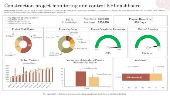
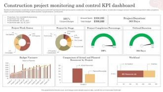
Mentioned slide displays construction project monitoring and control KPI dashboard which can be used by construction manager to track various metrics. Construction manager can track metrics like project work status, projects by stages, project completion percentage, utilized duration, budget variance , workload etc.
People who downloaded this PowerPoint presentation also viewed the following :
Construction Project Monitoring And Control Kpi Dashboard with all 7 slides:
Use our Construction Project Monitoring And Control Kpi Dashboard to effectively help you save your valuable time. They are readymade to fit into any presentation structure.





FAQs for Construction Project Monitoring And
Okay so first things first - figure out what decisions people actually need to make with this thing. Then pick 5-7 metrics that really matter, not just vanity numbers. Charts and graphs are your friend, but don't go crazy with the colors (honestly, rainbow dashboards are the worst). You'll want real-time data if possible, plus context like targets so people know if they're winning or losing. Mobile-friendly is non-negotiable since everyone checks these on their phone anyway. Oh, and resist cramming everything onto one screen - I've seen way too many dashboards that look like airplane cockpits. Keep it simple and focused on what actually drives action.
First figure out what winning actually means for your company - more revenue, happier customers, whatever. Then pick 3-5 metrics that tie directly to those goals. Honestly, most people get caught up tracking stuff that looks good on paper but doesn't matter. Your team should be able to impact these numbers through their actual day-to-day work. Set clear targets with deadlines. Oh, and definitely get your team involved in choosing the KPIs - they'll care way more about hitting numbers they helped pick. Trust me on that one.
Honestly, keep it simple - big, clear numbers for your most important stuff. Green and red color coding is obvious but it works. Don't overthink it. White space matters way more than people realize, so resist cramming everything together or everyone's eyes will just glaze over. I'd put your main metrics right at the top where nobody can miss them. Simple bar charts beat fancy visualizations every time. Make your time periods super obvious too - like whether you're showing daily or monthly data. Test it with a couple teammates first because you'll be surprised what confuses people. Oh, and stick with consistent fonts throughout.
Monthly updates are usually your sweet spot, but honestly it depends on what you're tracking. Daily sales? Yeah, update that daily. Customer satisfaction scores? Once a month is fine - those don't swing around like crazy anyway. The real trick is matching how often you refresh to how fast things actually change in your business. I've watched so many teams build these gorgeous dashboards then completely ignore them after two weeks. Don't be those people! Check quarterly which metrics you're still using for actual decisions vs. just... existing there.
Don't cram everything onto one screen - it's overwhelming. Also, skip the vanity metrics that look cool but are basically useless. Like, who cares about total page views if they don't actually tie to revenue? Your KPIs need to match what the business actually wants to achieve. Keep your visual design consistent so people aren't scratching their heads at random chart styles. Data should update often enough to be useful. Oh, and test it with real users first - I learned that one the hard way. Start basic and only add fancy stuff when you really need it.
Honestly, just keep it super simple - clear labels, consistent colors, group stuff logically. If someone can't figure it out in 30 seconds, you've already lost them. Test it with actual people from each team before you launch (trust me on this one, it'll save you from so many angry emails later). Put your most critical metrics at the top where people can see them right away. Oh, and maybe create different views for different roles? Like, your sales team doesn't need to wade through all the operations stuff. Get feedback early and tweak it based on how people actually use it.
Dude, there's honestly so many options it's kinda overwhelming. Tableau and Power BI are the big names - crazy powerful but yeah, expensive. Google Data Studio won't cost you anything and it's decent, just gets weird sometimes. I'd probably figure out what data you're working with first, then see which tool plays nice with it. Qlik Sense is solid if you're more technical, or you could go full custom with D3.js but that's like... a whole thing. Most have free trials anyway so just mess around with a few and see what clicks.
Yeah, totally doable! I'd start with text boxes for good customer quotes - those hit different than just numbers. Color-coded sentiment stuff works great too, or basic rating scales that turn feedback into something visual. Word clouds are kinda cool but honestly they get cluttered fast. The trick is keeping qualitative stuff bite-sized so it doesn't compete with your main metrics. Pick maybe 2-3 qualitative things that actually connect to your numbers, then just mess around with different formats. You'll figure out what works for your team pretty quick.
Honestly, you can't build a decent KPI dashboard without good visuals. Raw spreadsheet data is just painful to look at - your brain processes charts and graphs way faster than rows of numbers. Color-coded heat maps, gauges, trend lines... they make patterns pop out that you'd totally miss otherwise. Like, would you rather scan 50 data points or glance at a chart? No contest. Just pick the right chart types for what you're measuring (bar charts for comparisons, line graphs for trends over time, that sort of thing). Trust me, visual dashboards will save you so much time.
So I'd set up different tabs for each department first. Sales needs their conversion rates and pipeline stuff, HR wants retention numbers - you know how it goes. Most tools have permission settings so people don't get overwhelmed with random data they don't care about. Here's what works: ask each team what 3-5 numbers they actually look at every day. Build from there. Honestly, pick one department to test it with first - maybe whoever complains the least? Get their input, fix whatever's broken, then expand it. Way less headache than trying to please everyone at once.
NPS, CSAT, and Customer Effort Score are your big three - they'll show you what customers really think. Churn rate matters too, obviously. Track support ticket resolution time because honestly, slow support kills satisfaction faster than anything else. First-call resolution is huge for this reason. I'd probably check these monthly, maybe more if you're having issues. Oh, and set up some kind of alert system when numbers start dropping below where you want them. That way you're not scrambling to figure out what went wrong after it's too late.
Look, real-time data turns your KPI dashboard from a boring history lesson into something you'll actually use. Instead of discovering problems the next day, you catch them happening right now. Picture this: your conversion rates tank at 2pm and you know immediately, not during tomorrow's meeting when it's too late. Honestly, I've seen too many people stick with default refresh settings and wonder why their data feels stale. Set up alerts for when stuff goes wrong. Track campaigns while they're running, not after. Make decisions fast when you have all the info updating live. It's kind of a game-changer once you get used to it.
Honestly, just match your dashboard to who's looking at it. Executives want the big picture stuff upfront - key metrics they can glance at quickly. Your team needs the detailed data they can actually do something with. Set up automated reports so you're not constantly getting pinged for "the latest numbers" (seriously, this will save your sanity). Keep formatting consistent and labels clear - messy charts make people lose trust fast. Oh, and schedule those review meetings where you walk through everything together. Don't just send data - explain what it means and what needs to happen next.
Just use the mobile app or pull it up on your phone's browser - works great either way. Honestly, I'm kinda obsessed with checking mine now, like during my commute or waiting for meetings to start. Set up push notifications for the really critical stuff so you're not refreshing constantly (learned that the hard way). Your main KPIs should be right at the top since phone screens are tiny. Oh, and definitely bookmark it on your home screen! Nothing worse than scrambling through apps when someone asks "how are we doing this quarter?" and you need numbers fast.
Honestly, just make it part of their actual workflow instead of some separate thing they ignore. Integrate those KPI reviews into meetings they're already having. Training helps, but I find walking people through it one-on-one works way better - they get excited when they discover something useful. Oh, and send out weekly wins or highlights from the data. People love seeing their impact. The dashboard needs to be stupid easy to access too. Once someone sees how it actually helps their day-to-day work, they'll keep coming back. It's really about showing value upfront rather than hoping they'll figure it out.
-
SlideTeam makes creating presentations easy. Unlimited products, premium quality designs and affordable.
-
Great templates that you can use in your next keynote or conference. They are perfect for quick and visually-engaging delivery.