


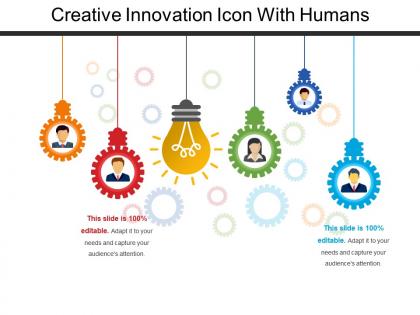
Creative innovation icon with humans




Try Before you Buy Download Free Sample Product
 Impress Your
 Audience
 100%
100% Editable
 Save Hours
 of Time


Share your ideas with your audience conveniently using this readily available Creative Innovation Icon With Humans PowerPoint slide design. This template is useful in both the cases; whether you have to demonstrate innovation or throw a light on special set of ideas. Express the strategies, plans, thoughts, concepts and creative ideas. This innovative ideas PowerPoint template can be of great use for the business managers, executives, educators and other related professionals. Make your everyday presentation eye catching by incorporating this readymade brainstorming PowerPoint slide design. Express your information in a smart way by using this bulb PPT template as the bulb symbolizes ideas, suggestions, vision, intelligence, and more. Our designers have curated this professionally designed high grade icons template with a thorough research. So, download it with a single click and create an amazing PPT presentation for your audience.
People who downloaded this PowerPoint presentation also viewed the following :
Creative innovation icon with humans with all 5 slides:
Create new skills with our Creative Innovation Icon With Humans. Blaze new trails with your thoughts.
FAQs for Creative innovation
Dude, stories completely change the game with presentations. Instead of boring everyone with bullet points, you're giving them characters and conflicts to think about. People's brains literally light up differently - I swear I've watched the most mind-numbing budget meetings turn into actual brainstorming sessions this way. Your audience gets emotionally hooked and starts coming up with way more creative solutions. Next time, try building your presentation around like a customer's journey or some "what if" scenario. Way better than just throwing data at people and hoping something sticks.
Honestly, visuals are huge when you're trying to sell a crazy new idea. Most people can't wrap their heads around abstract concepts - I know I struggle with it sometimes. Good design basically translates your complex innovation into something people actually get. Infographics, prototypes, even crappy sketches work. They help stakeholders picture the real impact instead of just nodding along confused. My take? Start every pitch with visuals. Prototype whatever you can, even if it looks rough around the edges. People need to see it to believe it.
Start everyone off brainstorming solo for like 5-10 minutes before sharing out loud - trust me, it stops the loud people from dominating everything. Make it a "yes, and..." vibe where you're building on ideas instead of immediately trashing them. Those random weird tangents? Don't shut them down too fast, they're usually where the magic happens. Cap it at 45 minutes (people's brains check out after that), get someone sketching ideas on a whiteboard or whatever, then group similar stuff together at the end. Oh, and definitely circle back within a couple days to look at everything again - you'll see things way differently.
Blue's your best bet as a base - gets people thinking clearly and builds trust. Then throw in some orange or yellow pops for creative energy. Purple's solid too since it mixes logic with passion. I honestly thought color psychology was total BS until I watched my team light up with warmer slides vs those boring gray ones we used to do. Red's tricky though - makes people feel rushed instead of thoughtful. Light backgrounds work best so your ideas don't get lost. Save the bold colors for key points you want stuck in their heads.
Honestly, digital tools are a lifesaver because you can test stuff super quickly without committing to anything major. I usually start with a Pinterest mood board (sounds basic but it works), then jump into Figma or Canva to actually mock things up. The AI stuff like ChatGPT and Midjourney? Total game-changers for when you're stuck - they'll suggest weird directions you never would've thought of. Your team can all jump in at once with collaboration tools instead of scheduling another meeting that could've been an email. Just pick whatever fits your workflow and build from there.
Honestly, just bake feedback sessions right into your whole process. After every few iterations, do quick surveys or live polls - whatever feels natural. The best insights come from those random "so what'd you think?" chats afterward, not formal surveys tbh. Here's the thing though - people get way more invested when they see you actually use their suggestions in the next version. Makes them feel heard, you know? I'd say check in every 2-3 rounds to keep things moving. Don't make it feel like work or people will just tune out.
Honestly, culture makes a huge difference in how people want to hear info. Americans and most Western folks like direct, straight-to-the-point presentations. Asian audiences? They prefer more context and letting conclusions develop naturally. I bombed a presentation in Mexico once because I didn't realize how much Latin American audiences connect with emotional stories and personal stuff. Northern Europeans are totally different - they want data, facts, and zero fluff. My German colleagues literally roll their eyes at too much storytelling. You'll want to research your specific audience first. Then match your style to what they actually expect, not what works back home.
Honestly, you want prompts that don't push people toward obvious answers. Give them tons of white space to get messy with ideas. I'd throw in "what if" scenarios and weird perspective shifts - like how would a kid tackle this problem? Don't use leading questions that basically scream the "right" response. I've watched so many templates fail because of this. Mix in some randomness generators and stuff that challenges assumptions. Oh, and add a "terrible ideas" section! Sounds counterproductive, but bad ideas weirdly unlock the good ones. Analogical thinking works too - comparing your problem to something completely different often sparks breakthroughs.
Honestly, ditch the boring pie charts and try something way more interesting. Interactive timelines are amazing for showing how ideas evolved. I'm obsessed with using metaphors too - like tree growth diagrams for development stages, or network maps that connect different innovations. Heat maps work surprisingly well for spotting where the magic happens across teams. Before/after comparisons? Total game-changer for showing actual impact. Here's what I always do: sketch the idea's whole journey on paper first (sounds old school but trust me). Then pick whatever format tells that story best. 3D concept maps can be pretty cool too if you're feeling ambitious.
Stop lecturing people and start getting them involved! Ask questions that make them think. Break into small groups. Give them actual stuff to do with their hands - sticky notes, whiteboards, whatever. I swear, the worst workshops are just someone droning on for hours. Make it safe to share terrible ideas by laughing about your own mistakes first. People need to know weird suggestions won't get them judged. Oh, and this is key - build in quiet time where they can just think without having to immediately share brilliant insights. Maybe try 10 minutes of silent brainstorming before anyone talks?
Honestly, those messy "what if" moments are where the magic happens - way more interesting than polished success stories if you ask me. Don't just show the final result. Walk through your actual problem-solving process because that's what people can steal and use later. I'd map out the whole journey visually, then highlight those breakthrough moments where everything clicked. Pick cases that are kinda similar to what your audience deals with but not exactly the same - forces them to think creatively without getting overwhelmed. Oh, and definitely save time for discussion afterward. People always have the best questions once they've seen the whole mess unfold.
Dude, presentations are getting way more interactive now - live polls, collaborative whiteboards, that whole choose-your-adventure vibe. Visual storytelling is everywhere too. People are ditching boring charts for actual cinematic techniques that tell stories with data. Minimalist design is having a moment (though honestly sometimes I miss the chaos of old PowerPoint templates lol). AR stuff is becoming cheaper to use. There's also this trend where presenters just... talk to people like humans instead of reading scripts? Wild concept, right? Start small - even one poll completely shifts the room's energy. You'll see what I mean.
Honestly, always nail down your main point first before you get fancy with it. People need to understand what you're saying in like 30 seconds max. I can't tell you how many times I've sat through presentations where someone was trying so hard to be creative that I had no clue what their actual point was - super annoying. Layer your creative stuff on top after you've got the core message solid. Run your ideas by someone else first too. If they're scratching their head, tone it down. Quick test: does your creative element help people get it better? Great, keep it. Does it just muddy things up? Toss it.
Honestly, visual metaphors are your best friend here. Break everything into smaller chunks with clear hierarchy - people's brains can only handle so much at once. I totally steal from TED talks because they nail this stuff. Turn your data into a story with that problem-solution-impact flow, and find one central metaphor to thread through the whole thing. Like, if you're explaining a complex system, maybe it's like a city with different neighborhoods? Interactive elements help too, even simple ones. Oh and don't overthink the gamification thing - sometimes just a progress bar works. The narrative arc makes boring info way stickier in people's minds.
Dude, interactive stuff seriously changes everything. Polls, breakouts, live Q&A - suddenly people aren't just sitting there zoning out. They're actually building on each other's ideas, which honestly is the best part. I watched this super boring quarterly review turn into this crazy idea session just because the presenter threw in a "what if" segment. Your audience stays way more engaged and brings perspectives you'd never think of. Oh, and they feel like they're part of it instead of being talked at. Start with a quick poll next time - you'll see what I mean immediately.
-
Topic best represented with attractive design.
-
Great product with effective design. Helped a lot in our corporate presentations. Easy to edit and stunning visuals.